
# Visual Guidelines
FinClip Mini-Program supports various flexible customization methods. To ensure a unified visual style for the Mini-Program, the following conventions are established. Developers can design the UI based on these conventions.
# 1. Mini-Program Menu
# 1.1 Capsule Control
The Mini-Program "More" menu can be opened by clicking the "..." icon in the upper right corner of the Mini-Program. By default, after opening, three buttons will appear: "Forward / Share", "Return to Home" (grayed out by default when already on the home page), and "Complain / Feedback".

The default dimensions of the capsule control are as follows (see How to Set):
- Total width: 88;
- Total height: 32;
- Right margin of the capsule: 10;
- Capsule corner radius: 5;
- Capsule border width: 0.8;
In addition to these three basic button functions, developers can also inject other functions themselves. For self-injected functions, please design the icons as shown below.
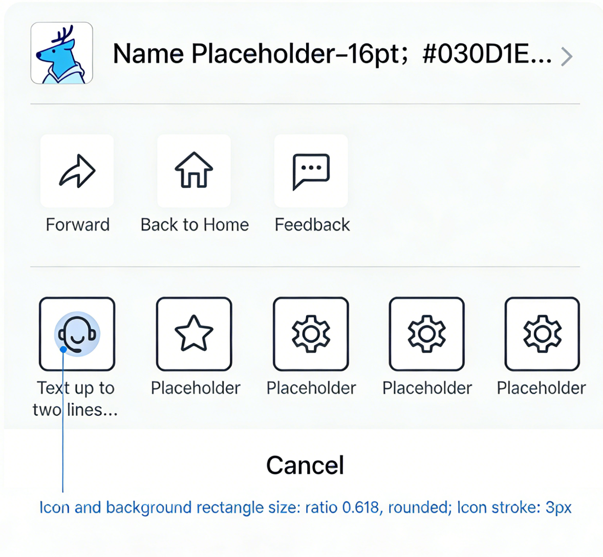
# 1.2 Dark and Light Color Schemes for the Mini-Program Menu
Developers can choose a dark or light Mini-Program menu based on interface needs to create a design style suitable for the Mini-Program.

# 2. Fonts / Colors
# 2.1 Fonts

# 2.2 Colors

# 3. Basic Controls
# 3.1 Startup Loading

# 3.2 Tabs
Provide peer areas to organize and display large blocks of content, keeping the interface clean.

# 3.3 Bottom Tab Bar
Generally fixed at the bottom, serving as entry points for different pages. The number of tabs should be no less than 2 and no more than 5.

# 3.4 Buttons
The buttons used are mainly divided into Primary Button, Secondary Button, and Text Button, where:
- Primary Button: Used for the main action point. Only one primary button is allowed in an operation area.
- Secondary Button: Used for the least important action points.
- Text Button: Used for action points that serve as external links.

The response states of buttons include 3 types: Normal State, Press State, and Disable State.

# 3.5 Lists


