
# Setting Mini-Program Permissions Dialog
# 1. Effect Preview
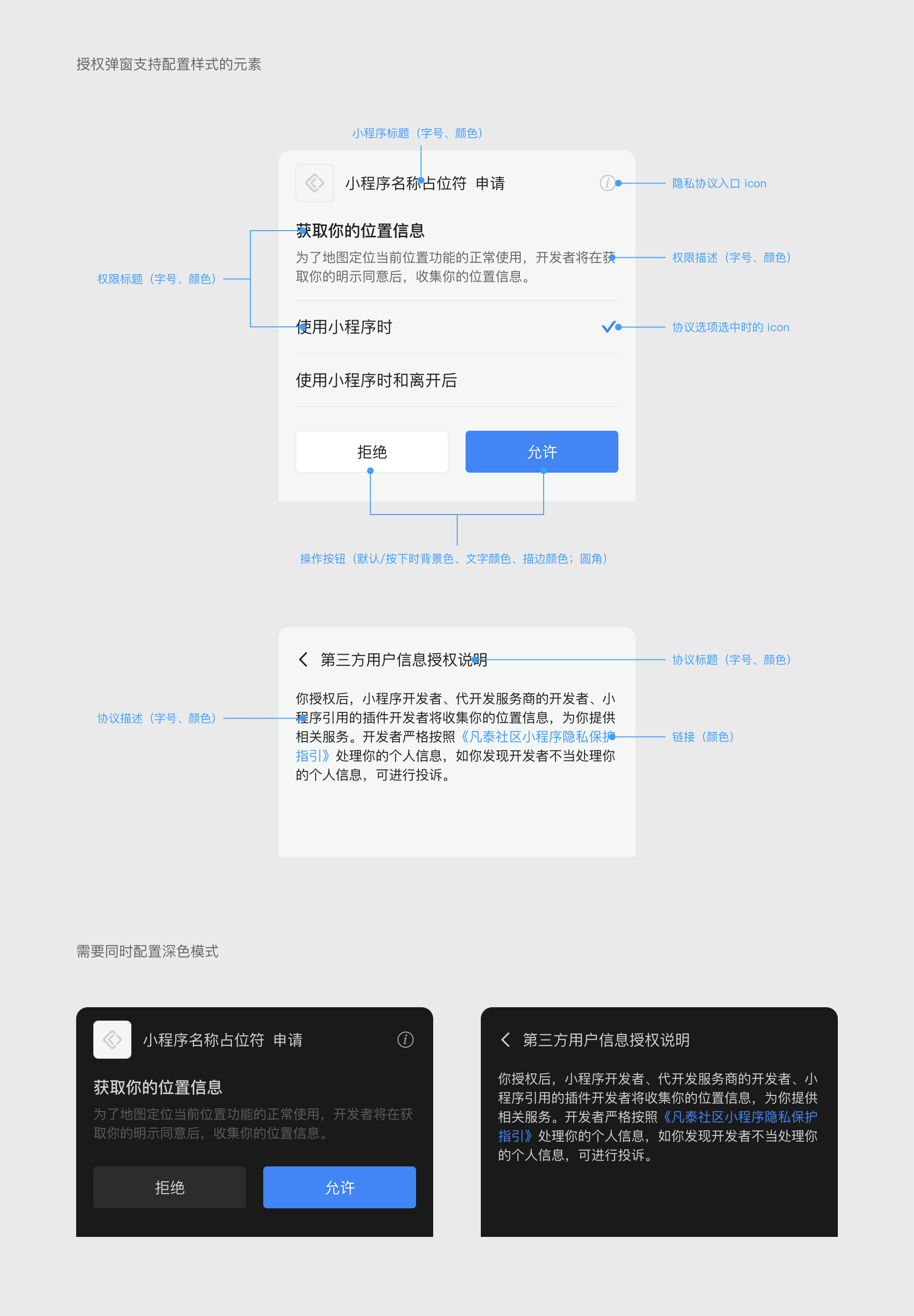
# 2. Setting Mini-Program Permissions Dialog UI Style
# 2.1 Scope
Modification of the Mini-Program Capsule UI style must be implemented by the Host-App. Once set, all Mini-Programs, Mini-Games, and H5 applications within the Host-App will adopt this appearance.
# 2.2 iOS Configuration Method
Configure via the FATAuthViewConfig class during SDK initialization:
// Set Mini-Program name font and size
[FATClient sharedClient].uiConfig.authViewConfig.appletNameFont = [UIFont fontWithName:@"PingFangSC-Regular" size:16];
// Set Mini-Program name light color (Light Mode)
[FATClient sharedClient].uiConfig.authViewConfig.appletNameLightColor = [UIColor redColor];
// Set Mini-Program name dark color (Dark Mode)
[FATClient sharedClient].uiConfig.authViewConfig.appletNameDarkColor = [UIColor blueColor];
Description of specific configurable properties:
/**
 Mini-Program name font size, default font is PingFangSC-Regular, default size 16
 */
@property (nonatomic, strong) UIFont *appletNameFont;

/**
 Mini-Program name light color (Light Mode), default #202020
 */
@property (nonatomic, strong) UIColor *appletNameLightColor;

/**
 Mini-Program name dark color (Dark Mode), default #D0D0D0
 */
@property (nonatomic, strong) UIColor *appletNameDarkColor;

/**
 Privacy agreement entry icon (Light Mode), size: 22pt (@2× @3×)
 */
@property (nonatomic, strong) UIImage *agreementLightImage;

/**
 Privacy agreement entry icon (Dark Mode), size: 22pt (@2× @3×)
 */
@property (nonatomic, strong) UIImage *agreementDarkImage;

/**
 Permission title font size, default font is PingFangSC-Medium, default size 17
 Note: Permission option text font size uses this configuration, but the font is fixed as PingFangSC-Regular
 */
@property (nonatomic, strong) UIFont *authorizeTitleFont;

/**
 Permission title light color (Light Mode), default #202020
 Note: Permission option text color uses this configuration
 */
@property (nonatomic, strong) UIColor *authorizeTitleLightColor;

/**
 Permission title dark color (Dark Mode), default #D0D0D0
 Note: Permission option text color uses this configuration
 */
@property (nonatomic, strong) UIColor *authorizeTitleDarkColor;

/**
 Permission description font size, default font is PingFangSC-Regular, default size 14
 */
@property (nonatomic, strong) UIFont *authorizeDescriptionFont;

/**
 Permission description light color (Light Mode), default #666666
 */
@property (nonatomic, strong) UIColor *authorizeDescriptionLightColor;

/**
 Permission description dark color (Dark Mode), default #8C8C8C
 */
@property (nonatomic, strong) UIColor *authorizeDescriptionDarkColor;

/**
 Agreement title font size, default font is PingFangSC-Regular, default size 16
 */
@property (nonatomic, strong) UIFont *agreementTitleFont;

/**
 Agreement title light color (Light Mode), default #202020
 */
@property (nonatomic, strong) UIColor *agreementTitleLightColor;

/**
 Agreement title dark color (Dark Mode), default #D0D0D0
 */
@property (nonatomic, strong) UIColor *agreementTitleDarkColor;

/**
 Agreement description font size, default font is PingFangSC-Regular, default size 14
 */
@property (nonatomic, strong) UIFont *agreementDescriptionFont;

/**
 Agreement description light color (Light Mode), default #202020
 */
@property (nonatomic, strong) UIColor *agreementDescriptionLightColor;

/**
 Agreement description dark color (Dark Mode), default #D0D0D0
 */
@property (nonatomic, strong) UIColor *agreementDescriptionDarkColor;

/**
 Permission option selected icon (Light Mode), size: 22pt (@2× @3×)
 */
@property (nonatomic, strong) UIImage *authorizeSelectedLightImage;

/**
 Permission option selected icon (Dark Mode), size: 22pt (@2× @3×)
 */
@property (nonatomic, strong) UIImage *authorizeSelectedDarkImage;

/**
 Link light color (Light Mode), default #409EFF
 */
@property (nonatomic, strong) UIColor *linkLightColor;

/**
 Link dark color (Dark Mode), default #368CE4
 */
@property (nonatomic, strong) UIColor *linkDarkColor;

/**
 Allow button configuration (Light Mode), default configuration as follows:
 Corner Radius: 4
 Default Background Color: #4285F4
 Default Border: #4285F4
 Default Text Color: #FFFFFF
 Pressed Background Color: #3B77DB
 Pressed Border: #3B77DB
 Pressed Text Color: #FFFFFF
 */
@property (nonatomic, strong) FATAuthButtonConfig *allowButtonLightConfig;

/**
 Allow button configuration (Dark Mode), default configuration as follows:
 Corner Radius: 4
 Default Background Color: #4285F4
 Default Border: #4285F4
 Default Text Color: #FFFFFF
 Pressed Background Color: #5E97F5
 Pressed Border: #5E97F5
 Pressed Text Color: #FFFFFF
 */
@property (nonatomic, strong) FATAuthButtonConfig *allowButtonDarkConfig;

/**
 Reject button configuration (Light Mode), default configuration as follows:
 Corner Radius: 4
 Default Background Color: #FFFFFF
 Default Border: #E2E2E2
 Default Text Color: #222222
 Pressed Background Color: #D8D8D8
 Pressed Border: #D8D8D8
 Pressed Text Color: #222222
 */
@property (nonatomic, strong) FATAuthButtonConfig *rejectButtonLightConfig;

/**
 Reject button configuration (Dark Mode), default configuration as follows:
 Corner Radius: 4
 Default Background Color: #2C2C2C
 Default Border: #2C2C2C
 Default Text Color: #D0D0D0
 Pressed Background Color: #414141
 Pressed Border: #414141
 Pressed Text Color: #D0D0D0
 */
@property (nonatomic, strong) FATAuthButtonConfig *rejectButtonDarkConfig;
# 2.3 Android Configuration Method
Configure via the AuthViewConfig class during SDK initialization:
FinAppConfig.UIConfig uiConfig = new FinAppConfig.UIConfig();
AuthViewConfig authViewConfig = new AuthViewConfig();
uiConfig.setAuthViewConfig(authViewConfig);
Description of specific configurable properties:
/**
 * Authorization dialog configuration
 */
public static class AuthViewConfig {
    /**
     * Mini-Program name font size, default 16
     */
    public float appletNameTextSize = 16;

    /**
     * Mini-Program name light color, default #222222
     */
    @ColorInt
    public int appletNameLightColor = 0xff222222;

    /**
     * Mini-Program name dark color, default #d0d0d0
     */
    @ColorInt
    public int appletNameDarkColor = 0xffd0d0d0;

    /**
     * Permission title font size, default 17
     */
    public float authorizeTitleTextSize = 17;

    /**
     * Permission title light color, default #222222
     */
    @ColorInt
    public int authorizeTitleLightColor = 0xff222222;

    /**
     * Permission title dark color, default #d0d0d0
     */
    @ColorInt
    public int authorizeTitleDarkColor = 0xffd0d0d0;

    /**
     * Permission description font size, default 14
     */
    public float authorizeDescriptionTextSize = 14;

    /**
     * Permission description light color, default #666666
     */
    @ColorInt
    public int authorizeDescriptionLightColor = 0xff666666;

    /**
     * Permission description dark color, default #5c5c5c
     */
    @ColorInt
    public int authorizeDescriptionDarkColor = 0xff5c5c5c;

    /**
     * Agreement option selected light icon, size: 22x22dp
     */
    @DrawableRes
    public int authorizeSelectedLightImage = R.drawable.fin_applet_ic_checked;

    /**
     * Agreement option selected dark icon, size: 22x22dp
     */
    @DrawableRes
    public int authorizeSelectedDarkImage = R.drawable.fin_applet_ic_checked;

    /**
     * Privacy agreement entry light icon, size: 22x22dp
     */
    @DrawableRes
    public int agreementLightImage = R.drawable.fin_applet_info;

    /**
     * Privacy agreement entry dark icon, size: 22x22dp
     */
    @DrawableRes
    public int agreementDarkImage = R.drawable.fin_applet_info;

    /**
     * Agreement title font size, default 16
     */
    public float agreementTitleTextSize = 16;

    /**
     * Agreement title light color, default #222222
     */
    @ColorInt
    public int agreementTitleLightColor = 0xff222222;

    /**
     * Agreement title dark color, default #d0d0d0
     */
    @ColorInt
    public int agreementTitleDarkColor = 0xffd0d0d0;

    /**
     * Agreement description font size, default 14
     */
    public float agreementDescriptionTextSize = 14;

    /**
     * Agreement description light color, default #222222
     */
    @ColorInt
    public int agreementDescriptionLightColor = 0xff222222;

    /**
     * Agreement description dark color, default #d0d0d0
     */
    @ColorInt
    public int agreementDescriptionDarkColor = 0xffd0d0d0;

    /**
     * Link light color, default #4285f4
     */
    @ColorInt
    public int linkLightColor = 0xff4285f4;

    /**
     * Link dark color, default #4285f4
     */
    @ColorInt
    public int linkDarkColor = 0xff4285f4;

    /**
     * Allow button light configuration, default configuration as follows:
     * Corner Radius: 4
     * Default Background Color: #4285F4
     * Pressed Background Color: #3B77DB
     * Default Border: #4285F4
     * Pressed Border: #3B77DB
     * Default Text Color: #FFFFFF
     * Pressed Text Color: #FFFFFF
     */
    public AuthButtonConfig allowButtonLightConfig = new AuthButtonConfig(
            4, 0xff4285f4, 0xff3b77db,
            0xff4285f4, 0xff3b77db,
            0xffffffff, 0xffffffff
    );

    /**
     * Allow button dark configuration, default configuration as follows:
     * Corner Radius: 4
     * Default Background Color: #4285F4
     * Pressed Background Color: #5E97F5
     * Default Border: #4285F4
     * Pressed Border: #5E97F5
     * Default Text Color: #FFFFFF
     * Pressed Text Color: #FFFFFF
     */
    public AuthButtonConfig allowButtonDarkConfig = new AuthButtonConfig(
            4, 0xff4285f4, 0xff5e97f5,
            0xff4285f4, 0xff5e97f5,
            0xffffffff, 0xffffffff
    );

    /**
     * Reject button light configuration, default configuration as follows:
     * Corner Radius: 4
     * Default Background Color: #FFFFFF
     * Pressed Background Color: #D8D8D8
     * Default Border: #E2E2E2
     * Pressed Border: #D8D8D8
     * Default Text Color: #222222
     * Pressed Text Color: #222222
     */
    public AuthButtonConfig rejectButtonLightConfig = new AuthButtonConfig(
            4, 0xffffffff, 0xffd8d8d8,
            0xffe2e2e2, 0xffd8d8d8,
            0xff222222, 0xff222222
    );

    /**
     * Reject button dark configuration, default configuration as follows:
     * Corner Radius: 4
     * Default Background Color: #2C2C2C
     * Pressed Background Color: #414141
     * Default Border: #2C2C2C
     * Pressed Border: #414141
     * Default Text Color: #D0D0D0
     * Pressed Text Color: #D0D0D0
     */
    public AuthButtonConfig rejectButtonDarkConfig = new AuthButtonConfig(
            4, 0xff2c2c2c, 0xff414141,
            0xff2c2c2c, 0xff414141,
            0xffd0d0d0, 0xffd0d0d0
    );

    /**
     * Button configuration
     */
    public static class AuthButtonConfig {
        /**
         * Button corner radius
         */
        public float cornerRadius;

        /**
         * Button normal background color
         */
        @ColorInt
        public int normalBackgroundColor;

        /**
         * Button pressed background color
         */
        @ColorInt
        public int pressedBackgroundColor;

        /**
         * Button normal border color
         */
        @ColorInt
        public int normalBorderColor;

        /**
         * Button pressed border color
         */
        @ColorInt
        public int pressedBorderColor;

        /**
         * Button normal text color
         */
        @ColorInt
        public int normalTextColor;

        /**
         * Button pressed text color
         */
        @ColorInt
        public int pressedTextColor;

        public AuthButtonConfig(float cornerRadius,
                                int normalBackgroundColor,
                                int pressedBackgroundColor,
                                int normalBorderColor,
                                int pressedBorderColor,
                                int normalTextColor,
                                int pressedTextColor)
    }
}
# 2.4. HarmonyOS Configuration Method
Configure via AuthViewConfig during SDK initialization:
// Some parameters omitted

const finAppConfig: IFinAppConfig.IFinAppConfig = {
  uiConfig:{
    authViewConfig: {},
  }
}
FinAppClient.init(finAppConfig, context, entryInfo, startMode)
/**
   * Authorization dialog configuration
   */
  interface IAuthViewConfig {
    /**
     * Mini-Program name font size, default 16
     */
    appletNameTextSize?: number;

    /**
     * Mini-Program name light color, default #222222
     */
    appletNameLightColor?: ResourceColor;

    /**
     * Mini-Program name dark color, default #d0d0d0
     */
    appletNameDarkColor?: ResourceColor;

    /**
     * Permission title font size, default 17
     */
    authorizeTitleTextSize?: number;

    /**
     * Permission title light color, default #222222
     */
    authorizeTitleLightColor?: ResourceColor;

    /**
     * Permission title dark color, default #d0d0d0
     */
    authorizeTitleDarkColor?: ResourceColor;

    /**
     * Permission description font size, default 14
     */
    authorizeDescriptionTextSize?: number;

    /**
     * Permission description light color, default #666666
     */
    authorizeDescriptionLightColor?: ResourceColor;

    /**
     * Permission description dark color, default #5c5c5c
     */
    authorizeDescriptionDarkColor?: ResourceColor;

    /**
     * Agreement option selected light icon, size: 22x22dp
     */
    authorizeSelectedLightImage?: ResourceStr;

    /**
     * Agreement option selected dark icon, size: 22x22dp
     */
    authorizeSelectedDarkImage?: ResourceStr;

    /**
     * Privacy agreement entry light icon, size: 22x22dp
     */
    agreementLightImage?: ResourceStr;

    /**
     * Privacy agreement entry dark icon, size: 22x22dp
     */
    agreementDarkImage?: ResourceStr;

    /**
     * Agreement title font size, default 16
     */
    agreementTitleTextSize?: number;

    /**
     * Agreement title light color, default #222222
     */
    agreementTitleLightColor?: ResourceColor;

    /**
     * Agreement title dark color, default #d0d0d0
     */
    agreementTitleDarkColor?: ResourceColor;

    /**
     * Agreement description font size, default 14
     */
    agreementDescriptionTextSize?: number;

    /**
     * Agreement description light color, default #222222
     */
    agreementDescriptionLightColor?: ResourceColor;

    /**
     * Agreement description dark color, default #d0d0d0
     */
    agreementDescriptionDarkColor?: ResourceColor;

    /**
     * Link light color, default #4285f4
     */
    linkLightColor?: ResourceColor;

    /**
     * Link dark color, default #4285f4
     */
    linkDarkColor?: ResourceColor;

    /**
     * Allow button light configuration
     * Default values:
     * cornerRadius: 4,
     * normalBackgroundColor: '#4285F4',
     * pressedBackgroundColor: '#3B77DB',
     * normalBorderColor: '#4285F4',
     * pressedBorderColor: '#3B77DB',
     * normalTextColor: '#FFFFFF',
     * pressedTextColor: '#FFFFFF',
     */
    allowButtonLightConfig?: IAuthButtonConfig;

    /**
     * Allow button dark configuration
     * Default values:
     * cornerRadius: 4,
     * normalBackgroundColor: '#4285F4',
     * pressedBackgroundColor: '#5E97F5',
     * normalBorderColor: '#4285F4',
     * pressedBorderColor: '#5E97F5',
     * normalTextColor: '#FFFFFF',
     * pressedTextColor: '#FFFFFF',
     */
    allowButtonDarkConfig?: IAuthButtonConfig;

    /**
     * Reject button light configuration
     * Default values:
     * cornerRadius: 4,
     * normalBackgroundColor: '#FFFFFF',
     * pressedBackgroundColor: '#D8D8D8',
     * normalBorderColor: '#E2E2E2',
     * pressedBorderColor: '#D8D8D8',
     * normalTextColor: '#222222',
     * pressedTextColor: '#222222',
     */
    rejectButtonLightConfig?: IAuthButtonConfig;

    /**
     * Reject button dark configuration
     * Default values:
     * cornerRadius: 4,
     * normalBackgroundColor: '#2C2C2C',
     * pressedBackgroundColor: '#414141',
     * normalBorderColor: '#2C2C2C',
     * pressedBorderColor: '#414141',
     * normalTextColor: '#D0D0D0',
     * pressedTextColor: '#D0D0D0',
     */
    rejectButtonDarkConfig?: IAuthButtonConfig;

  }

  /**
   * Button configuration
   */
  interface IAuthButtonConfig {
    /**
     * Button corner radius
     */
    cornerRadius: number;

    /**
     * Button normal background color
     */
    normalBackgroundColor: ResourceColor;

    /**
     * Button pressed background color
     */
    pressedBackgroundColor: ResourceColor;

    /**
     * Button normal border color
     */
    normalBorderColor: ResourceColor;

    /**
     * Button pressed border color
     */
    pressedBorderColor: ResourceColor;

    /**
     * Button normal text color
     */
    normalTextColor: ResourceColor;

    /**
     * Button pressed text color
     */
    pressedTextColor: ResourceColor;
  }