
# Low-Code Component Catalog
# 1. Page
A page container that can hold different components. Different pages are switched via route navigation.
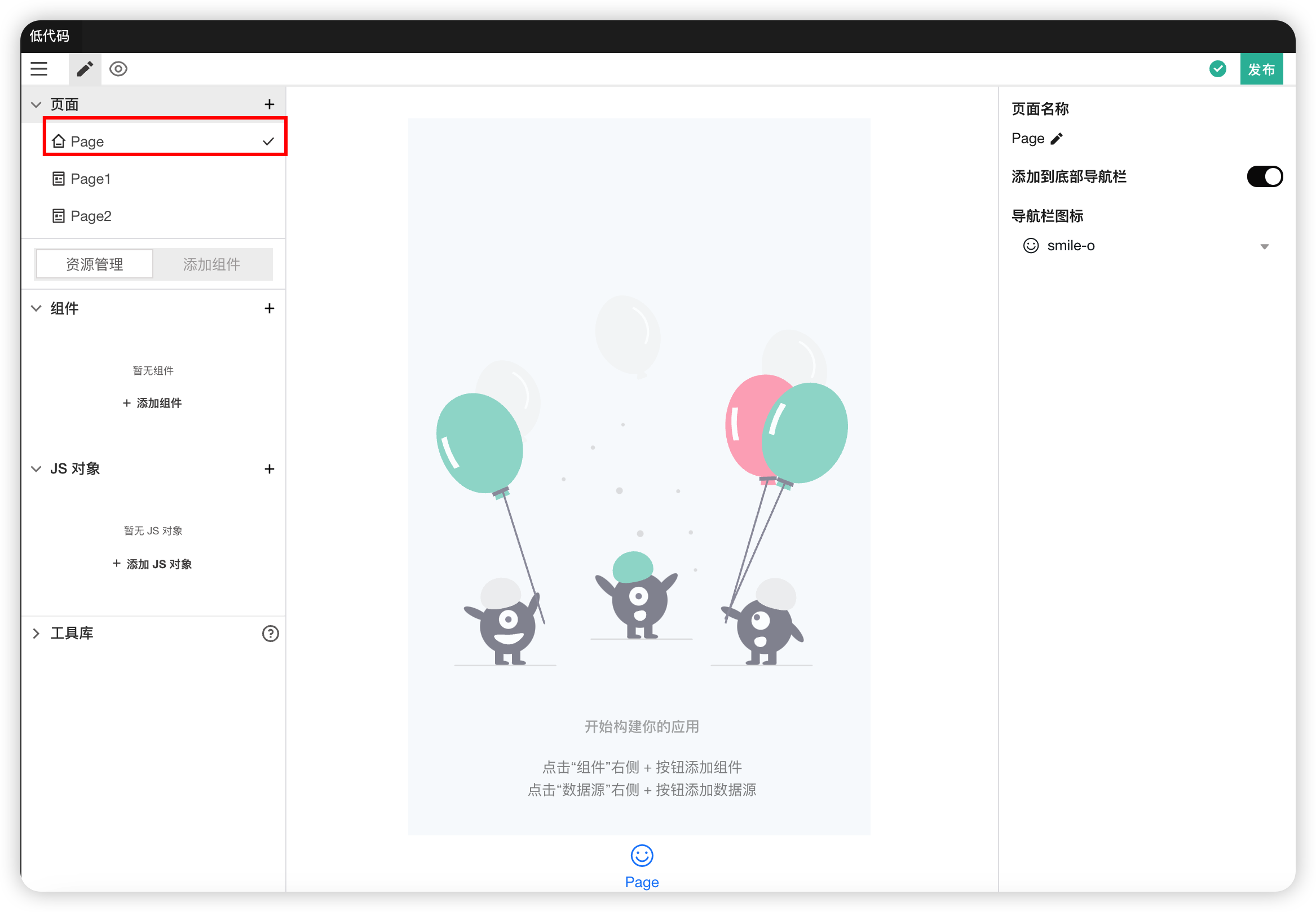
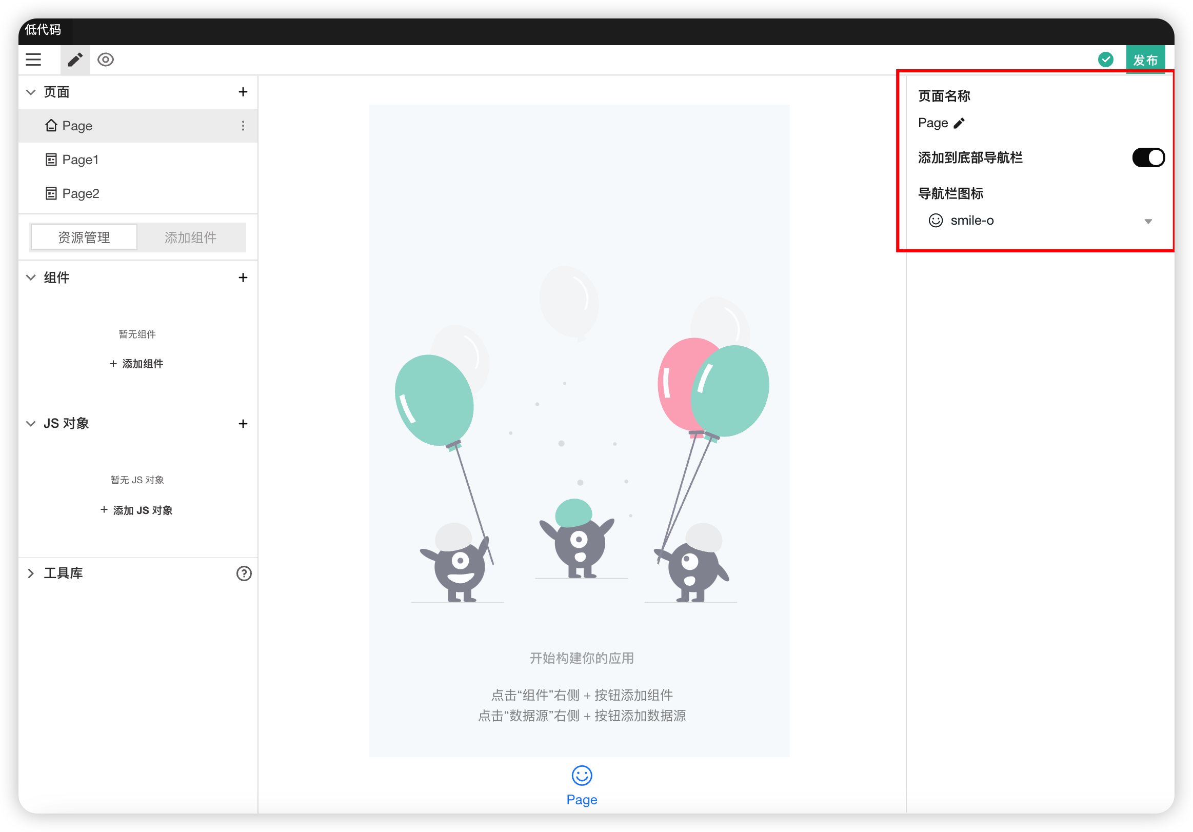
Properties
| Field | Description |
|---|---|
| Page Name | Used to modify the name of the current page |
| Add to Tab Bar | Used to control whether to display the page in the bottom navigation bar |
| Navigation Bar Icon | Used to set the icon corresponding to the bottom navigation bar. Only effective when "Add to Tab Bar" is selected |
# 2. HTML
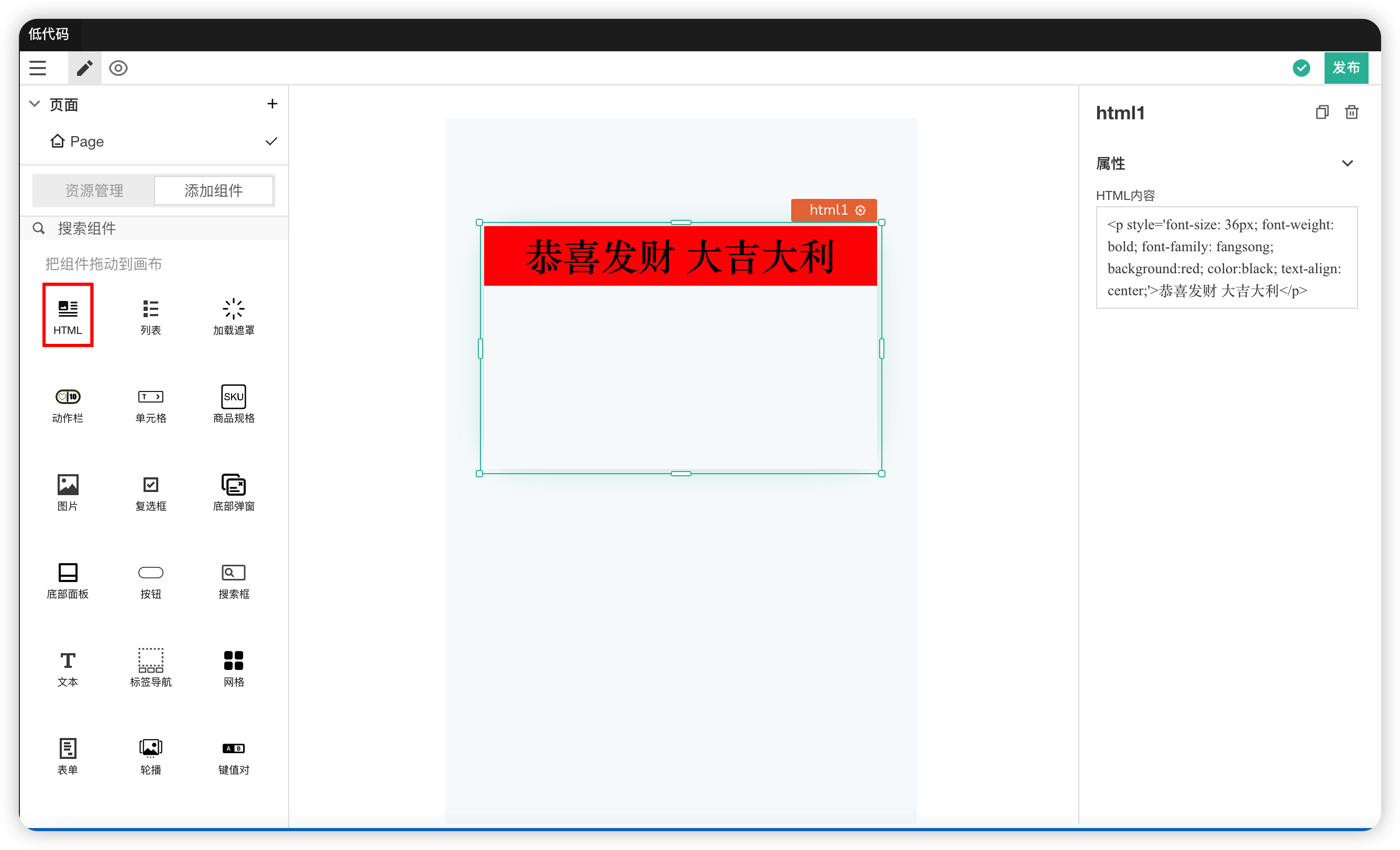
Properties
| Field | Description |
|---|---|
| HTML Content | Writing and modifying the HTML code content. The format must comply with HTML specifications |
# 3. List
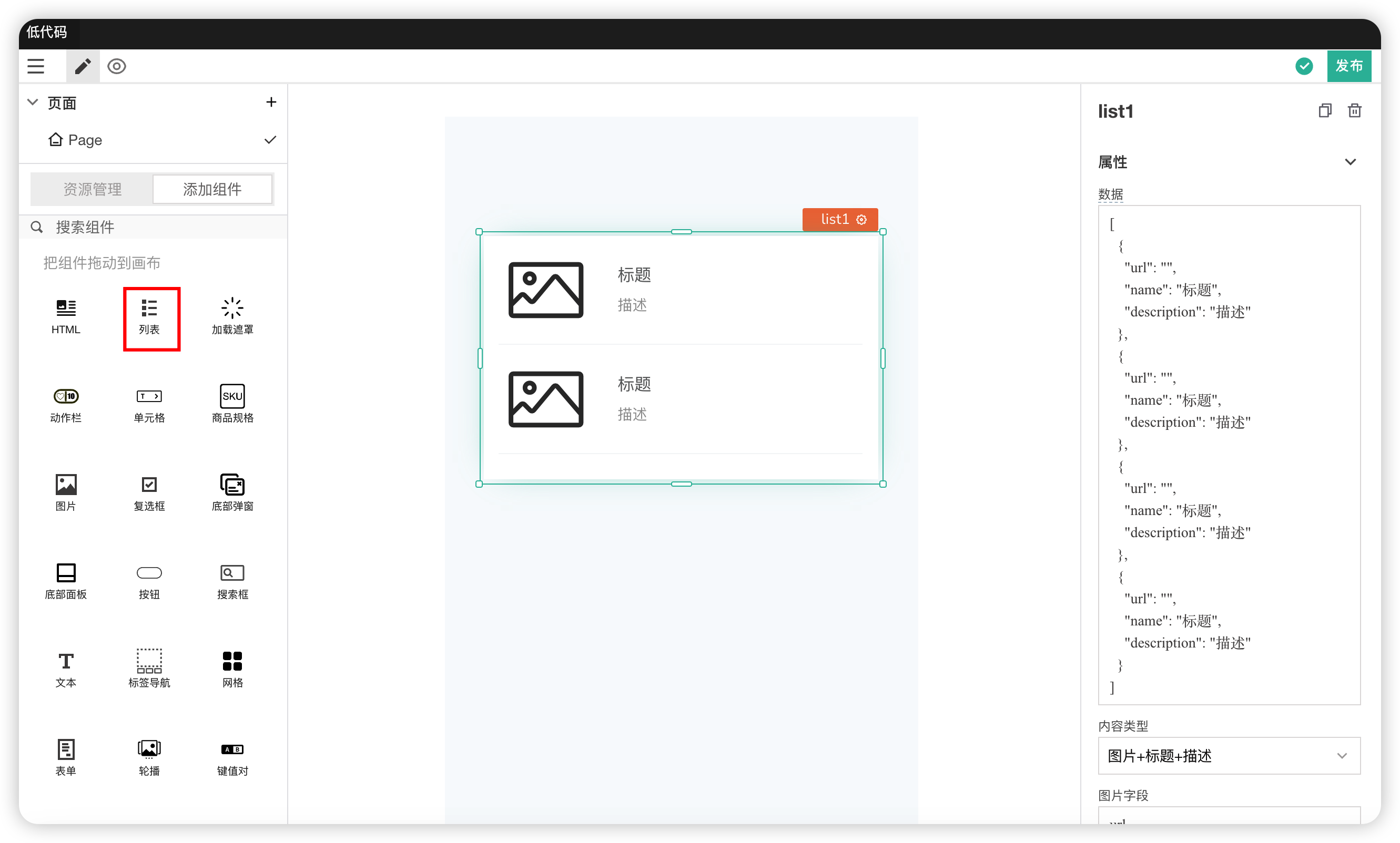
Properties
| Field | Description |
|---|---|
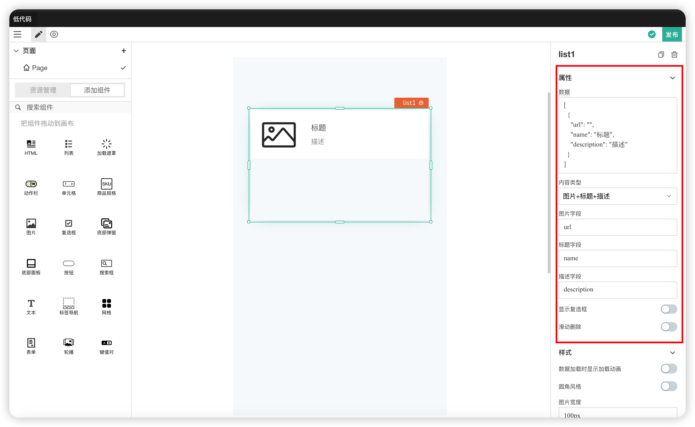
| Data | Gets an object used to generate a list |
| Content Type | Selects the content type displayed by the list, including price, controls, etc. |
| Image Field | The field name in the data object from which to get the image URL |
| Title Field | The field name in the data object from which to get the title text |
| Description Field | The field name in the data object from which to get the description text |
| Show Checkbox | Controls whether list items are displayed as checkboxes |
| Swipe to Delete | Swipe the list item left to reveal the delete function. The action performed when delete is clicked can be configured in the Actions module |
Styles
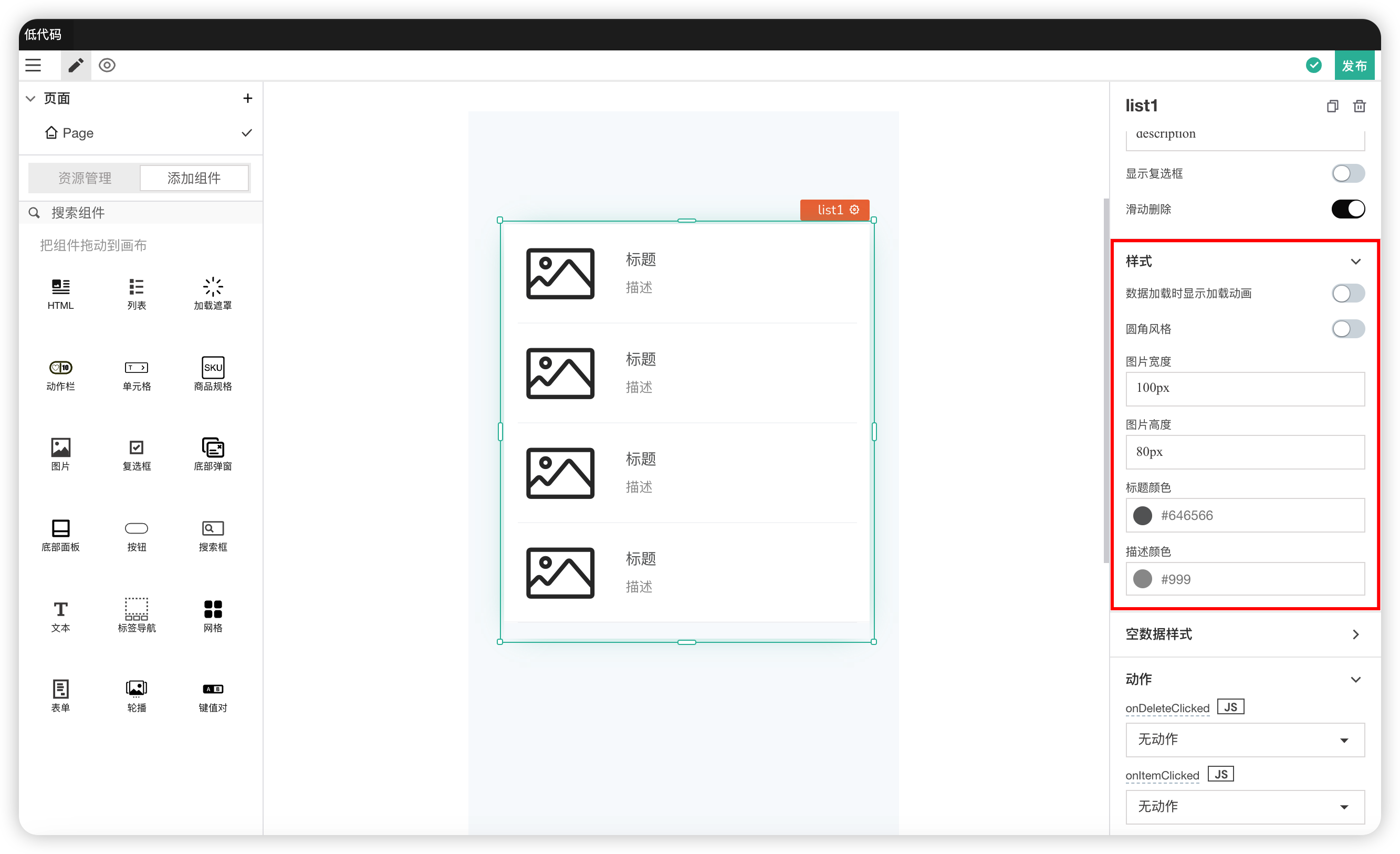
| Field | Description |
|---|---|
| Show Loading Animation on Data Load | Controls whether to show a loading animation while data is loading |
| Rounded Corner Style | Modifies the border style of the list |
| Image Width | Modifies the width of images in the list |
| Image Height | Modifies the height of images in the list |
| Title Color | Modifies the color of titles in the list |
| Description Color | Modifies the color of description text in the list |
Empty Data Format
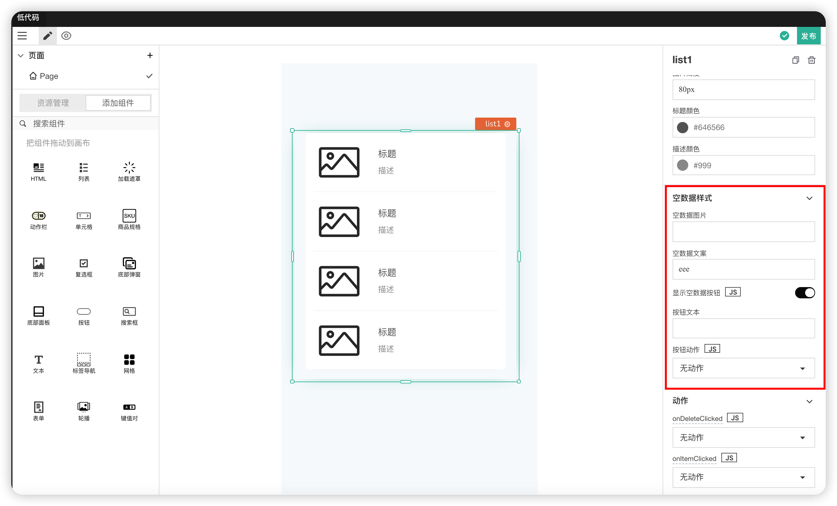
| Field | Description |
|---|---|
| Empty Data Image | The image displayed when the data is empty. |
| Empty Data Text | The text displayed when the data is empty. |
| Show Empty Data Button | Controls whether to show a button when the data is empty |
| Button Text | The text inside the button when the data is empty |
| Button Action | The action executed by the button when the data is empty |
Actions
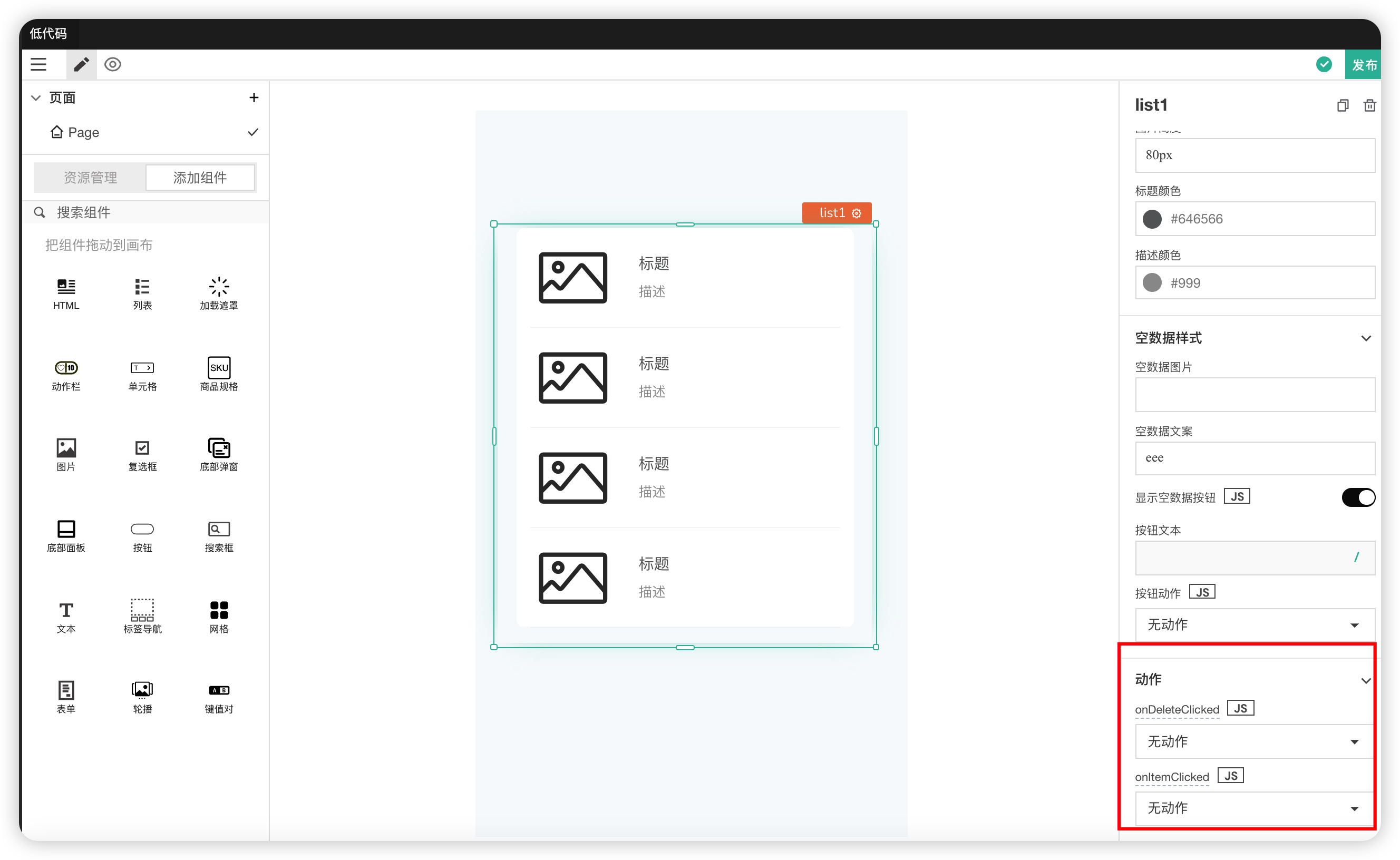
| Field | Description |
|---|---|
| onItemClicked | Action triggered when a list item is clicked |
| onDeleteClicked | Action triggered when the delete button is clicked after swiping an item left |
# 4. Loading Overlay
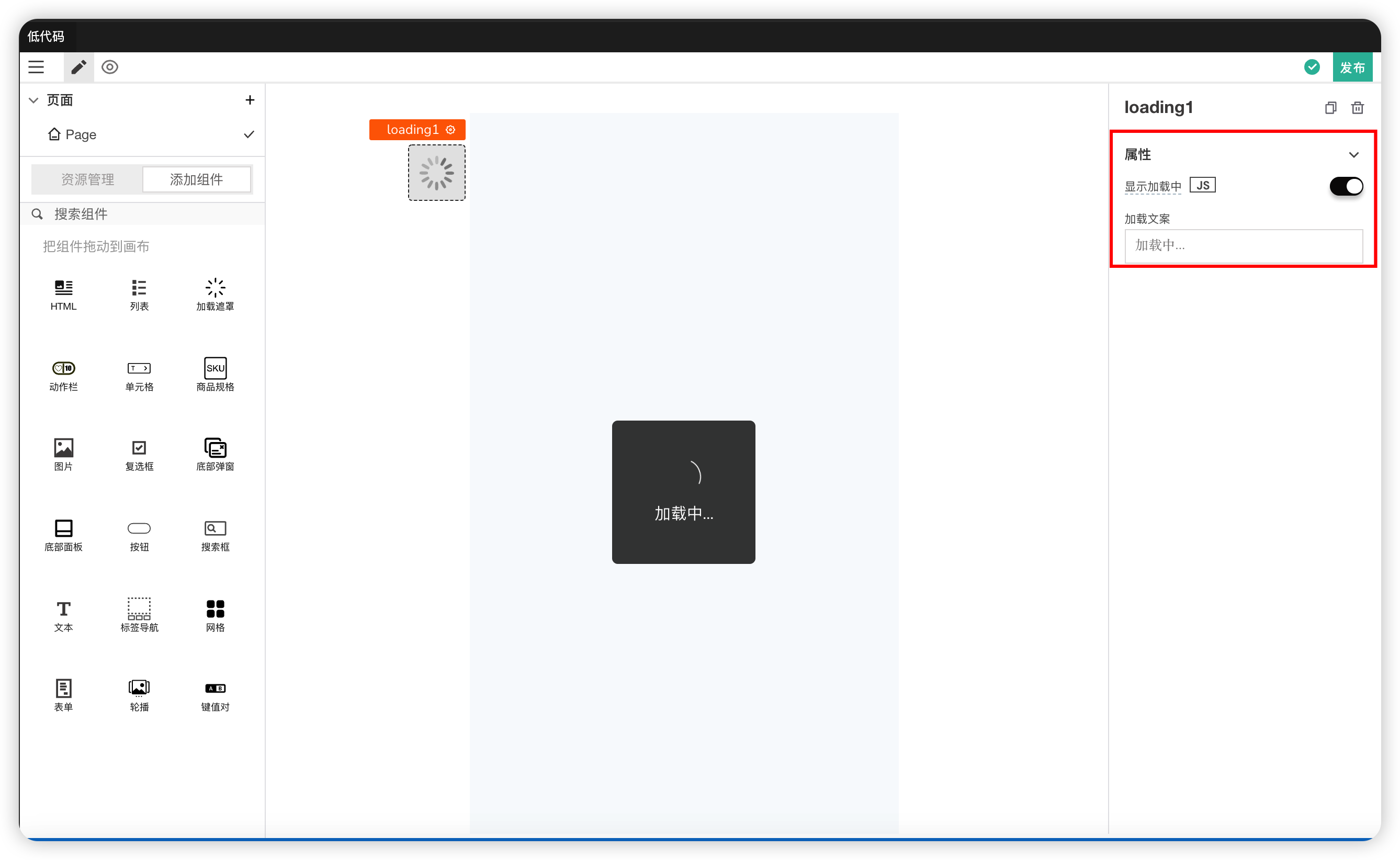
A loading icon used to indicate a transitional loading state.
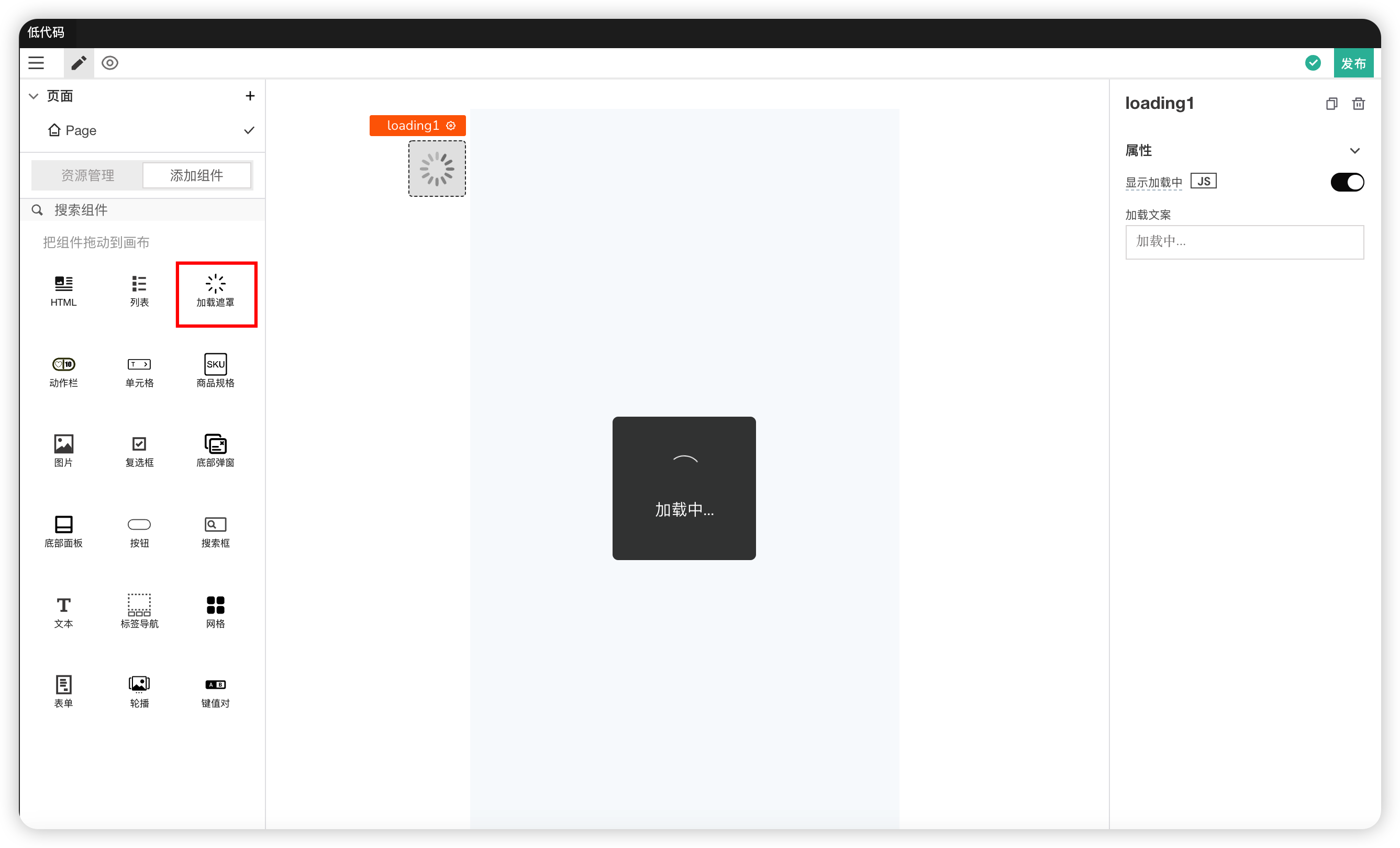
Properties
| Field | Description |
|---|---|
| Loading Text | Can modify the loading text. |
| Show Loading | Used to bind the running state of an action |
# 5. Action Bar
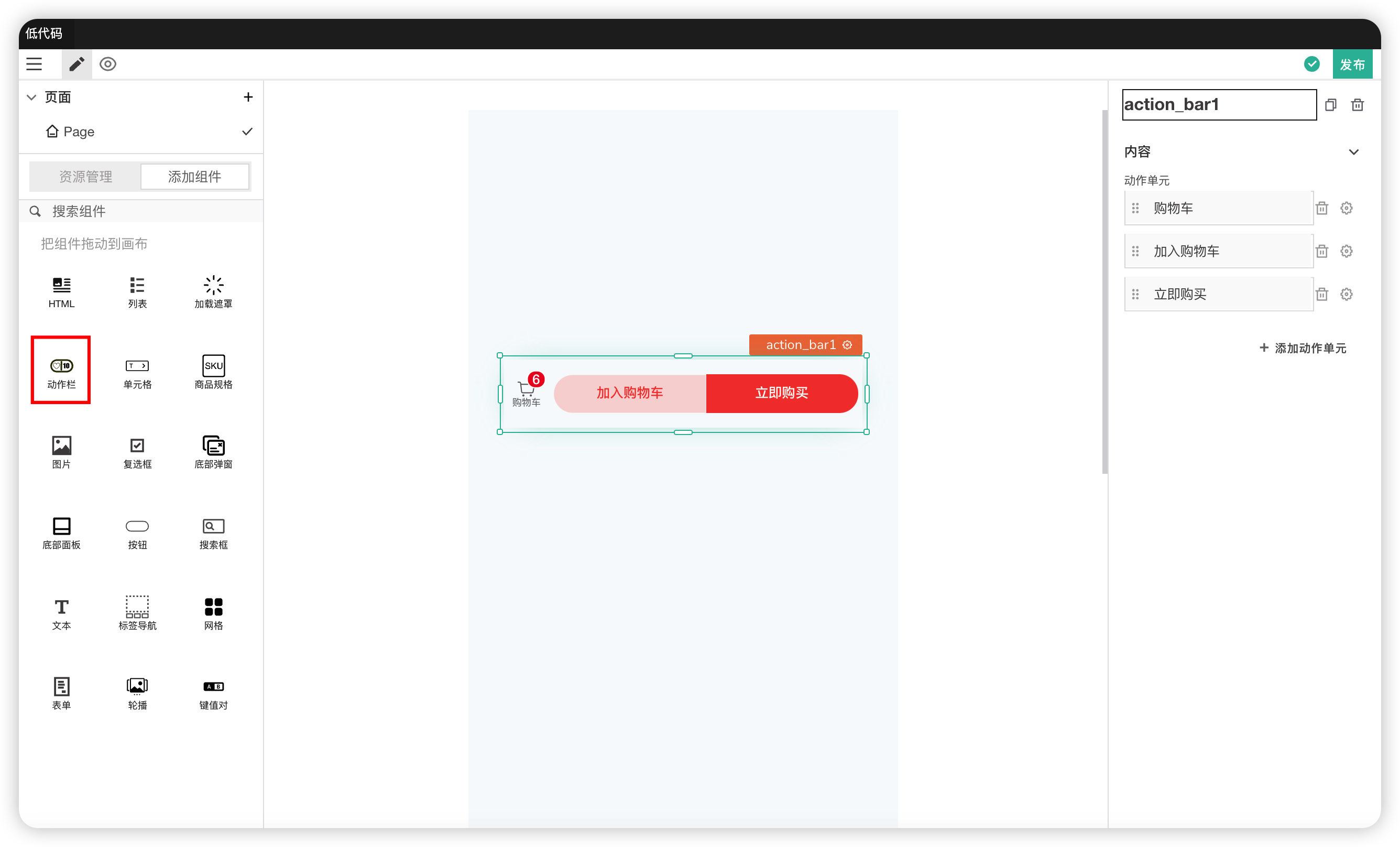
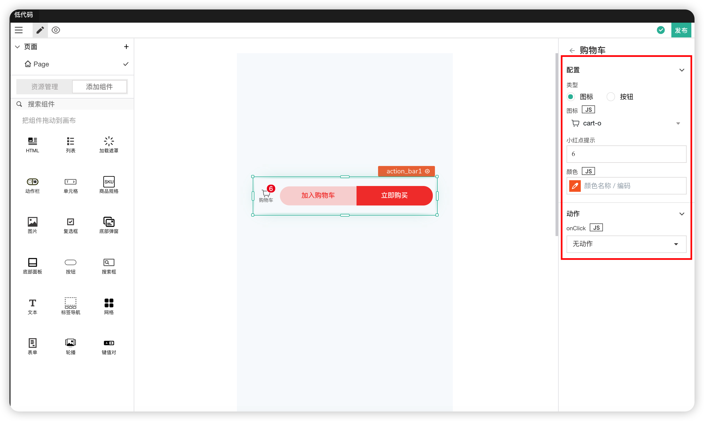
Content
| Field | Description |
|---|---|
| Action Unit | Can add or delete action units. Click Configure to configure them |
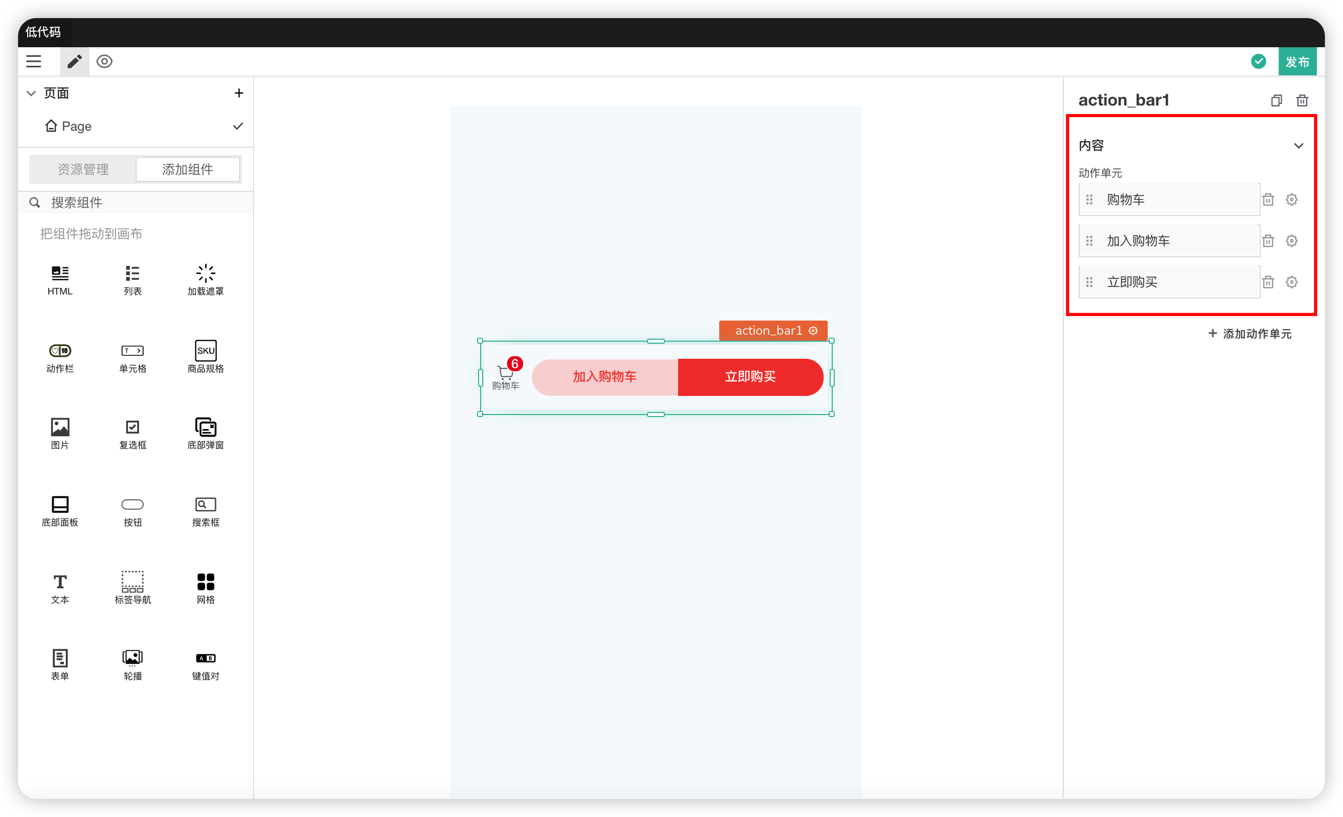
Action Unit Configuration
| Field | Description |
|---|---|
| Type | Modifies the display type of the action unit, which can be a button or an icon |
| Icon | If the action unit is an icon, this icon is displayed. Used to modify the icon |
| Badge Hint | Whether there is a small red dot hint in the upper right corner |
| Color | The color of the icon |
| Action | The action triggered when the action unit is clicked |
# 6. Cell
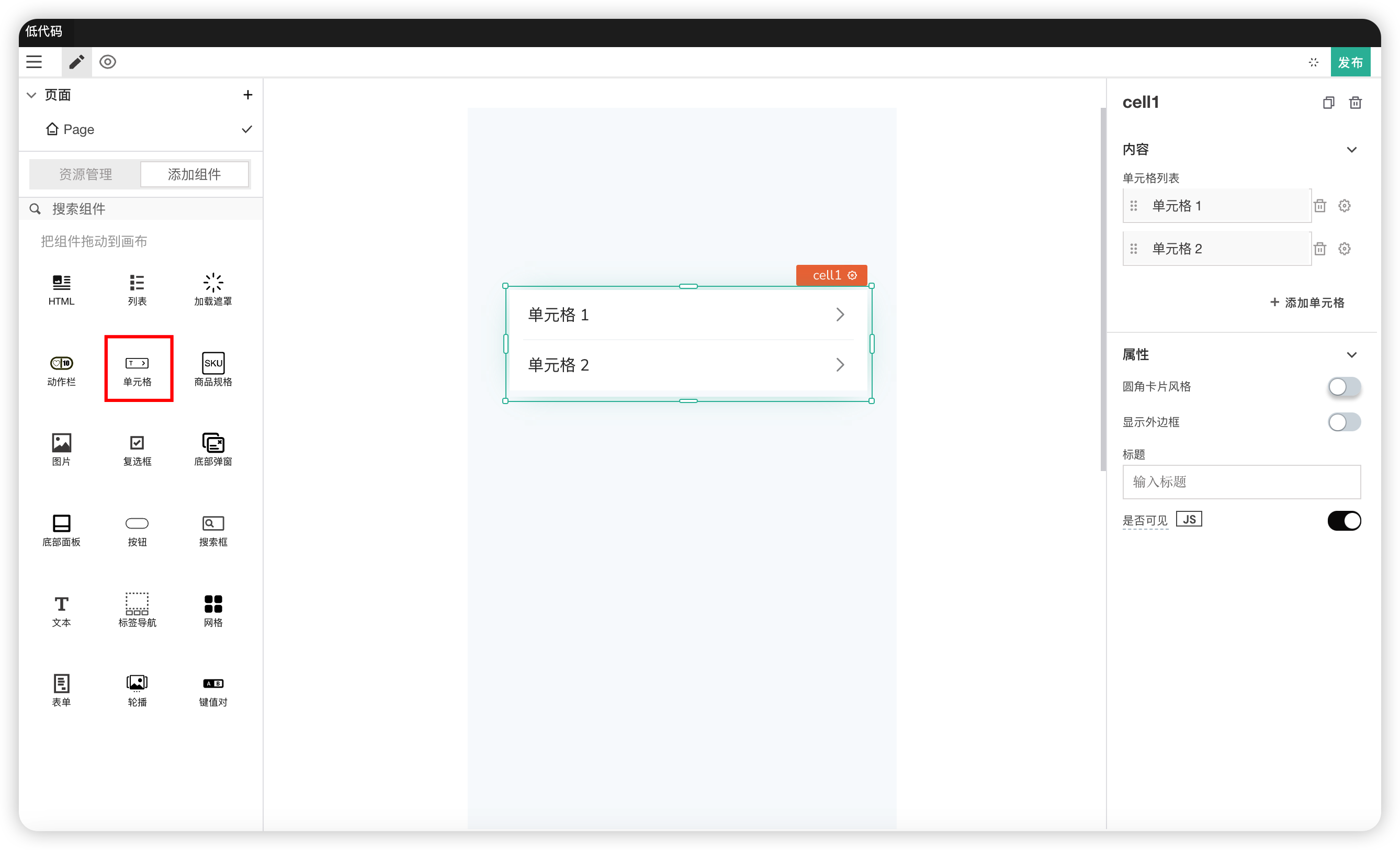
Content
| Field | Description |
|---|---|
| Cell List | Adds entries to the cell list and configures cells. Cell configuration can be done by clicking the settings icon on the right |
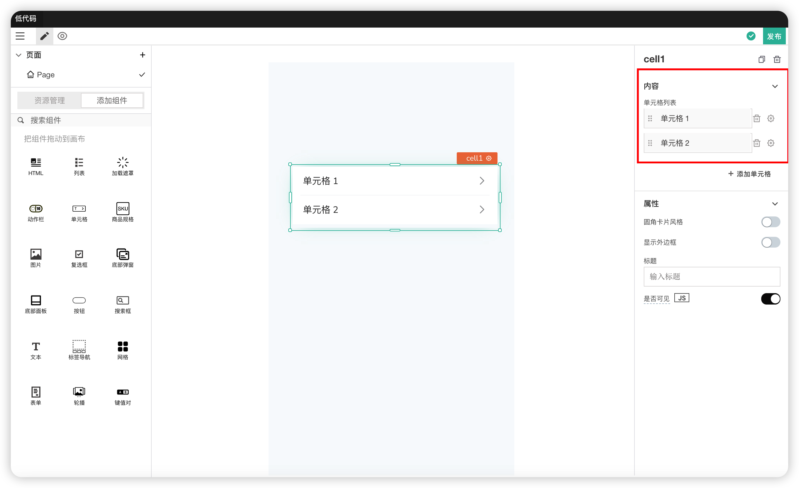
Properties
| Field | Description |
|---|---|
| Rounded Card Style | Modifies the border style of the cell |
| Show Outer Border | Controls whether to show the outer border style |
| Title | Modifies the text inside the title. If there is text, the title is displayed; if there is no content, the title is not displayed |
| Visible | Controls the visibility of the component on the page. When off: The component will be invisible when the application is published. In edit mode, it appears translucent |
# 7. Product Specifications
Used to display product information, including price, stock, product display, etc. Also allows actions like adding to cart and buying now.
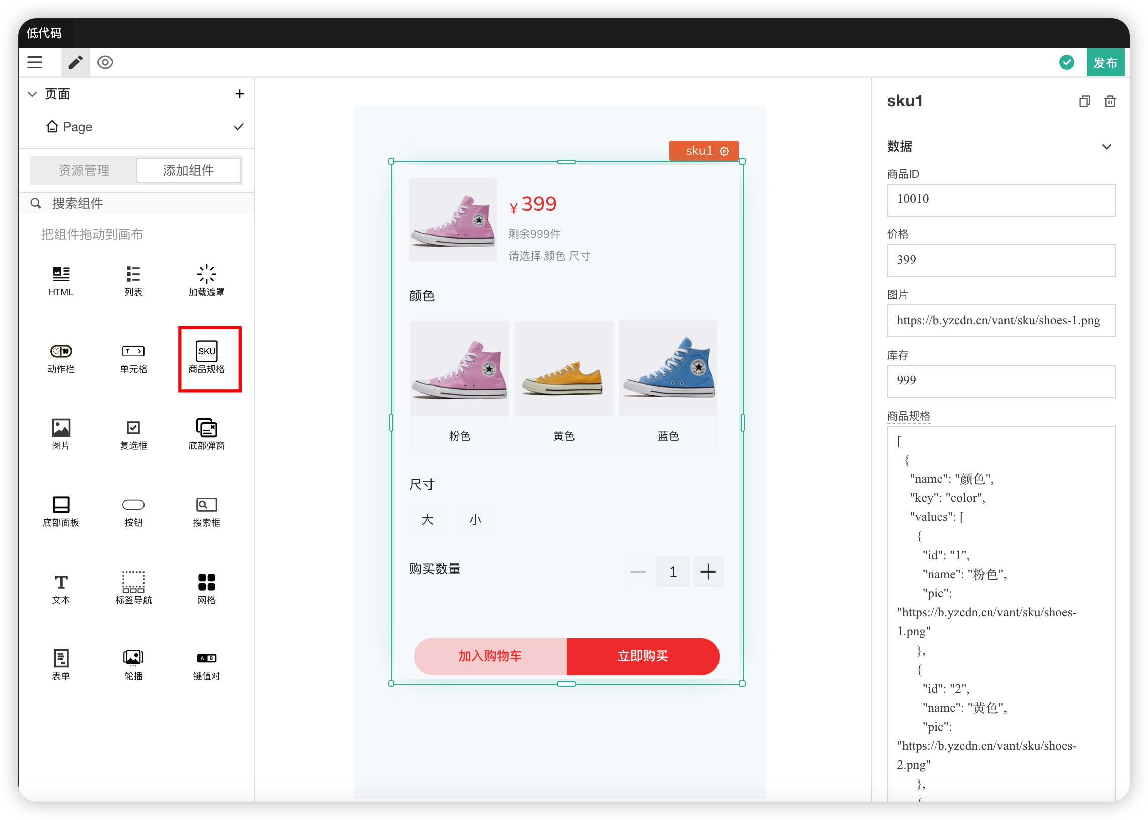
Data
| Field | Description |
|---|---|
| Product ID | The ID of the product |
| Price | Displays the price of the default product |
| Image | Displays the image of the default product |
| Stock | Displays the stock of the default product |
| Product Specifications | The specifications of the product. The data format is an array. Each specification must contain the fields: name, key, values (optional values) |
| Product Stock | The stock of the product. The data format is an array, corresponding to each product in the product specifications. Must contain the fields: id, price, stock, category (specification value) |

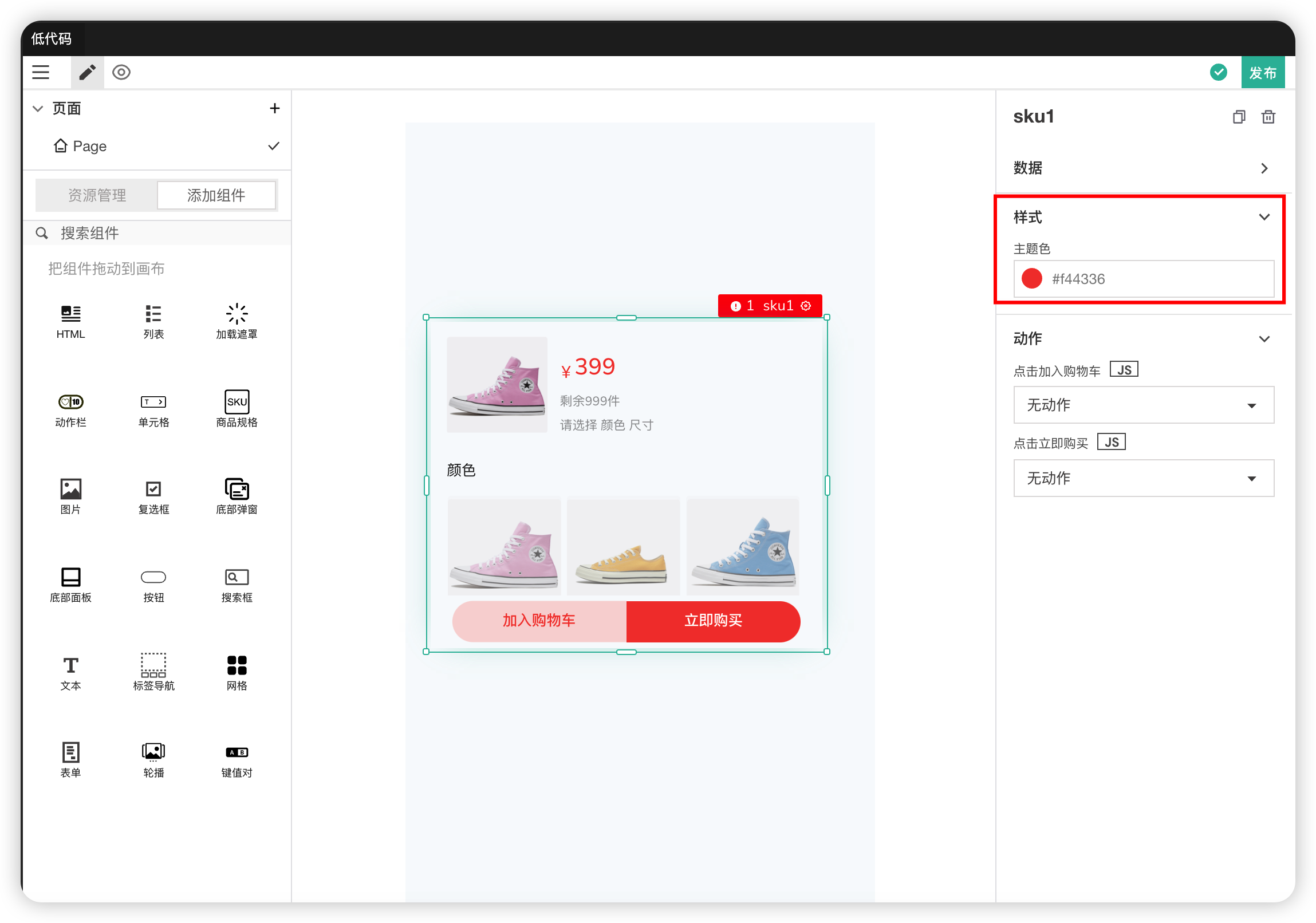
Styles
| Field | Description |
|---|---|
| Theme Color | Modifies the theme color |
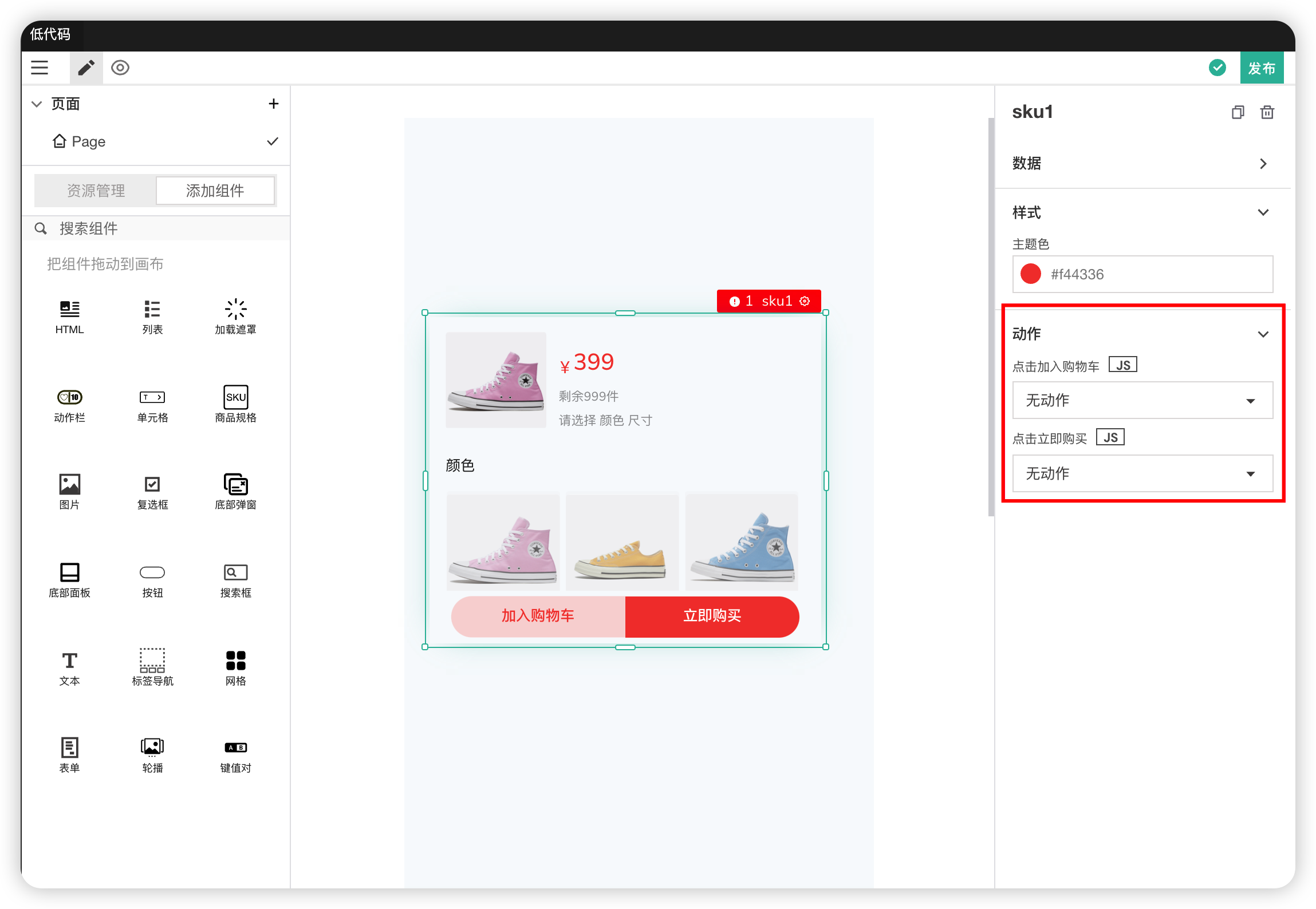
Actions
| Field | Description |
|---|---|
| onClick Add to Cart | Action triggered when the "Add to Cart" button is clicked |
| onClick Buy Now | Action triggered when the "Buy Now" button is clicked |
# 8. Image
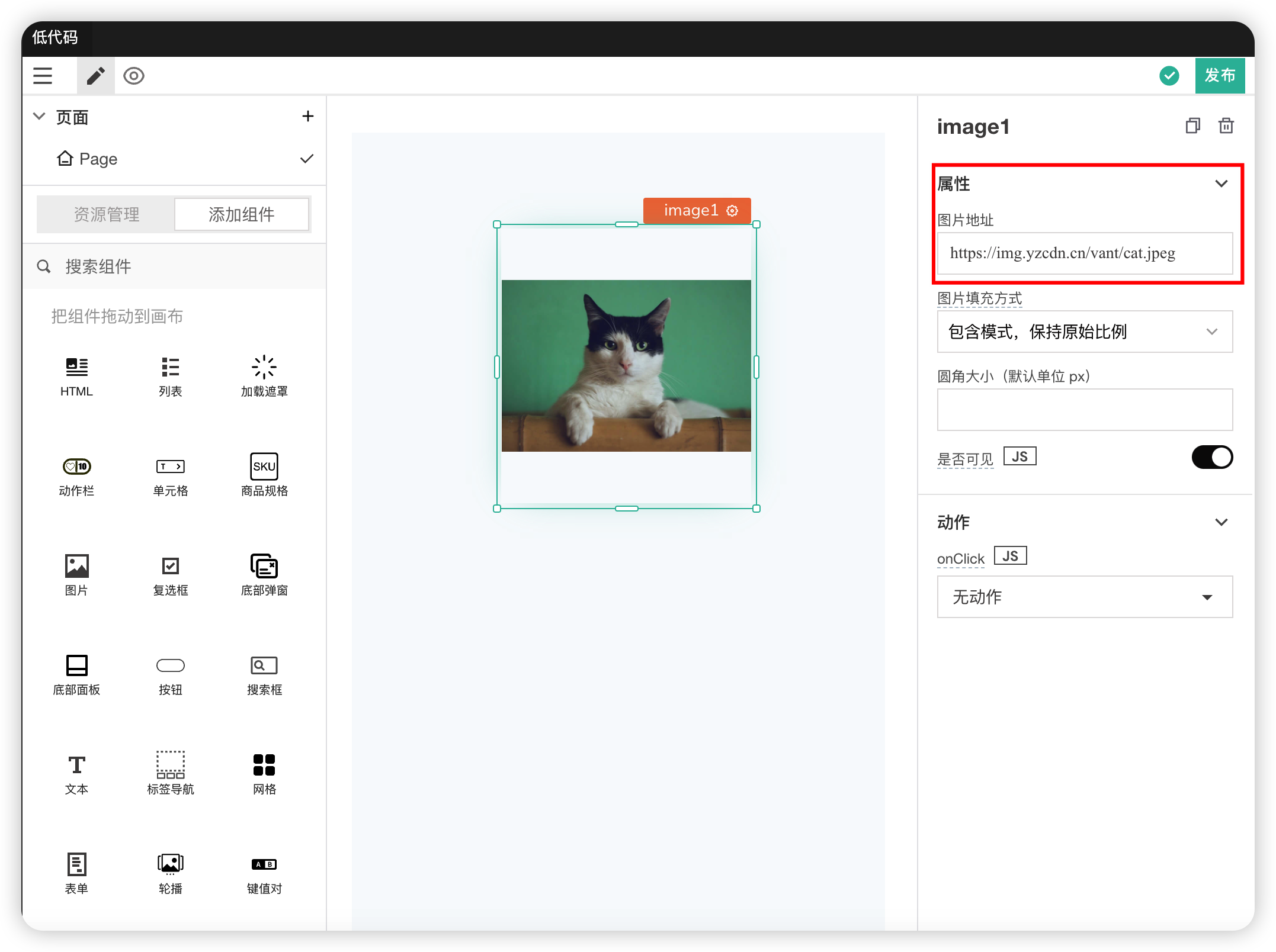
The Image component can display images in the application. The image format must be a URL or valid base64.
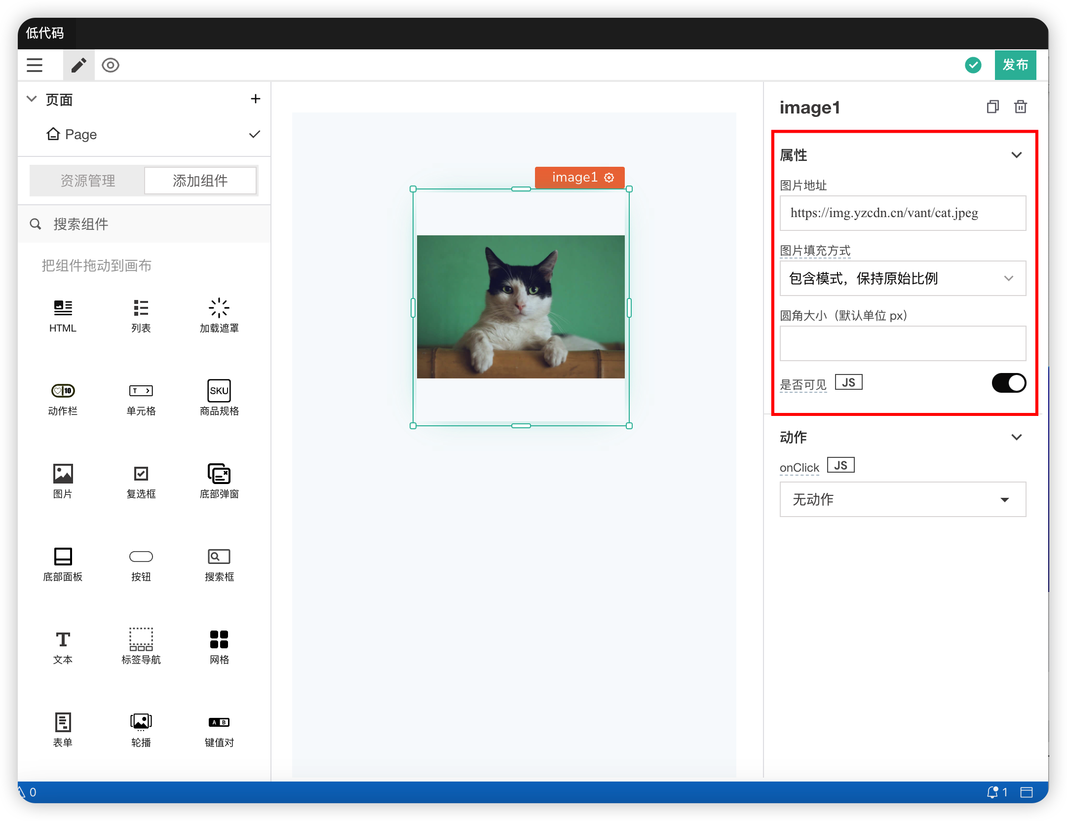
Properties
| Field | Description |
|---|---|
| Image URL | Sets the source of the image. Supports image URLs, data URIs, or base64 encoded image data |
| Image Fill Mode | Sets how the image fills the parent container. Supports "contain", "cover", and "auto". For other modes, refer to the CSS object-fit documentation |
| Visible | Controls the visibility of the component on the page. When off: The component will be invisible when the application is published. In edit mode, it appears translucent |
| Border Radius | Modifies the border radius of the image component |
Actions
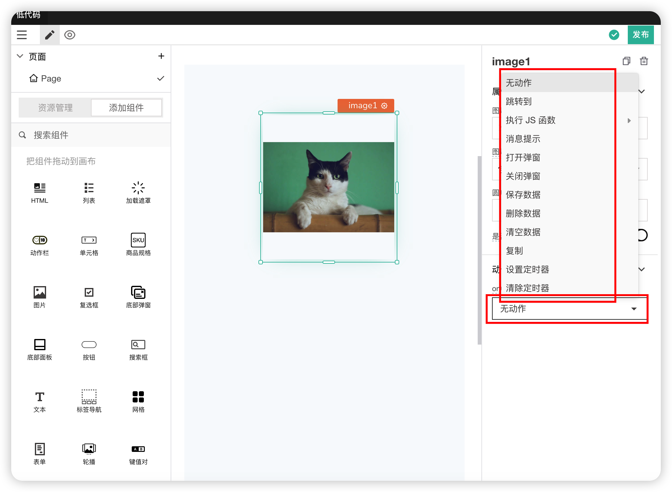
| Field | Description |
|---|---|
| onClick | Action triggered when the image component is clicked |
Example Description
Almost all major image formats are supported, including:
- JPG
- PNG
- SVG
- WebP
- GIF
You can enter the following addresses into the Image component to test:
//png:
 https://assets.appsmith.com/widgets/default.png

//jpg:
https://jpeg.org/images/jpegsystems-home.jpg

//gif:
https://mir-s3-cdn-cf.behance.net/project_modules/max_1200/5eeea355389655.59822ff824b72.gif

//webp:
https://www.gstatic.com/webp/gallery/4.sm.webp

//svg:
https://assets.codepen.io/3/kiwi.svg
Inline SVG Description
Inline SVG refers to SVG markup contained within the webpage markup. To display inline SVG, you can try the following steps:
- Drag and drop the Image widget onto the canvas
- Now, in the Image section, paste the URL mentioned below along with your SVG code:
data:image/svg+xml;charset=UTF-8,{{encodeURI('<svg..<your-svg>.. ></svg>')}}
You can even use an encoded URL like this:
example 1:
data:image/svg+xml,%3Csvg xmlns='http://www.w3.org/2000/svg'%3E%3Ccircle r='50' cx='50' cy='50' fill='tomato'/%3E%3Ccircle r='41' cx='47' cy='50' fill='orange'/%3E%3Ccircle r='33' cx='48' cy='53' fill='gold'/%3E%3Ccircle r='25' cx='49' cy='51' fill='yellowgreen'/%3E%3Ccircle r='17' cx='52' cy='50' fill='lightseagreen'/%3E%3Ccircle r='9' cx='55' cy='48' fill='teal'/%3E%3C/svg%3E

example 2:
data:image/svg+xml,%3Csvg xmlns='http://www.w3.org/2000/svg' width='100' height='100'%3E%3Ccircle cx='50' cy='50' r='40' stroke='green' stroke-width='4' fill='yellow' /%3E%3C/svg%3E
# 9. Checkbox
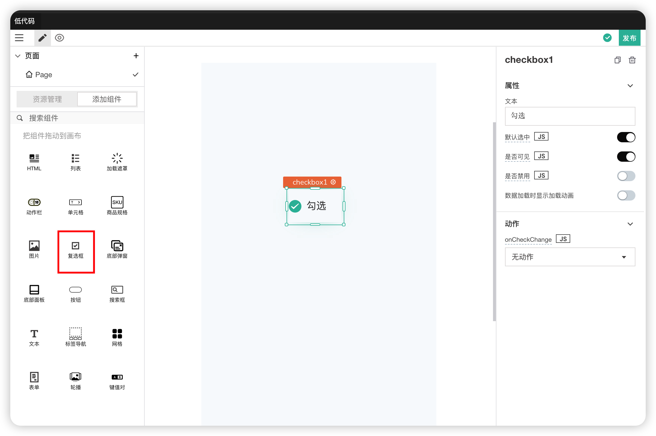
Properties
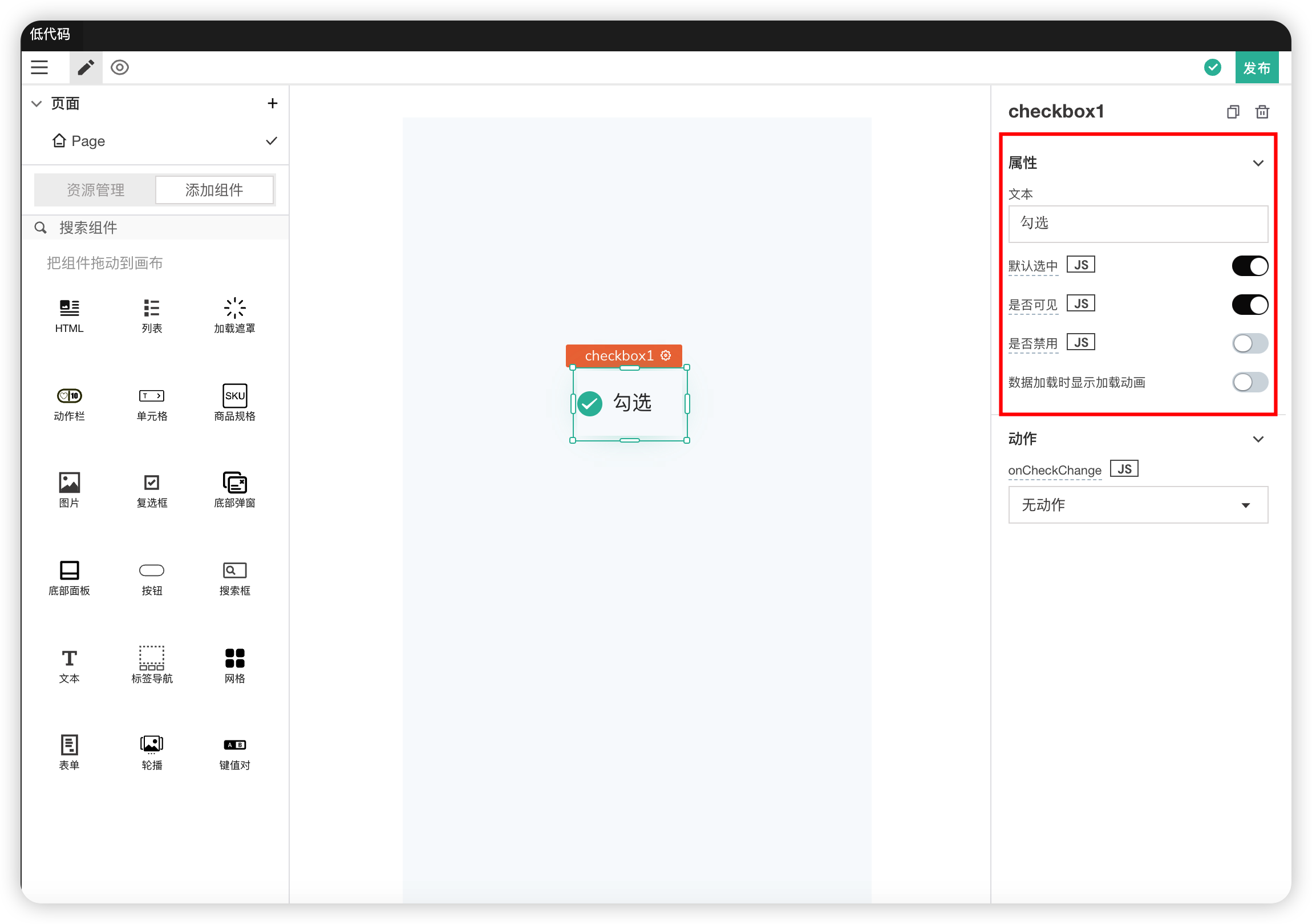
| Field | Description |
|---|---|
| Text | The text content corresponding to the checkbox |
| Checked by Default | Modifies the default checked state |
| Visible | Controls the visibility of the component on the page. When off: The component will be invisible when the application is published. In edit mode, it appears translucent |
| Disabled | Makes the component unclickable or unusable. The component remains visible to the user but does not allow user interaction. |
| Show Loading Animation on Data Load | Controls whether to show a loading animation while data is loading |
Actions
| Field | Description |
|---|---|
| onCheckChange | Action triggered when the checked state of the checkbox changes |
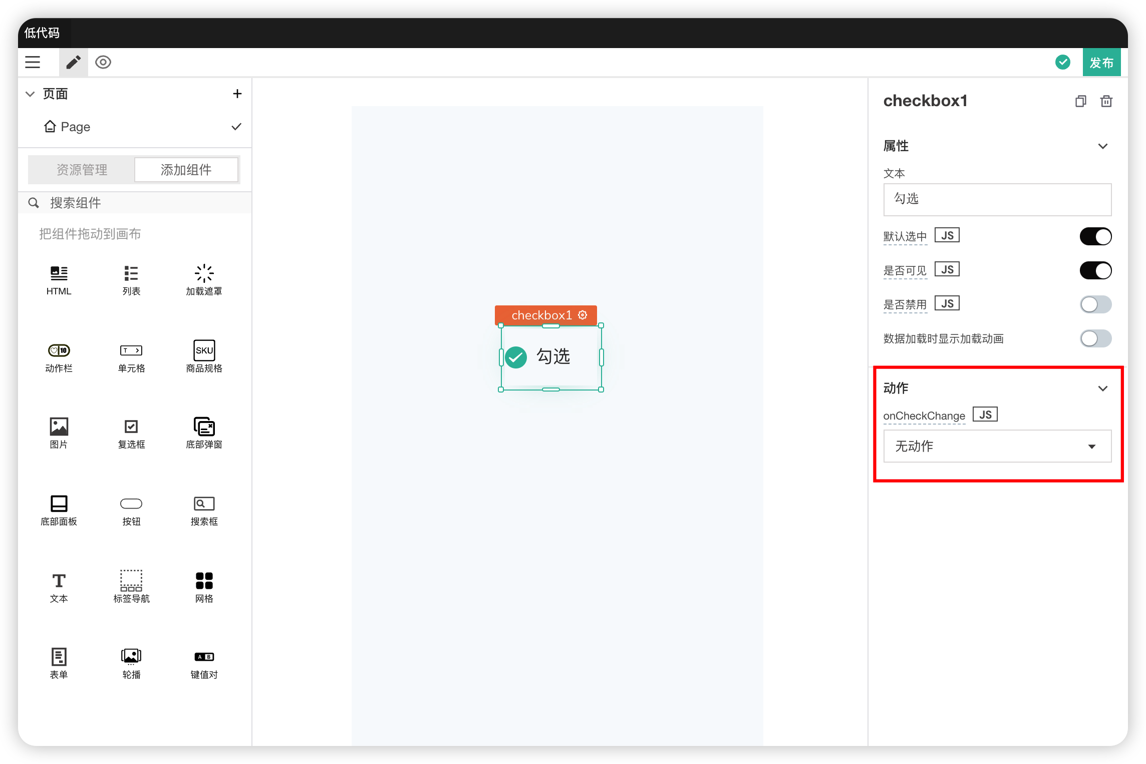
Supports JS Interaction
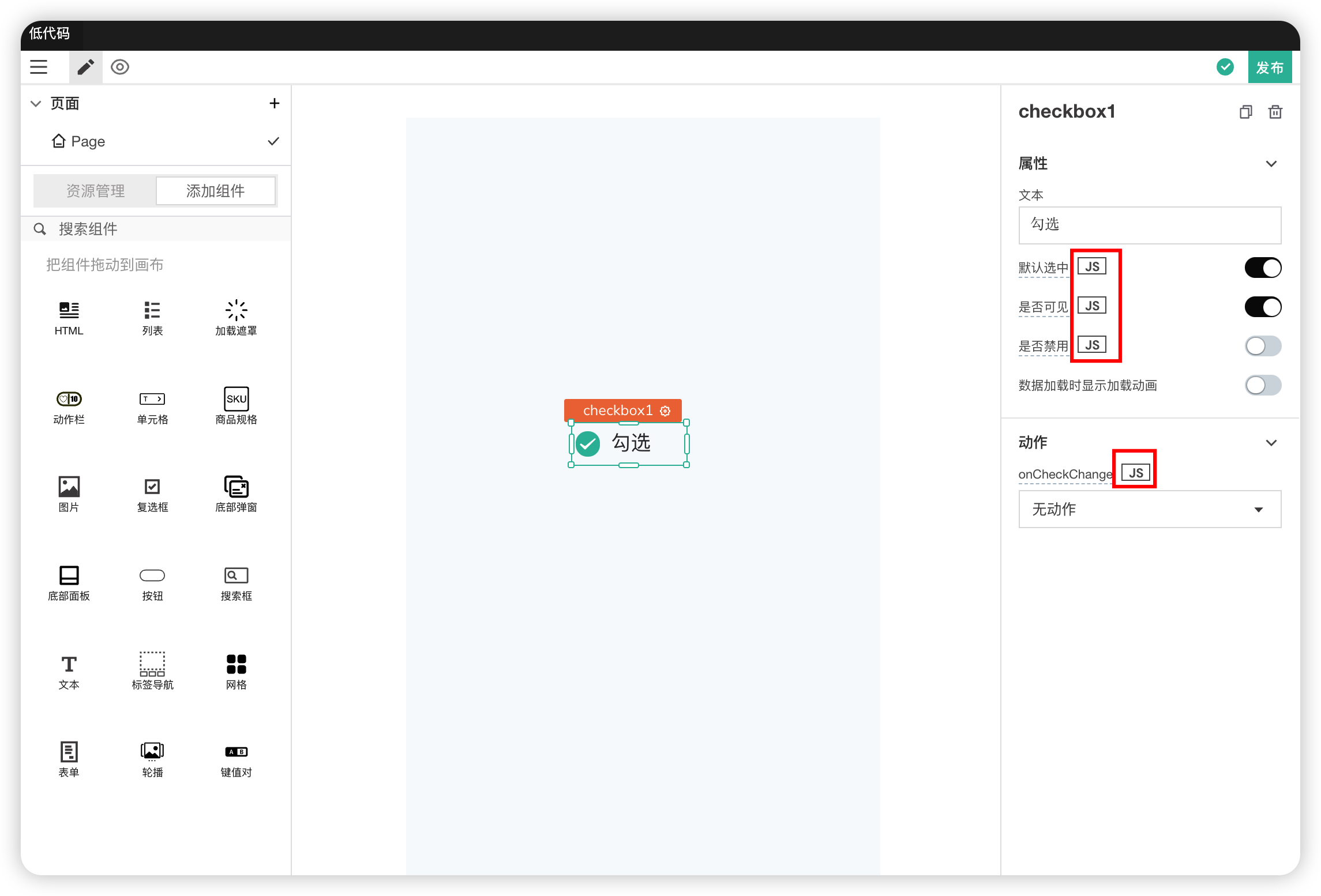
# 10. Bottom Dialog
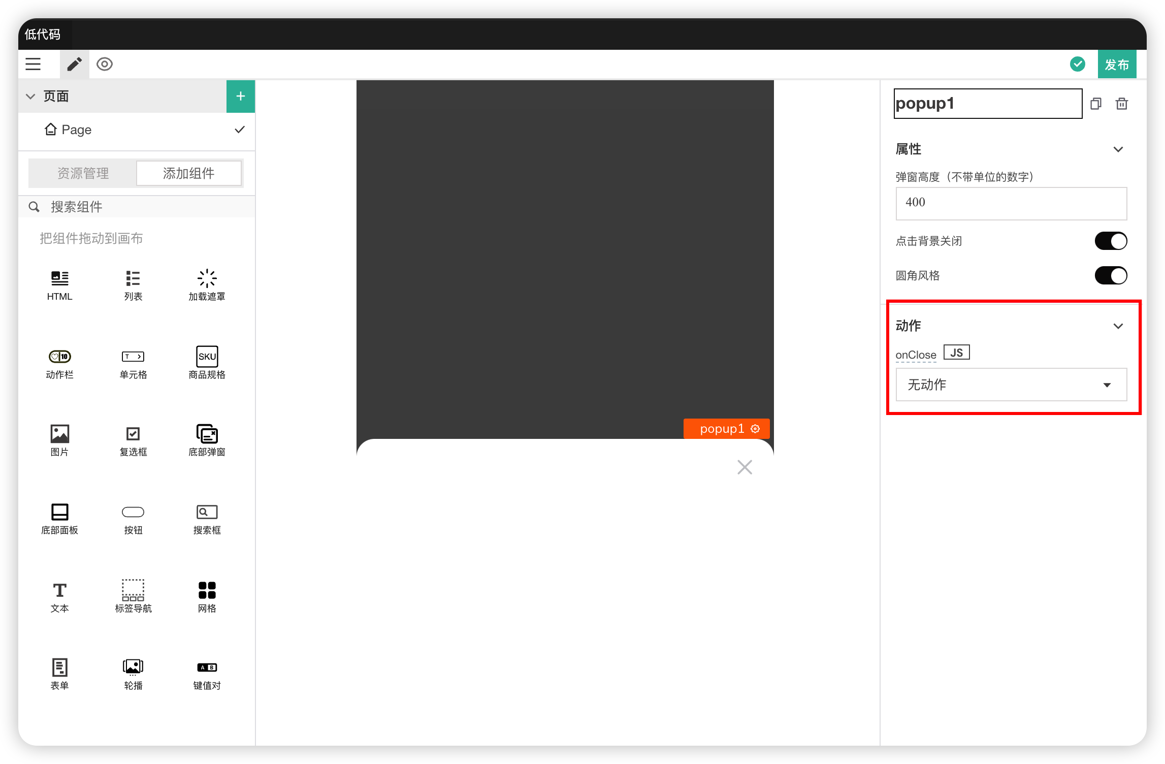
A popup layer that slides up from the bottom of the page.
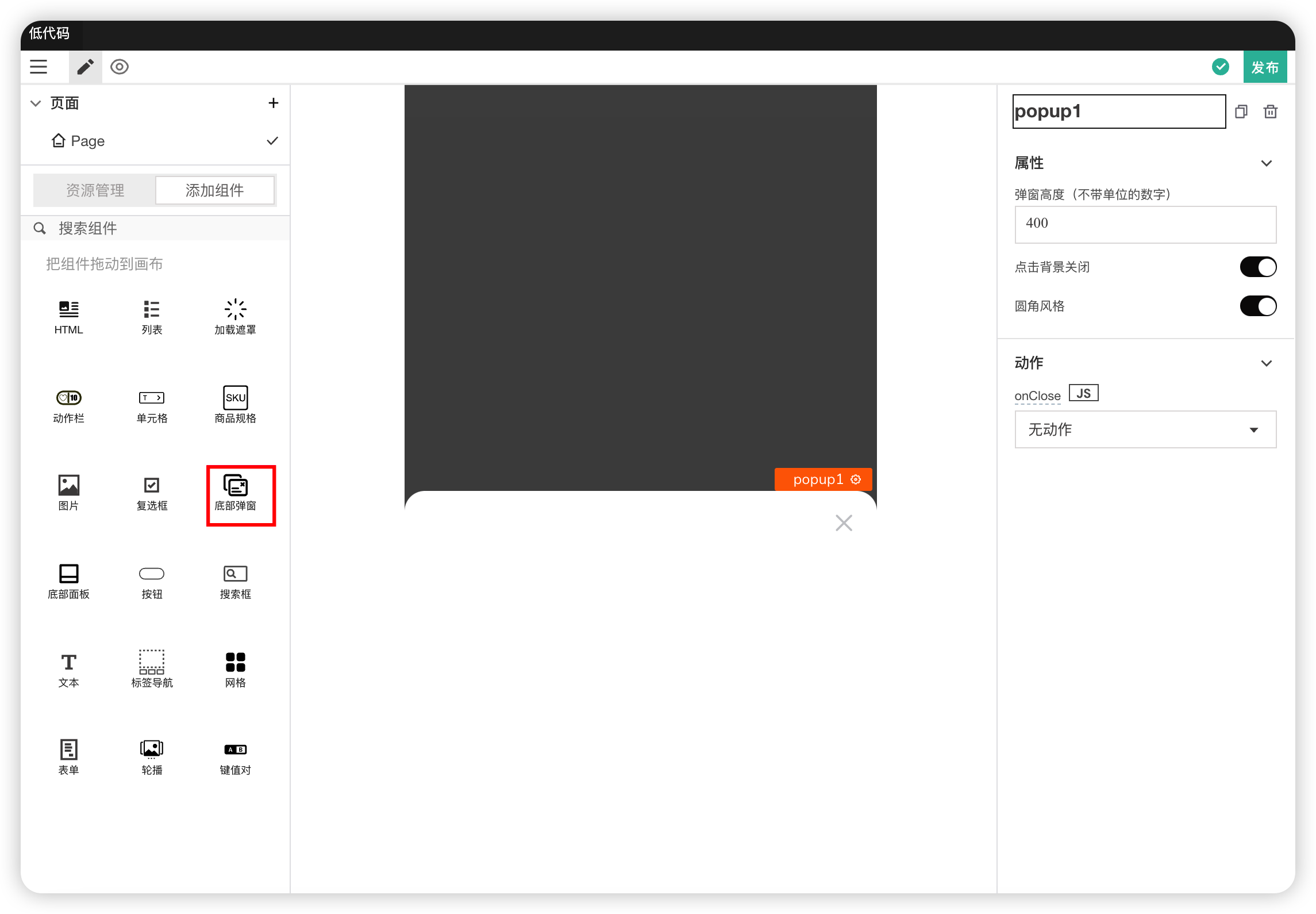
Properties
| Field | Description |
|---|---|
| Dialog Height | Modifies the height of the dialog. Only enter numbers without units |
| Close on Background Click | |
| Rounded Corner Style | Modifies the border radius style of the dialog |
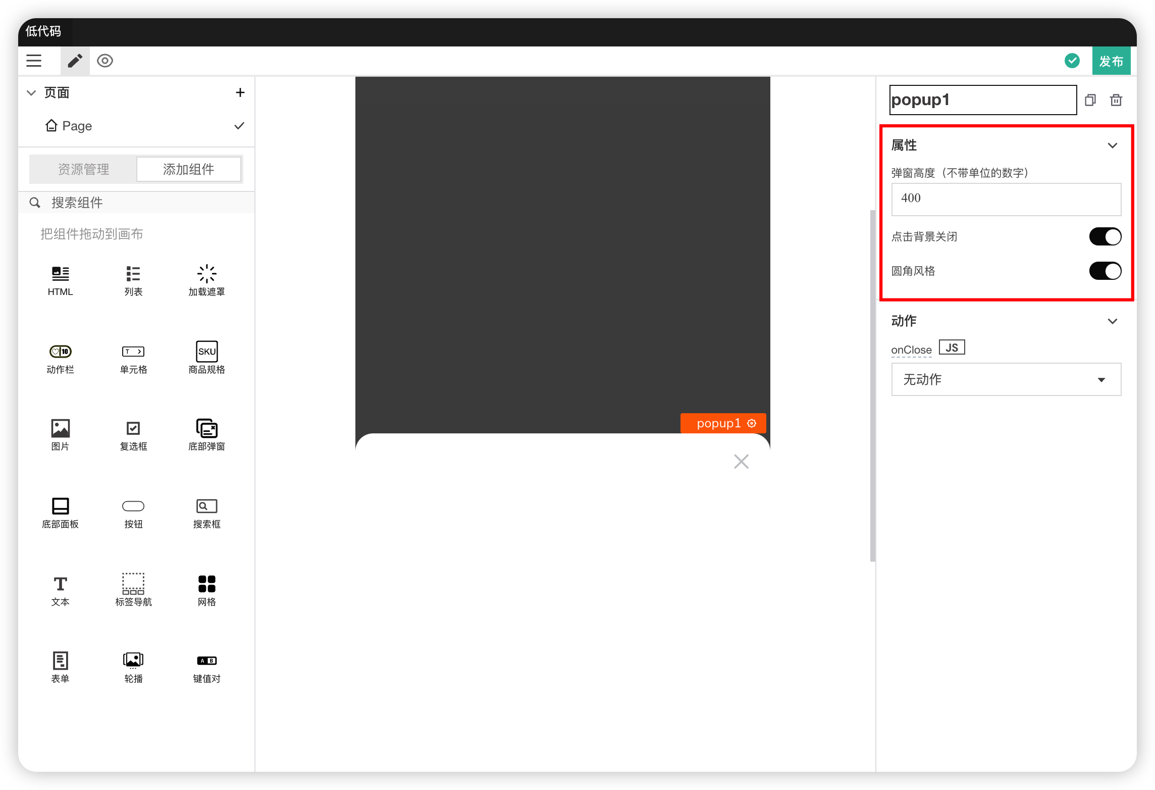
Actions
| Field | Description |
|---|---|
| onClose | Action triggered when the dialog is closed by clicking the close button or background |
# 11. Bottom Panel
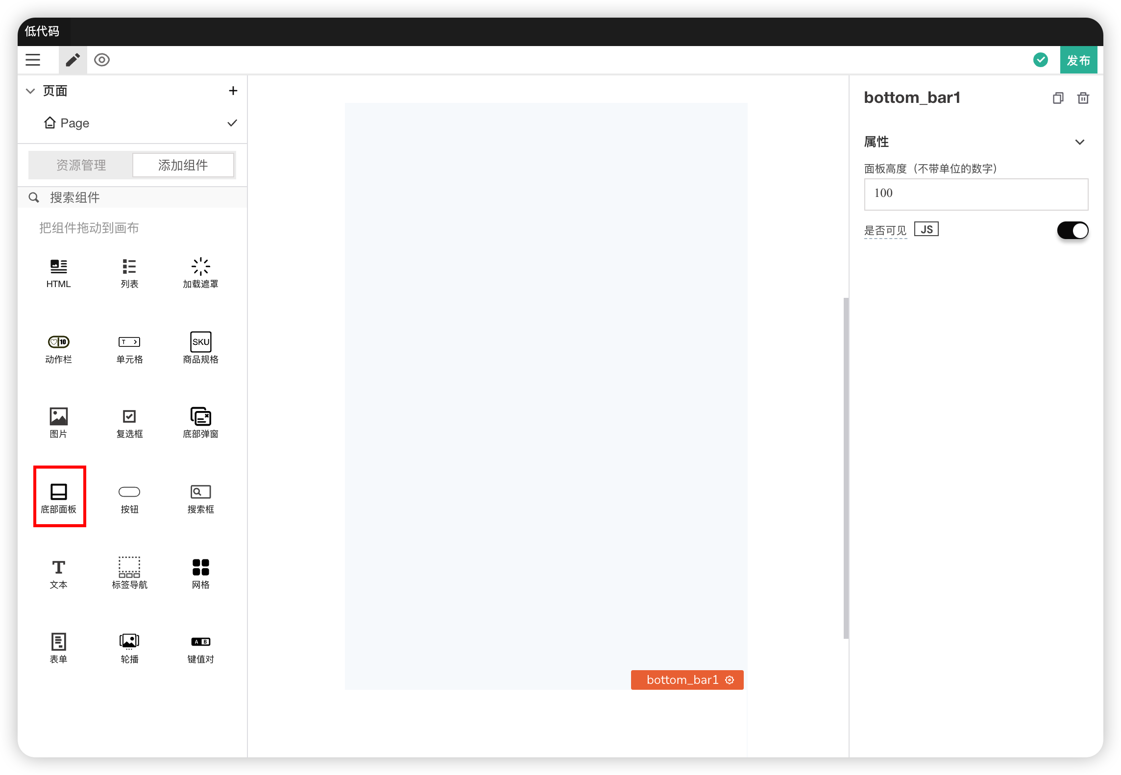
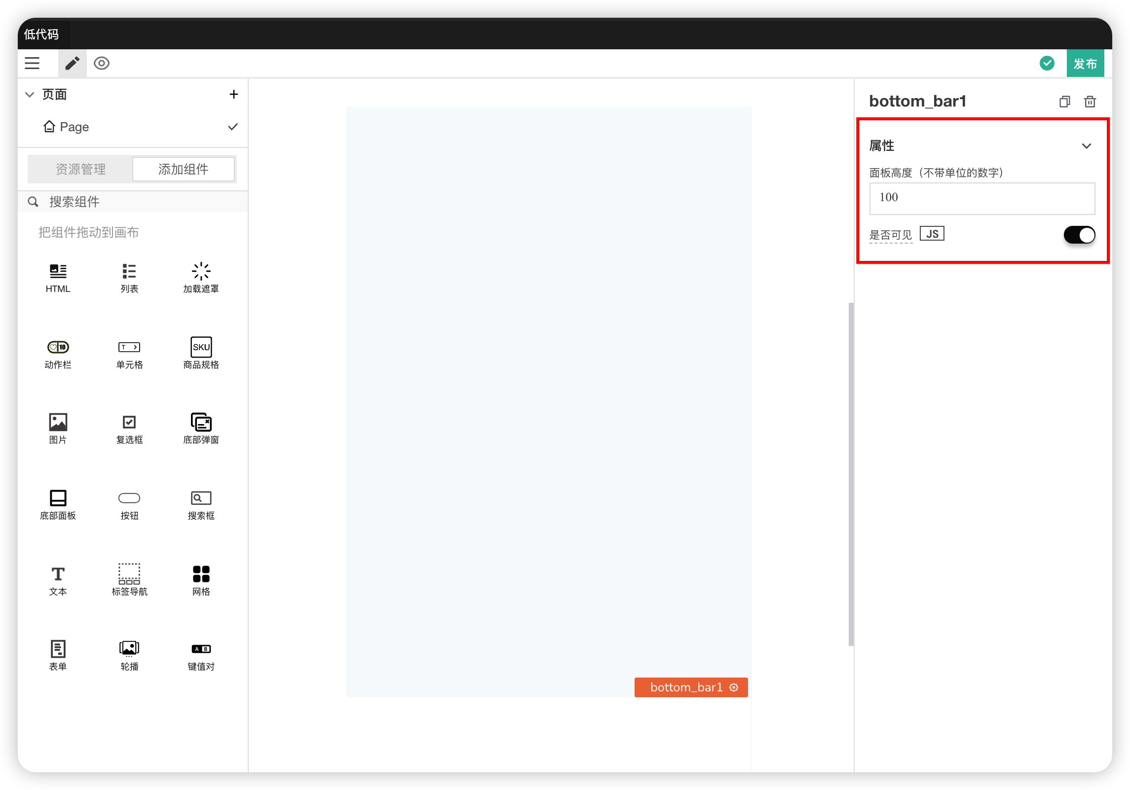
A panel fixed at the bottom of the page that does not scroll with the page.
Properties
| Field | Description |
|---|---|
| Panel Height | Modifies the height of the panel. Only enter numbers without units |
| Visible | Controls the visibility of the component on the page. When off: The component will be invisible when the application is published. In edit mode, it appears translucent |
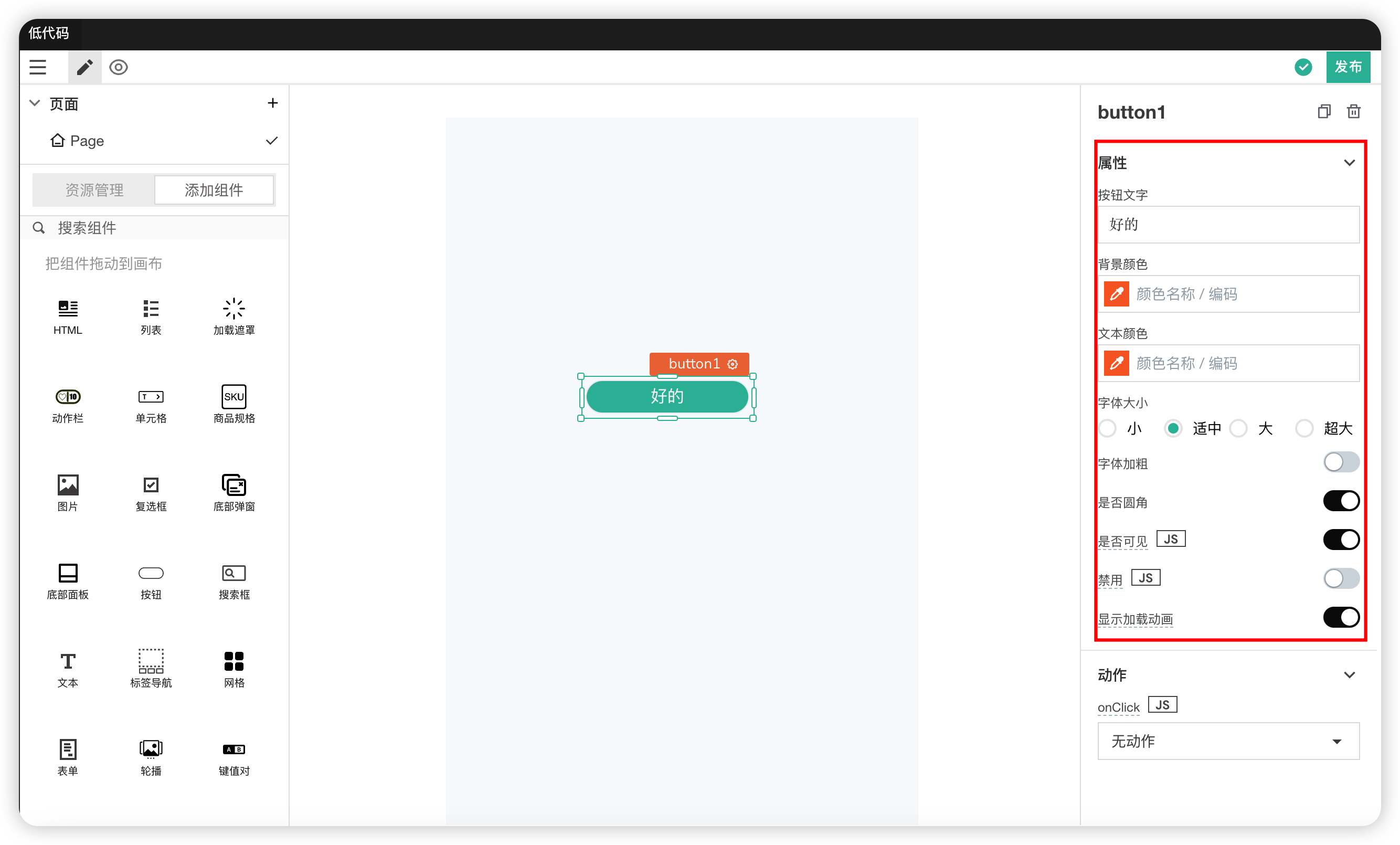
# 12. Button Component
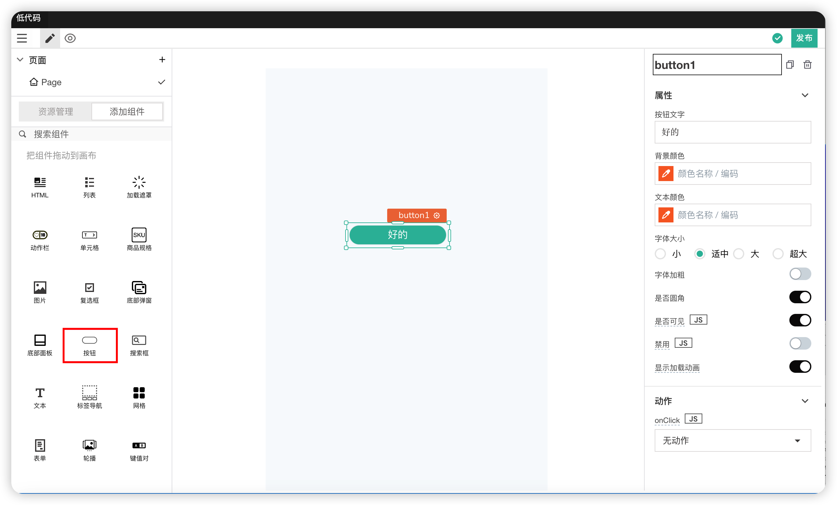
The Button component is a clickable entity that can trigger any event attached to it.
Properties
| Field | Description |
|---|---|
| Button Text | Can set the text inside the button |
| Background Color | Modifies the background color of the button |
| Text Color | Modifies the font color of the button text |
| Font Size | Modifies the font size of the button text |
| Font Weight | Modifies the bold style of the button text |
| Rounded Corners | Modifies the border style of the button (rounded or not) |
| Visible | Controls the visibility of the component on the page. When off: The component will be invisible when the application is published. In edit mode, it appears translucent |
| Disabled | Makes the component unclickable or unusable. The component remains visible to the user but does not allow user interaction. |
| Show Loading Animation | You can use the toggle switch to turn it on/off. You can also use JavaScript to turn it off/on |
Actions
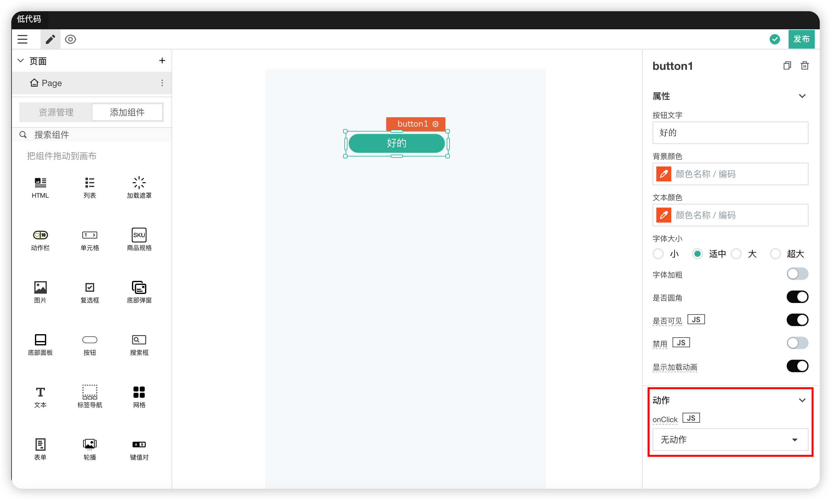
| Field | Description |
|---|---|
| onClick | Sets the action triggered when this component is clicked. Can perform navigation, prompts, and execute JavaScript functions |
Examples
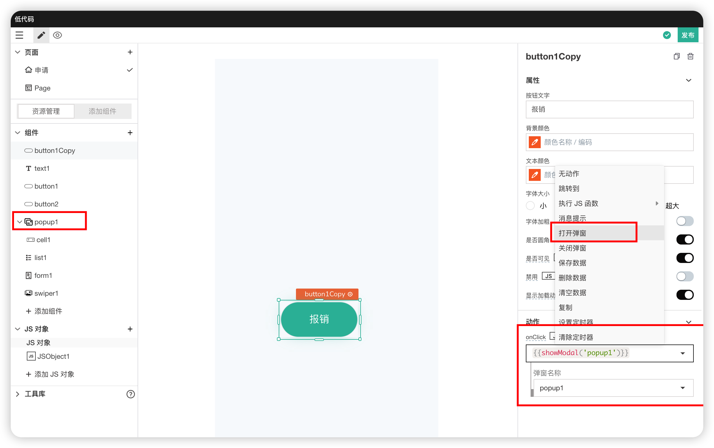
- In Actions, selecting "Open Dialog" allows you to directly select the name of the dialog to open via a dropdown.
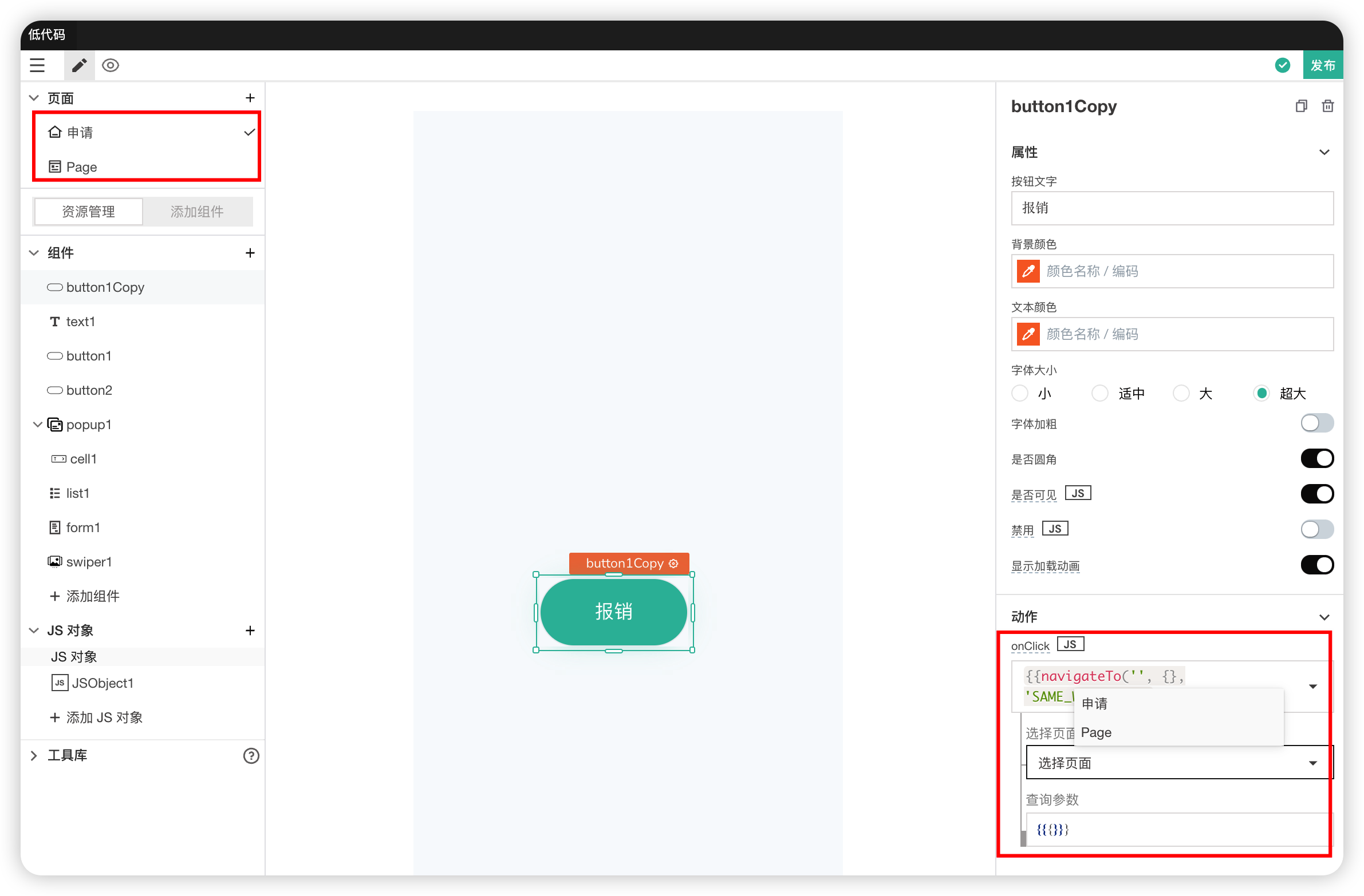
- In Actions, selecting "Navigate To" allows you to directly select the name of the page to open via a dropdown.
# 13. Search Box
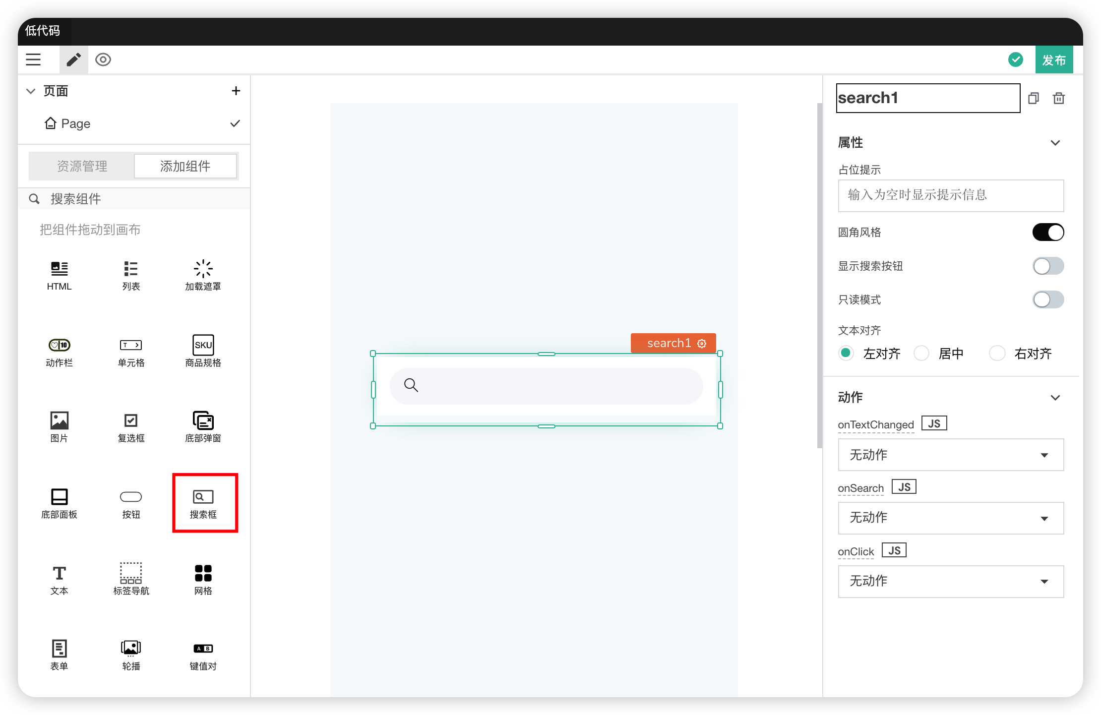
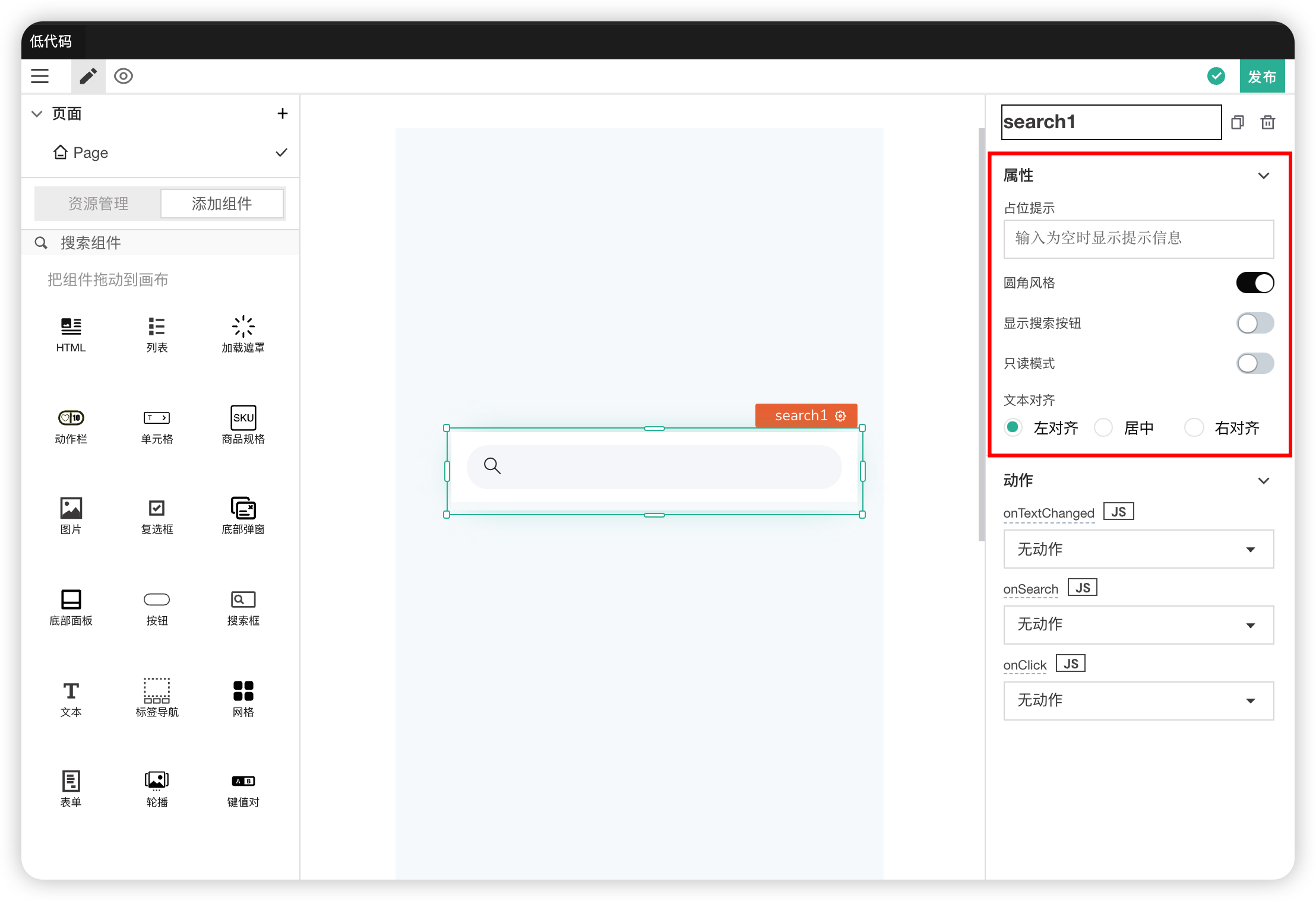
| Field | Description |
|---|---|
| Placeholder | The placeholder text displayed when the search box text is empty |
| Rounded Corner Style | Controls whether the search box uses a rounded border style |
| Show Search Button | Whether to display the search button on the right |
| Read-only Mode | Modifies the read-only mode of the search box. When in read-only mode, it is not editable |
| Text Alignment | Modifies the alignment of the text inside the search box |
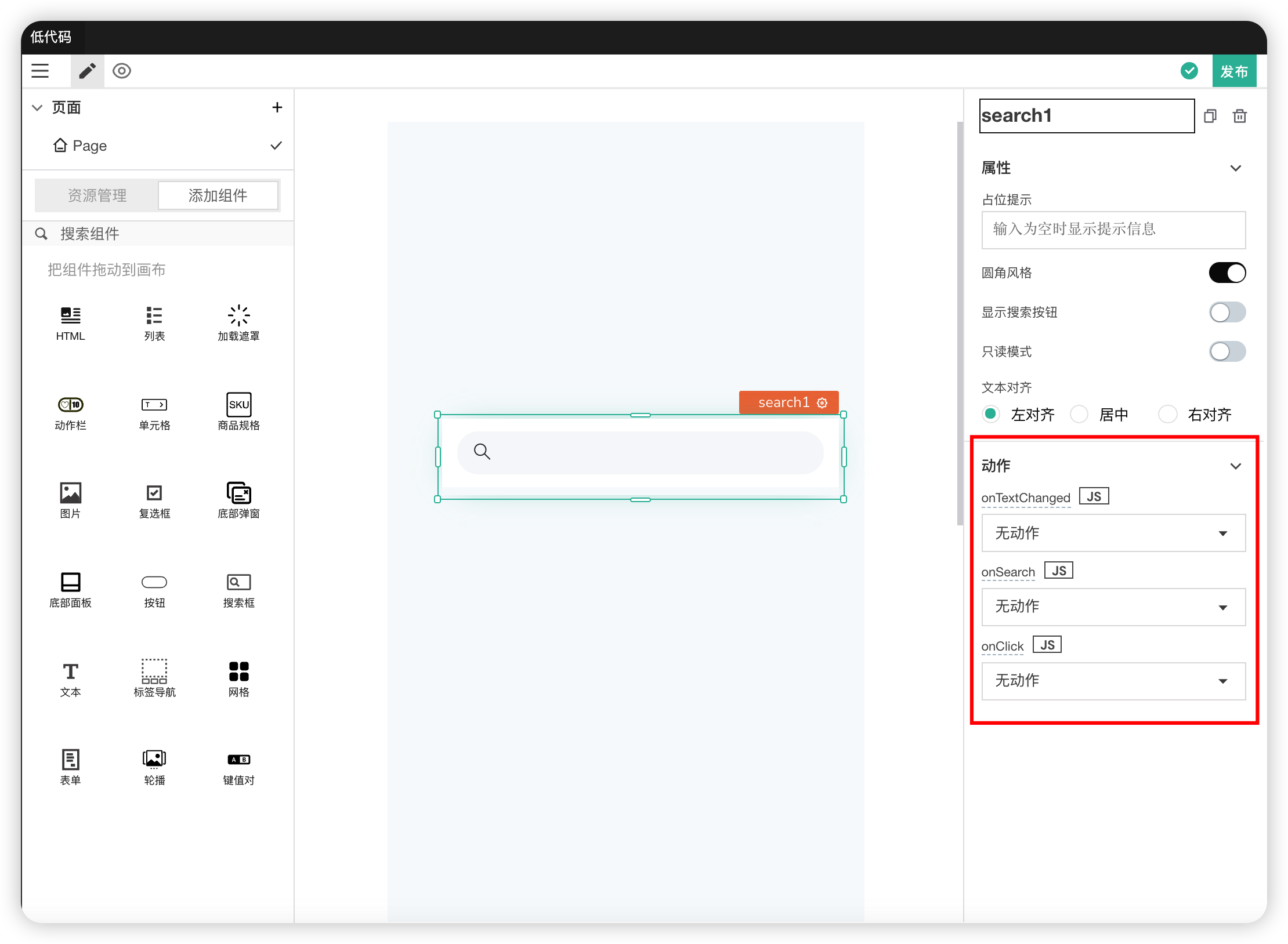
Actions
| Field | Description |
|---|---|
| onTextChanged | Action triggered when the input content of the search box changes |
| onSearch | Action triggered when the search button is clicked |
| onClick | Action triggered when the search box is clicked |
# 14. Text
A non-editable block of text content.
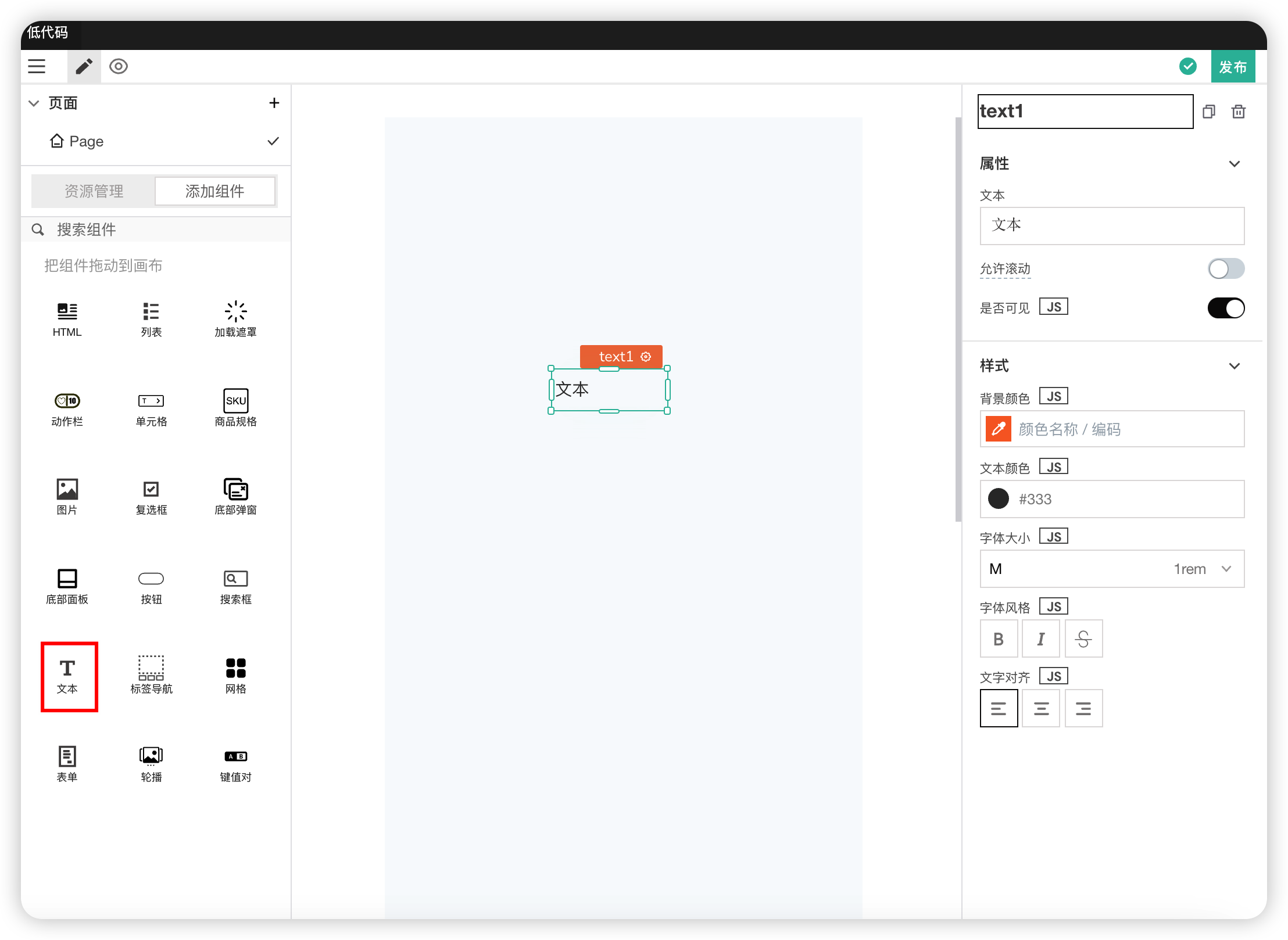
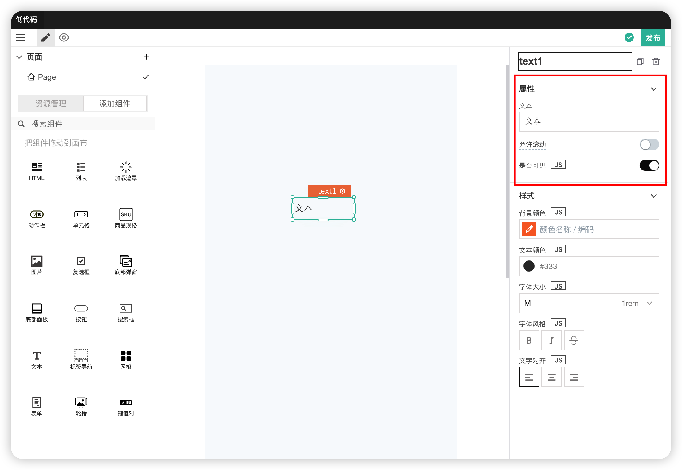
Properties
| Field | Description |
|---|---|
| Text | The text content displayed inside the text block |
| Scrollable | When the text exceeds the text block, whether scrolling is allowed |
| Visible | Controls the visibility of the component on the page. When off: The component will be invisible when the application is published. In edit mode, it appears translucent |
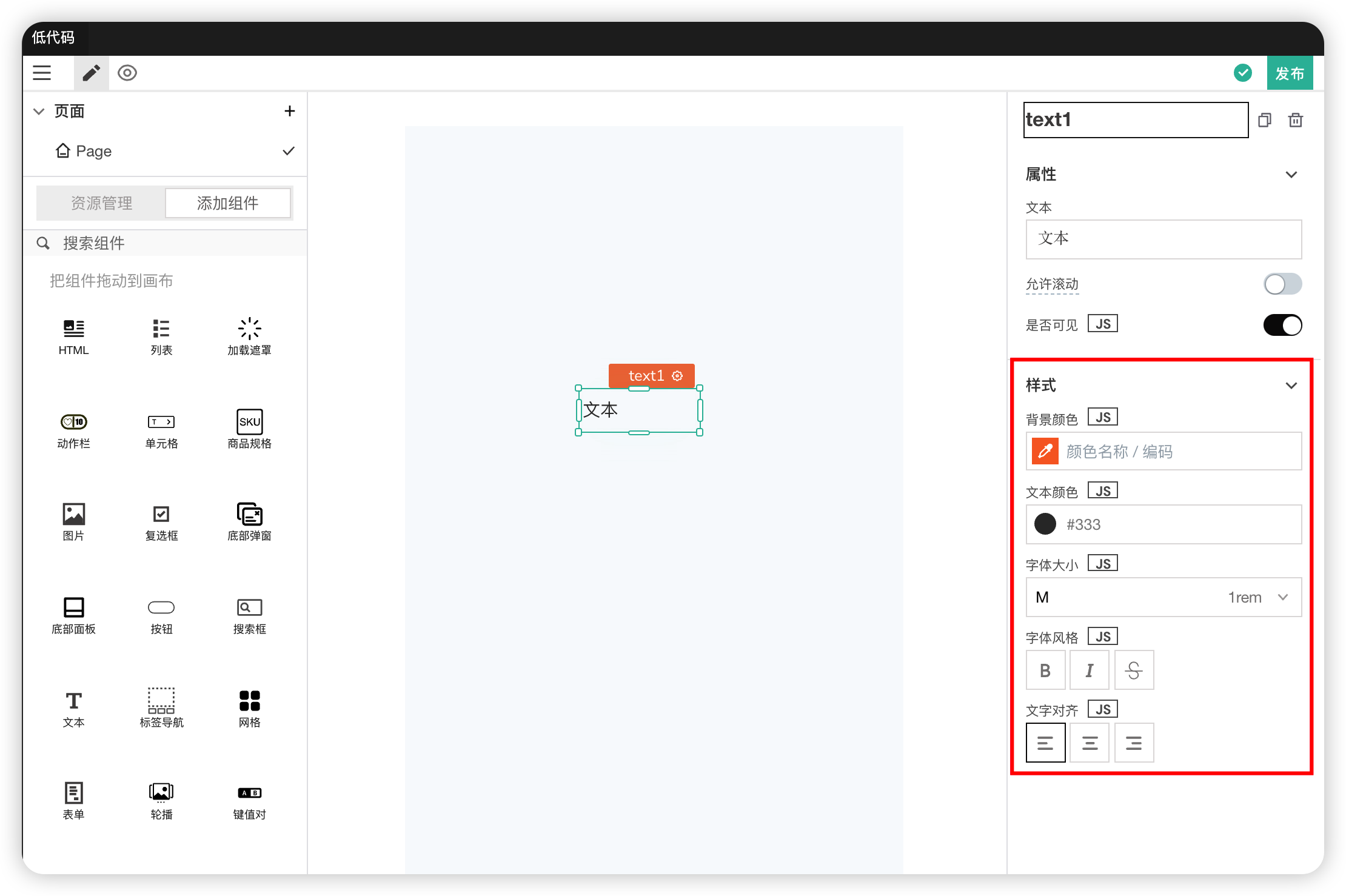
Styles
| Field | Description |
|---|---|
| Background Color | Used to modify the background color of the text block |
| Text Color | Used to modify the color of the text inside the block |
| Font Size | Used to modify the font size |
| Font Style | Used to modify the font style, including bold, italic, etc. |
| Text Alignment | Used to modify the text alignment |
# 15. Tab Navigation
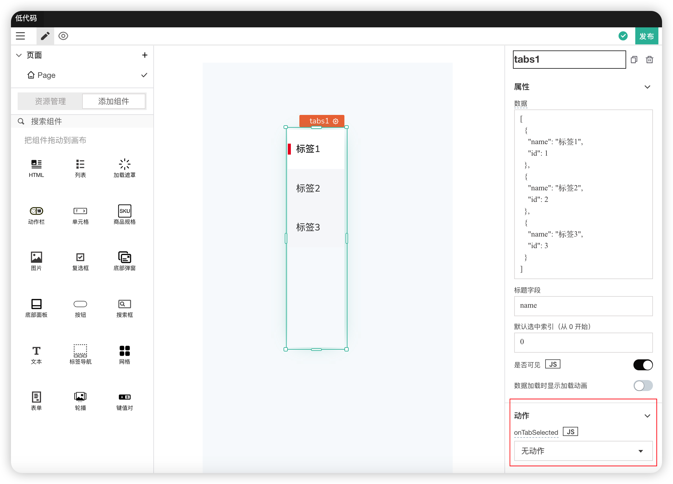
A vertically displayed navigation bar for switching between different content areas.
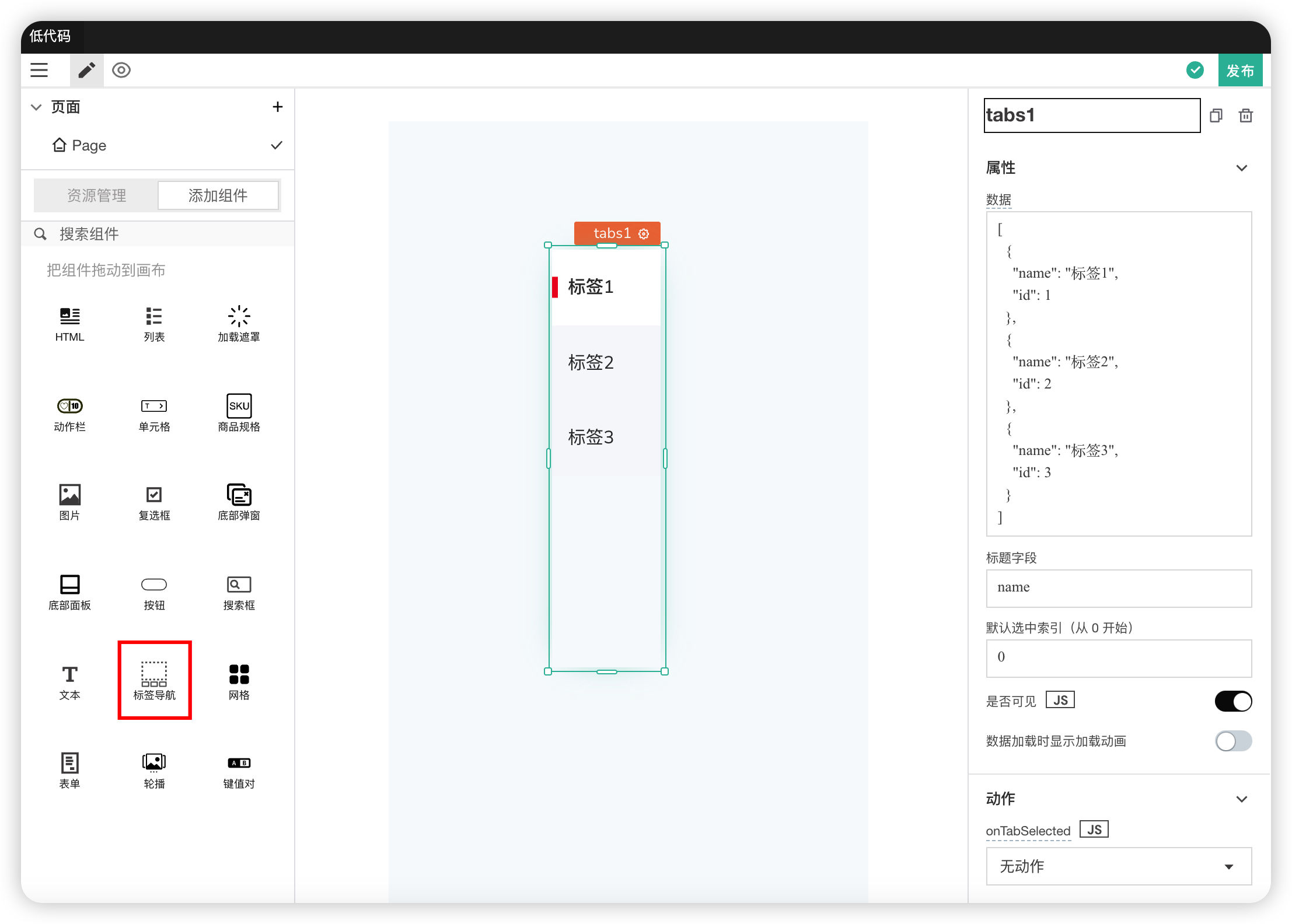
Properties
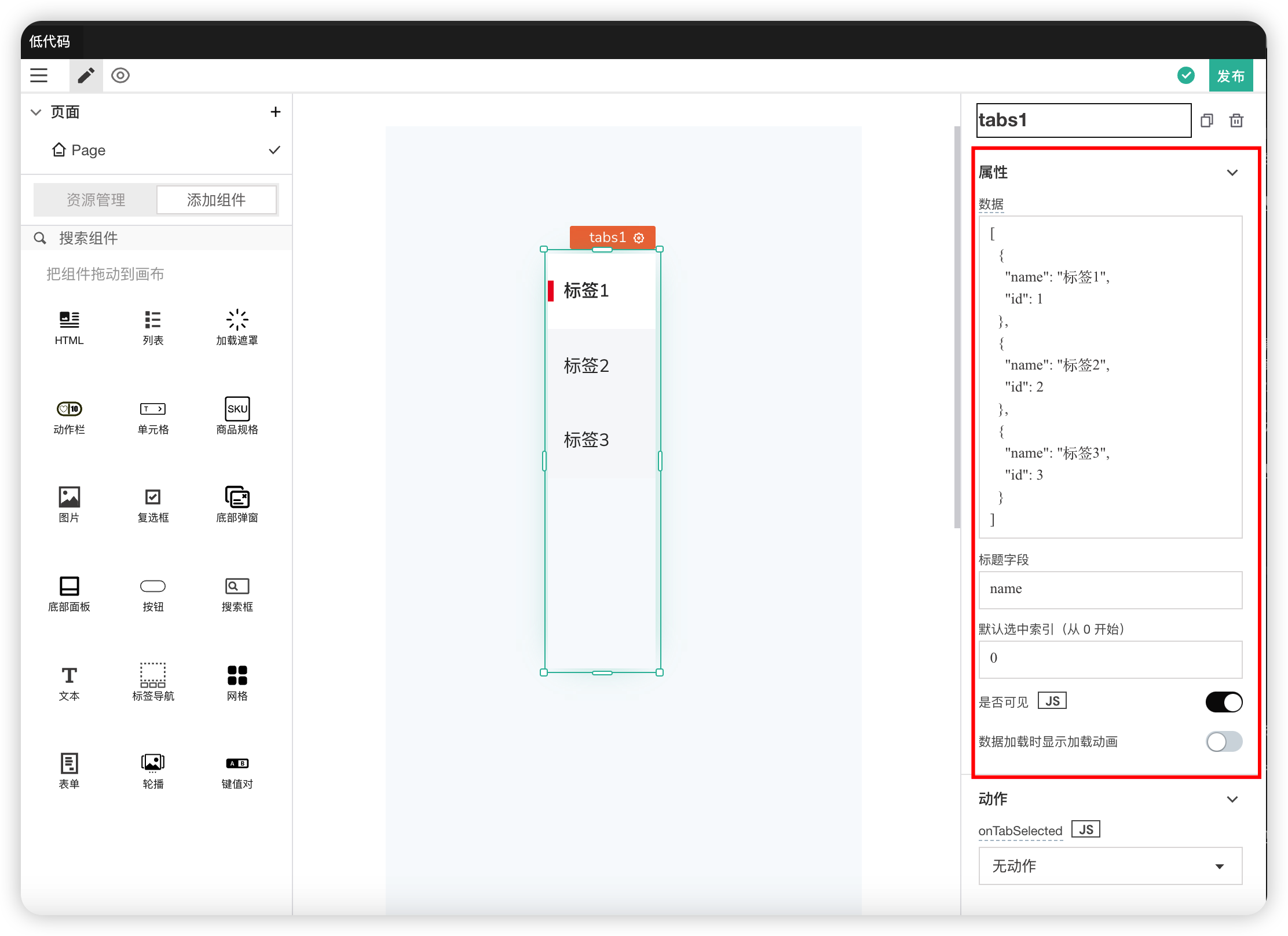
| Field | Description |
|---|---|
| Data | The format is an array |
| Title Field | The text in the tab. Used to specify which field in the data to get the text from |
| Default Selected Index | Modifies the default highlighted/selected tab |
| Visible | Controls the visibility of the component on the page. When off: The component will be invisible when the application is published. In edit mode, it appears translucent |
| Show Loading Animation on Data Load | Controls whether to show a loading animation while data is loading |
Actions
| Field | Description |
|---|---|
| onTabSelected | Action triggered when a tab is clicked |
# 16. Grid
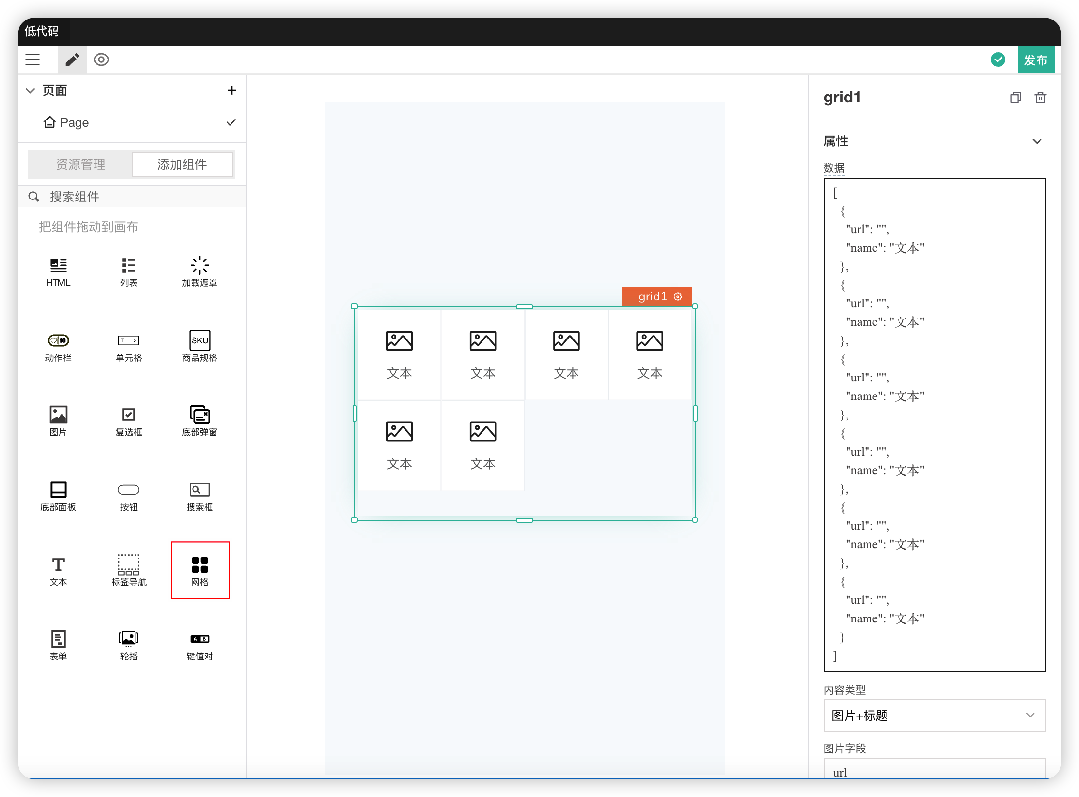
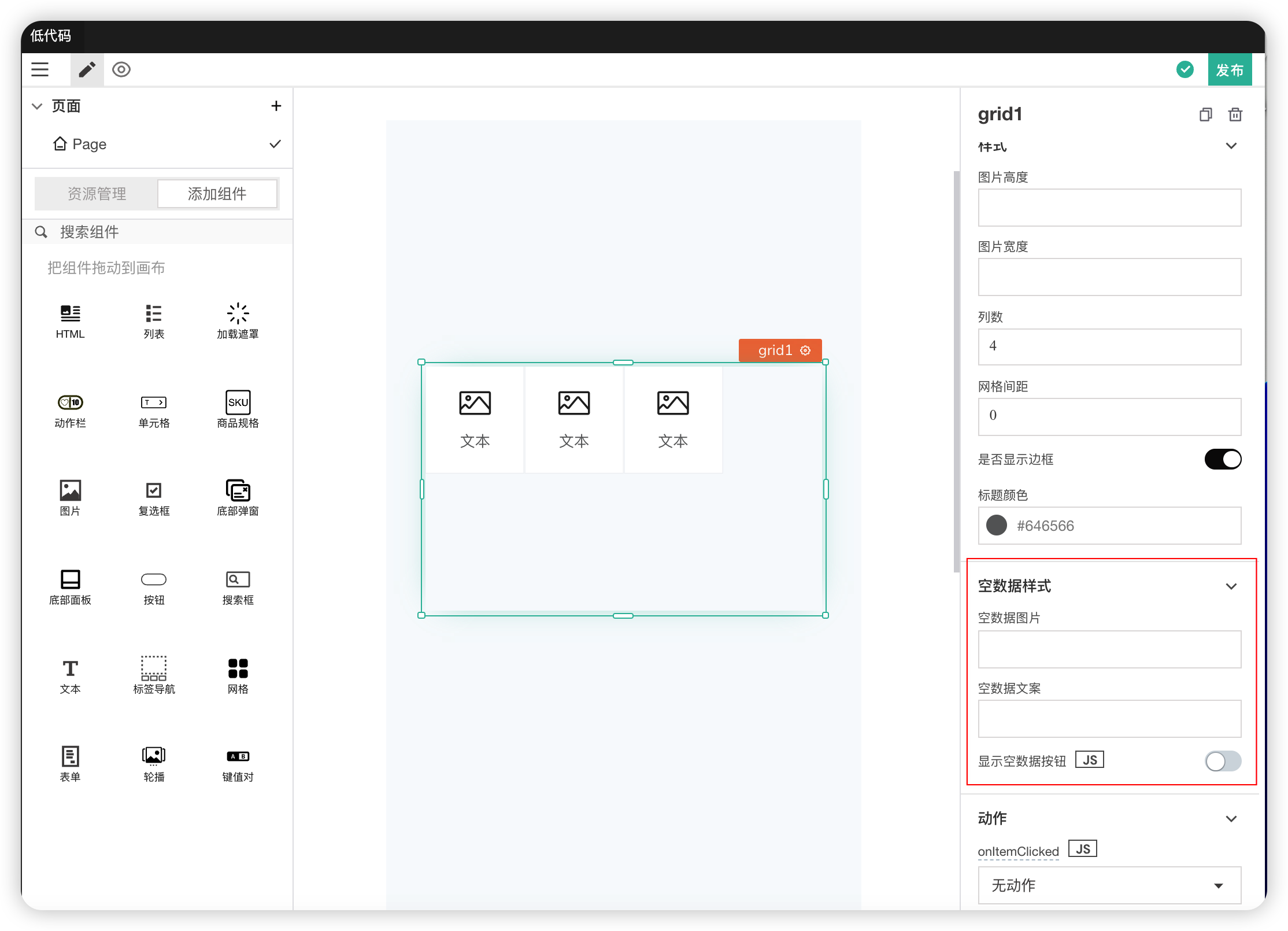
An area displaying images and text in a grid format. Defaults to 4 columns.
Properties
| Field | Description |
|---|---|
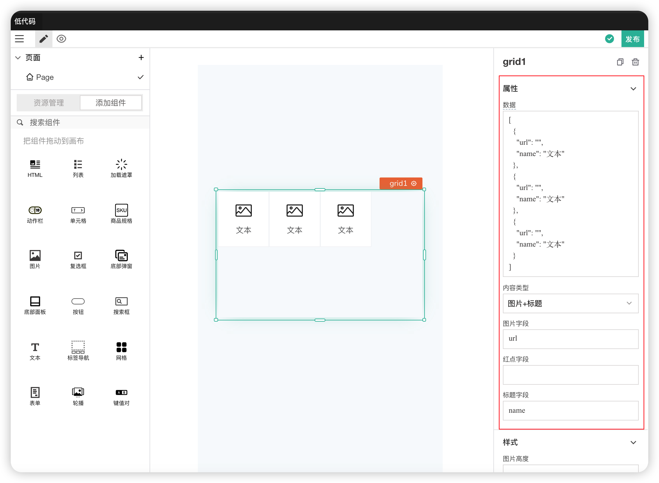
| Data | The data displayed in the grid. Format is an array. Can bind data using {{}} |
| Content Type | Controls the content type of a single grid cell. Can include title, description, and button |
| Image Field | The field used to display the image, obtained from the data |
| Badge Field | |
| Title Field | The field used to display the title, obtained from the data |
Styles
| Field | Description |
|---|---|
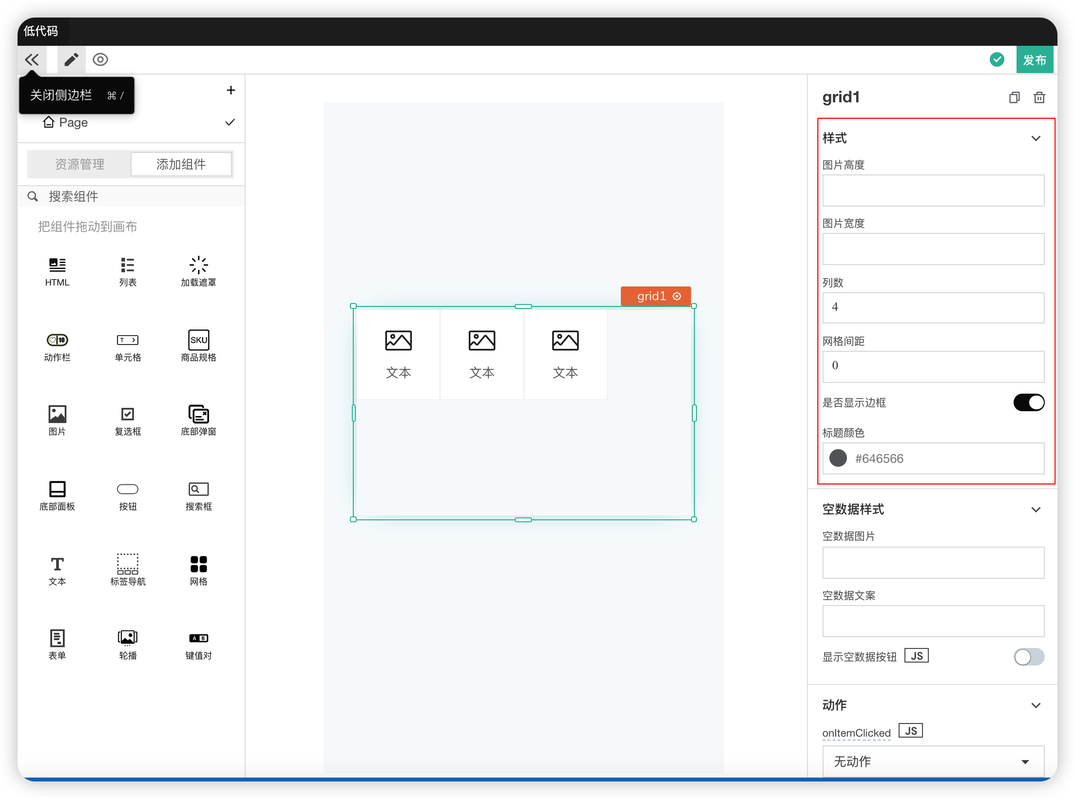
| Image Height | Used to modify the height of the image |
| Image Width | Used to modify the width of the image |
| Number of Columns | Used to modify the number of columns displayed in the grid. Minimum is 2 columns |
| Grid Spacing | The horizontal spacing between two grid cells. Default unit is px. Can enter values with units |
| Show Border | Controls whether to display the grid border |
| Title Color | Used to modify the text color of the title |
Empty Data Format
| Field | Description |
|---|---|
| Empty Data Image | The image content displayed when the data is empty |
| Empty Data Text | The text displayed when the data is empty |
Actions
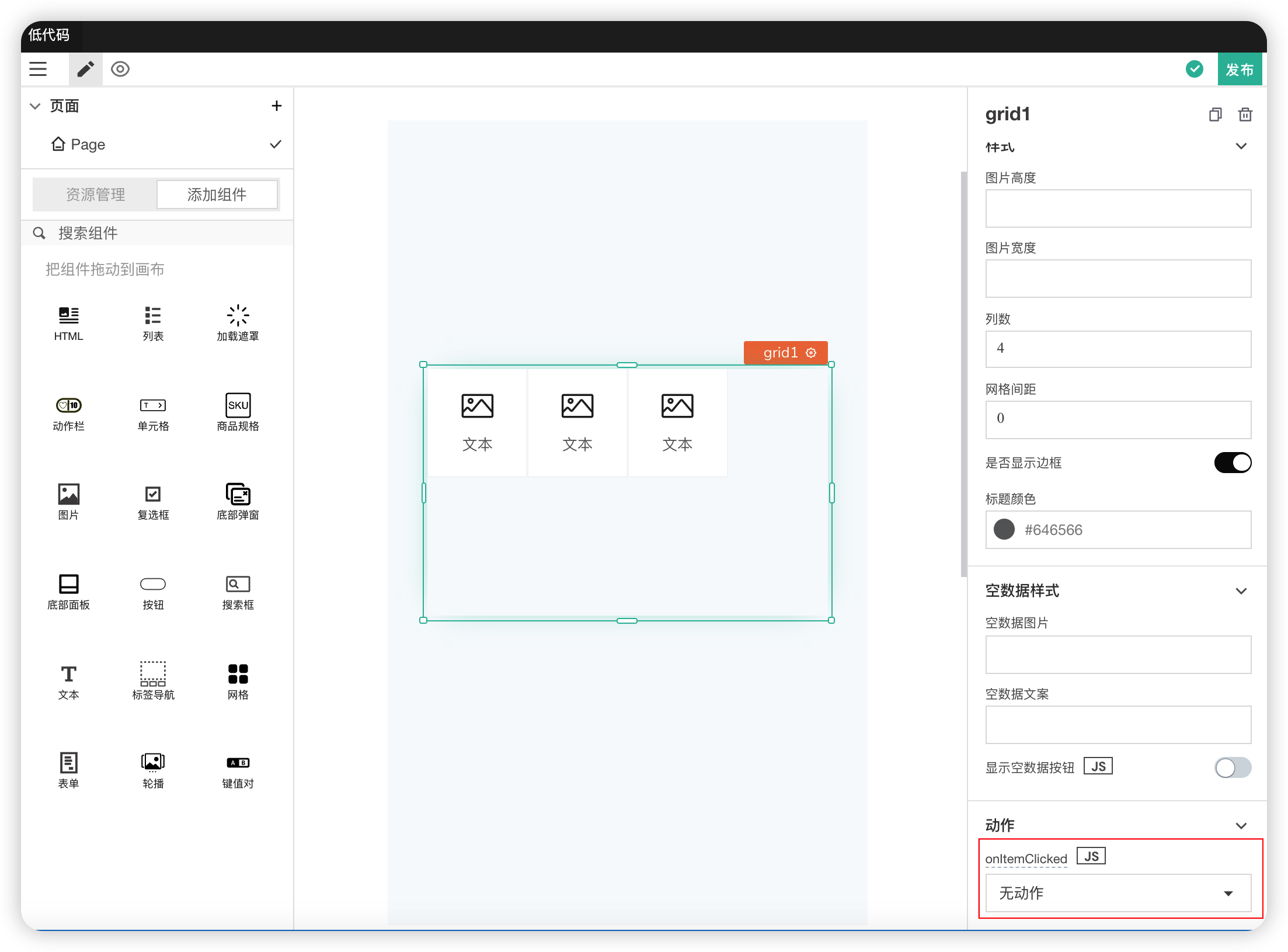
| Field | Description |
|---|---|
| onItemCliked | Action triggered when a grid cell is clicked |
# 17. Form Component
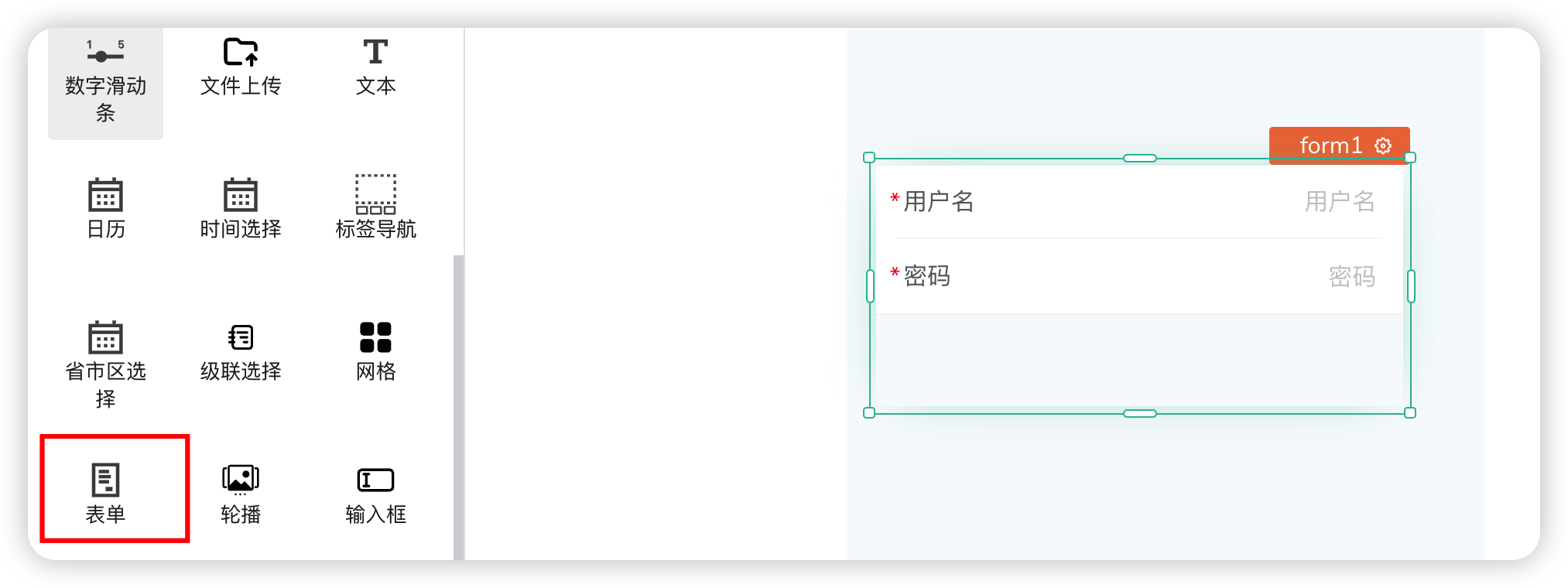
The Form component meets all your needs for capturing input data and connecting it to database queries or APIs.
The Form component can be used as a parent component, holding different components such as Text for displaying information to capture, Input for capturing user input, Dropdown for selection, and more.
Content
| Field | Description |
|---|---|
| Form Fields | Form fields, which can be added, modified, and configured |
Field Configuration
| Field | Description |
|---|---|
| Field Name | The name of the field when submitted |
| Required | Whether the field is required. If required, a warning will appear on blur |
| Field Control | The type of control, e.g., Radio, Checkbox, Province-City-District Selector |
| Input Type | Controls the type of input content, with corresponding validation, e.g., number, ID card number |
| Visible | Controls whether this item is displayed. If false, the corresponding required validation is ignored |
| Placeholder | The default content displayed when the form field is empty |
Properties
| Field | Description |
|---|---|
| Form Default Value | The default value of the form |
| Submit Button Text | The text content of the button for the submit operation |
| Rounded Card Style | Modifies the border style of the form component |
| Theme Color | Modifies the theme style of the form component, controlling the color of the submit button |
# 18. Carousel
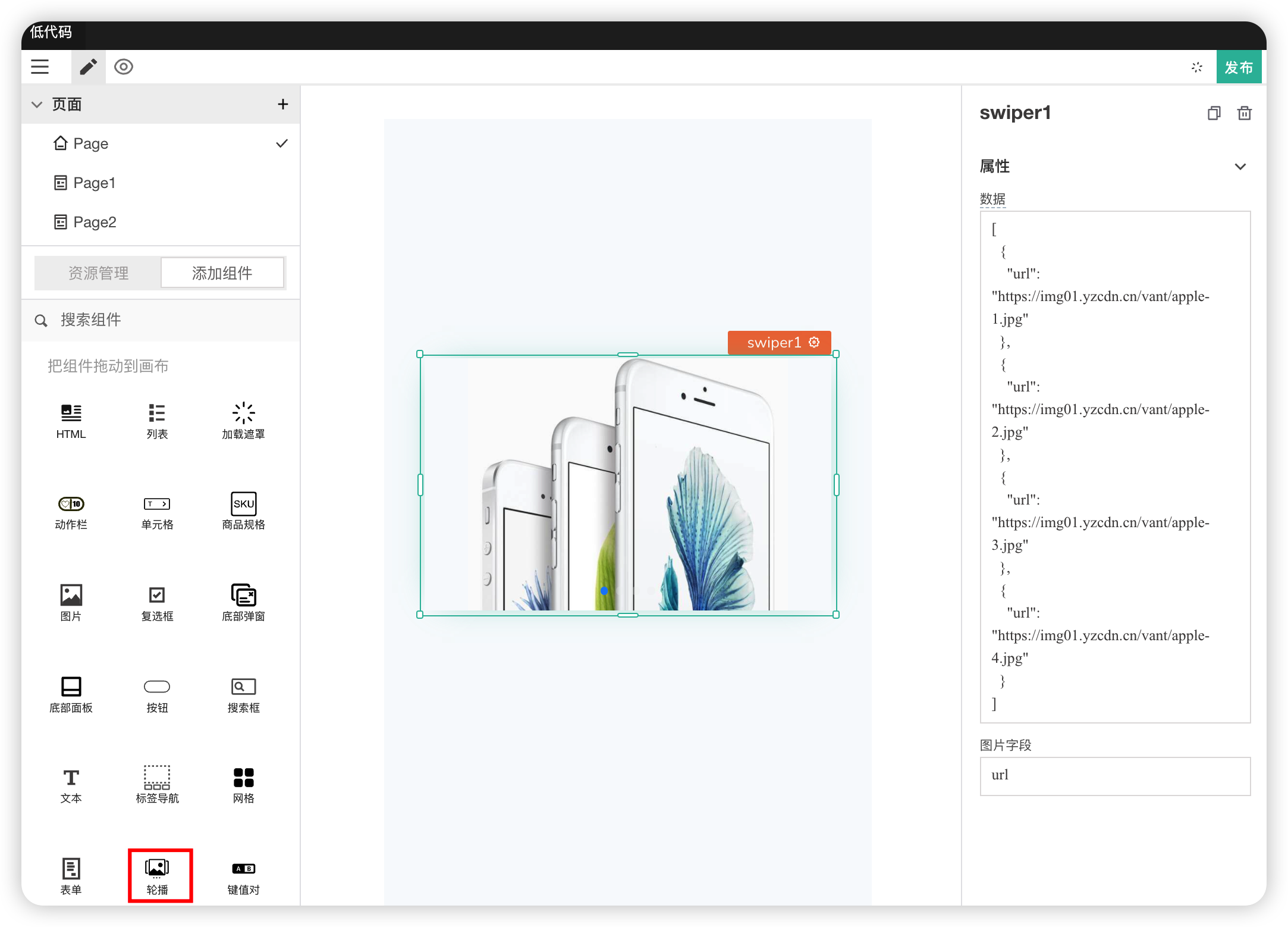
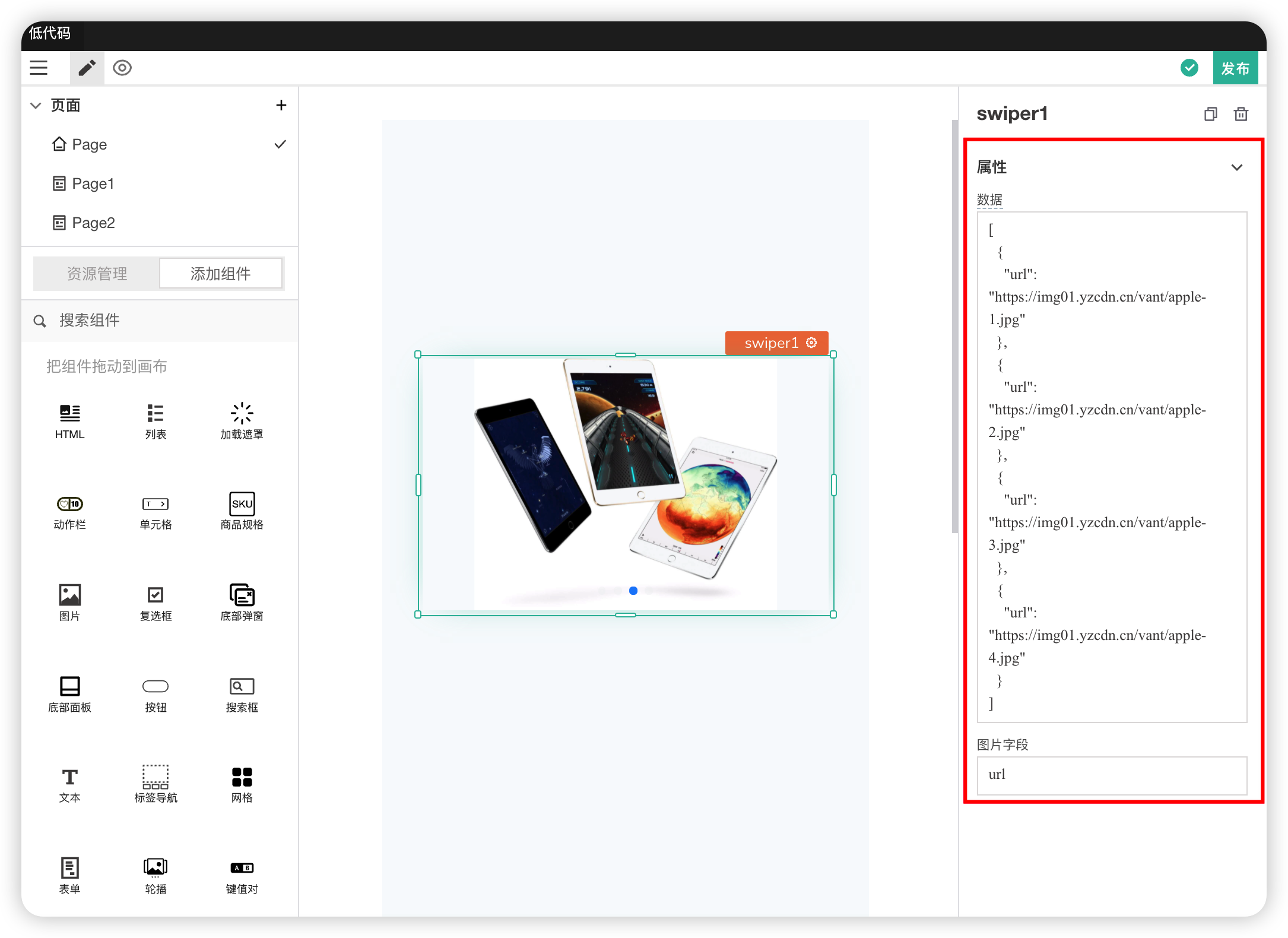
Used to cycle through a set of images or content.
Properties
| Field | Description |
|---|---|
| Data | The image URL data needed for the component |
| Image Field | The field representing the image, obtained from the data |
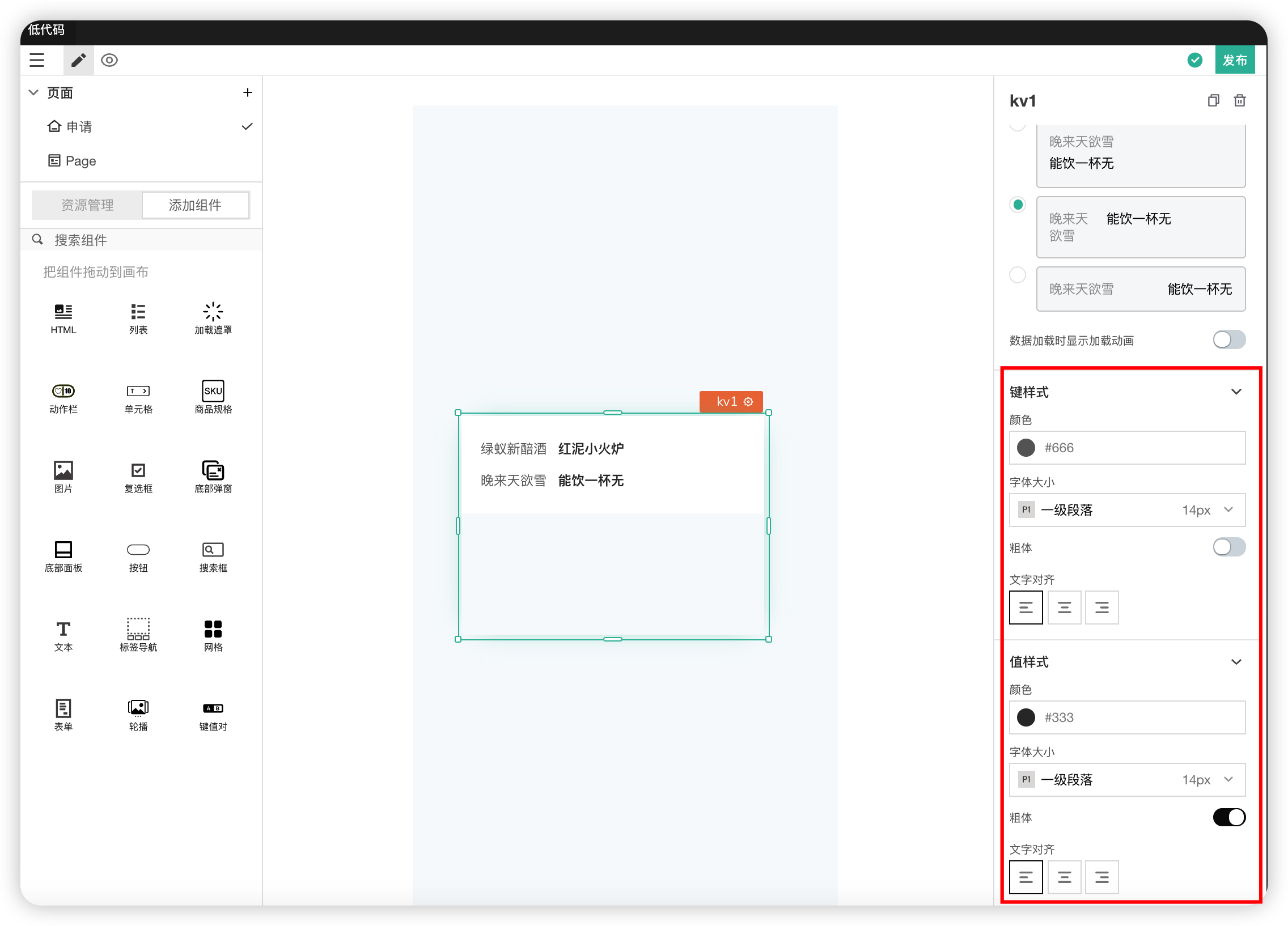
# 19. Key-Value Pair
Properties
| Field | Description |
|---|---|
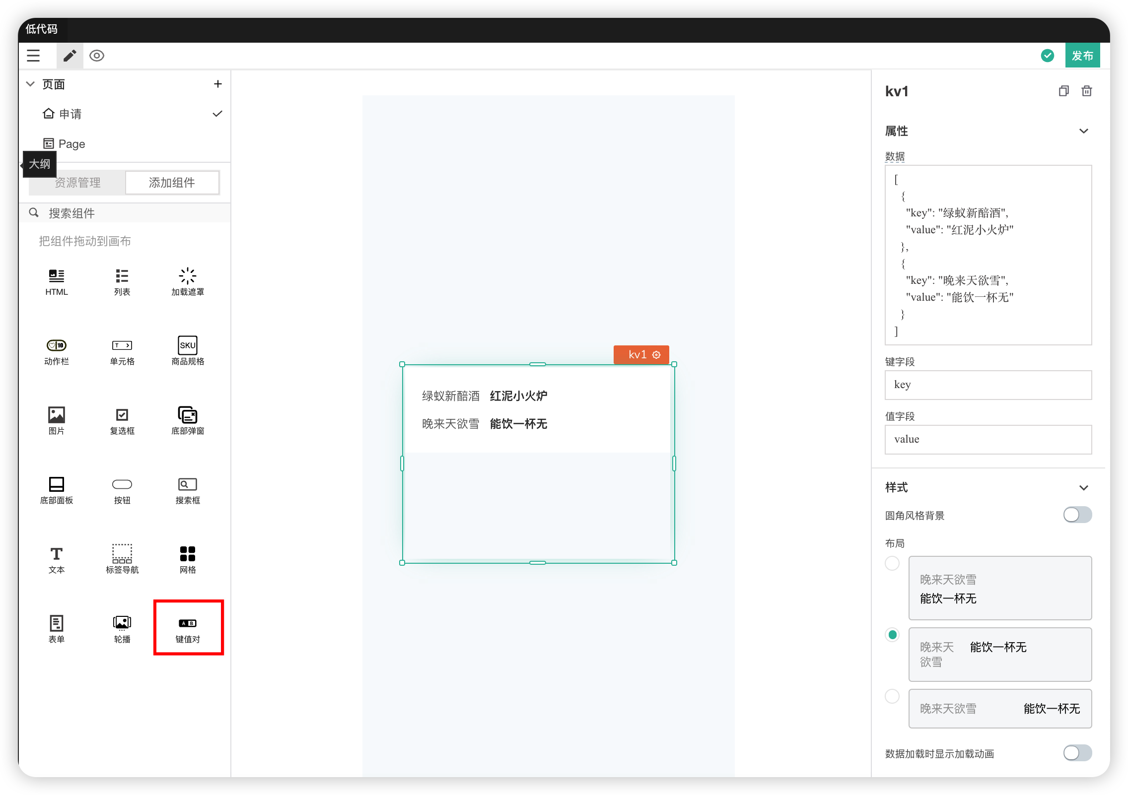
| Data | The data to be displayed. Format is an array |
| Key Field | The text for the key, obtained from the data |
| Value Field | The text for the value, obtained from the data |
Styles
| Field | Description |
|---|---|
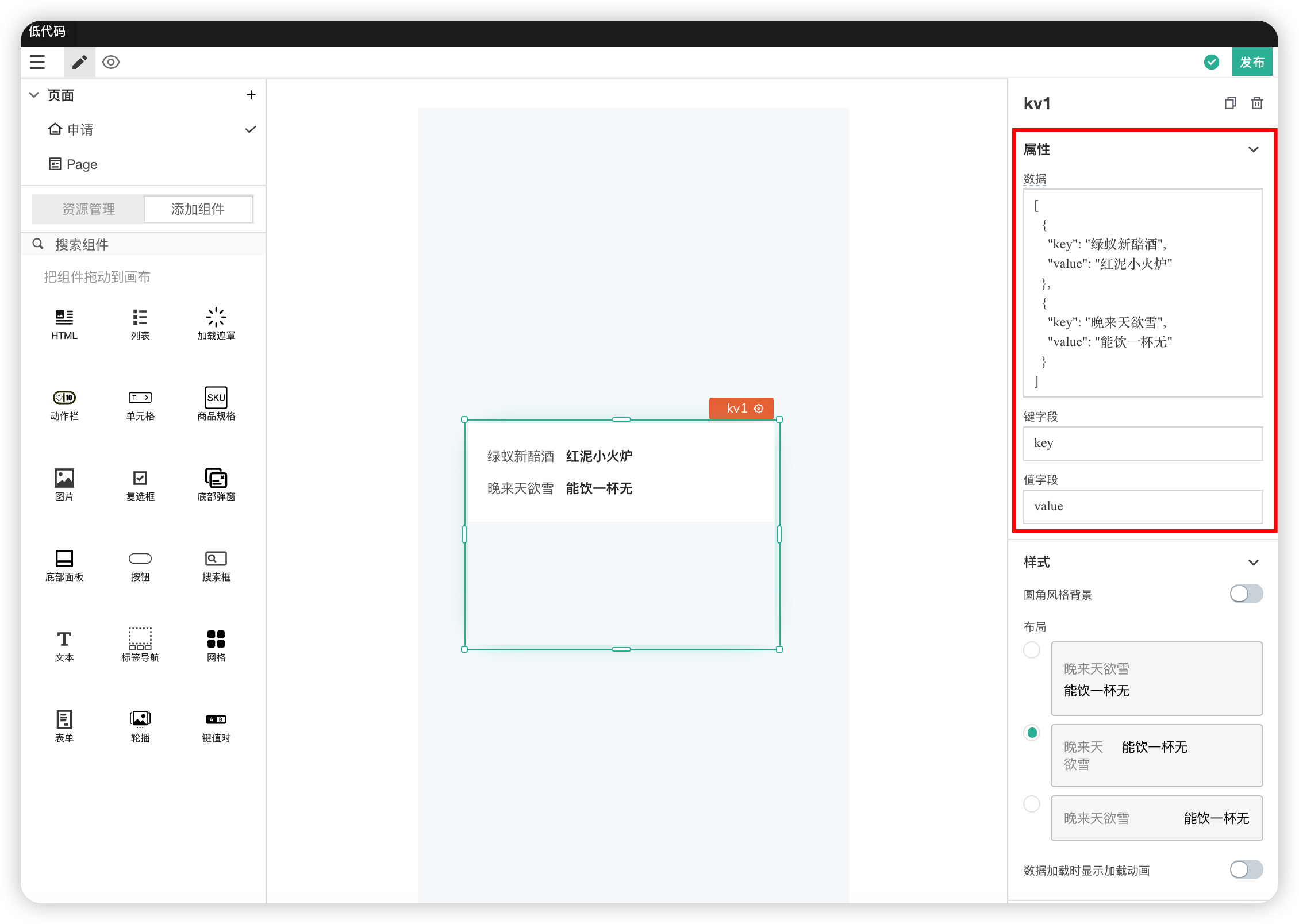
| Rounded Corner Background | Used to modify the border style |
| Layout | Used to modify the layout style of the key-value pairs |
| Show Loading Animation on Data Load | Controls whether to show a loading animation while data is loading |
Key Style and Value Style
| Field | Description |
|---|---|
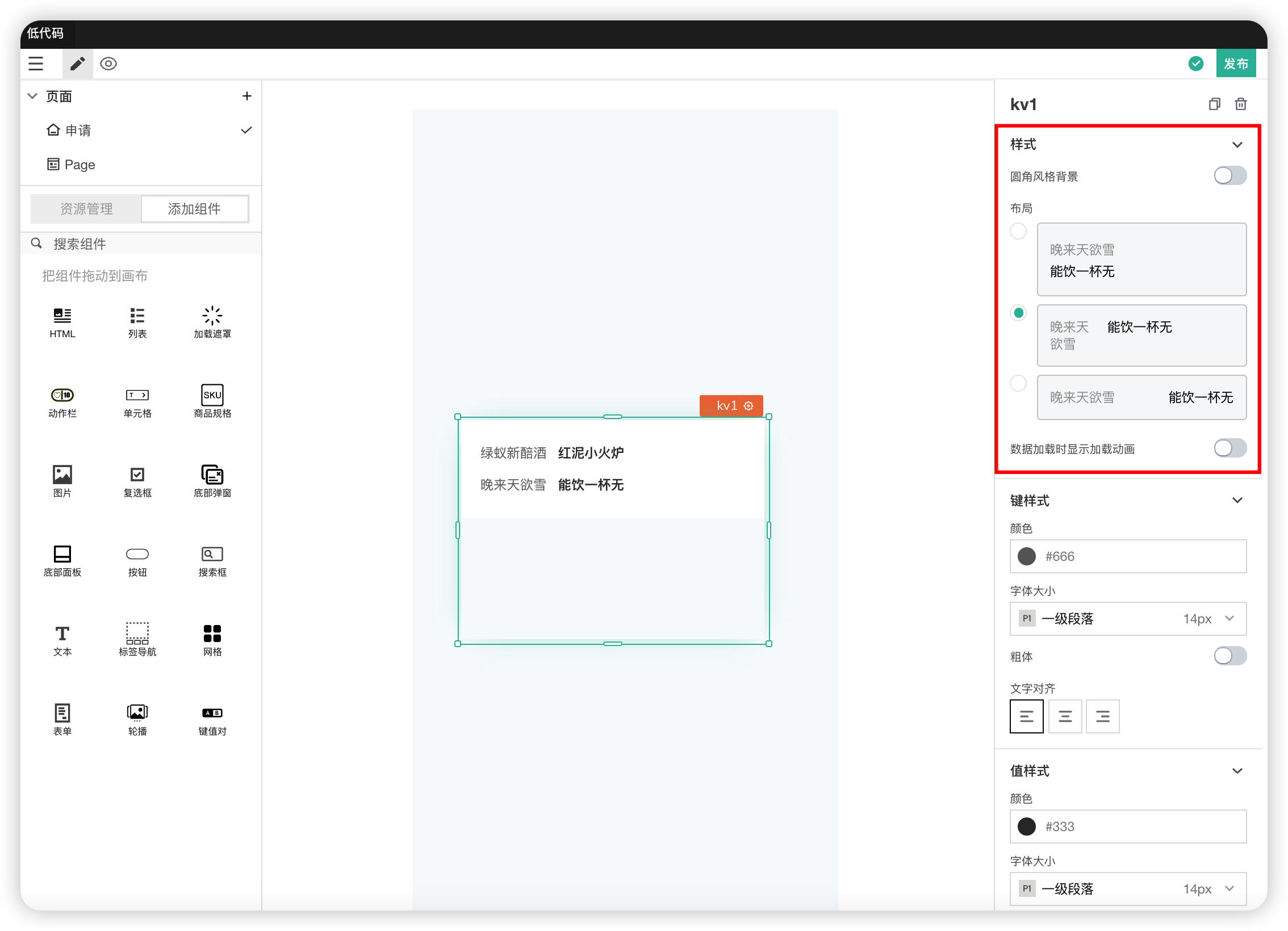
| Color | Used to modify the text color |
| Font Size | Used to modify the font size |
| Bold | Controls whether the font style is bold |
| Text Alignment | Sets the text alignment |
# 20. Divider
Used to separate content into different areas.
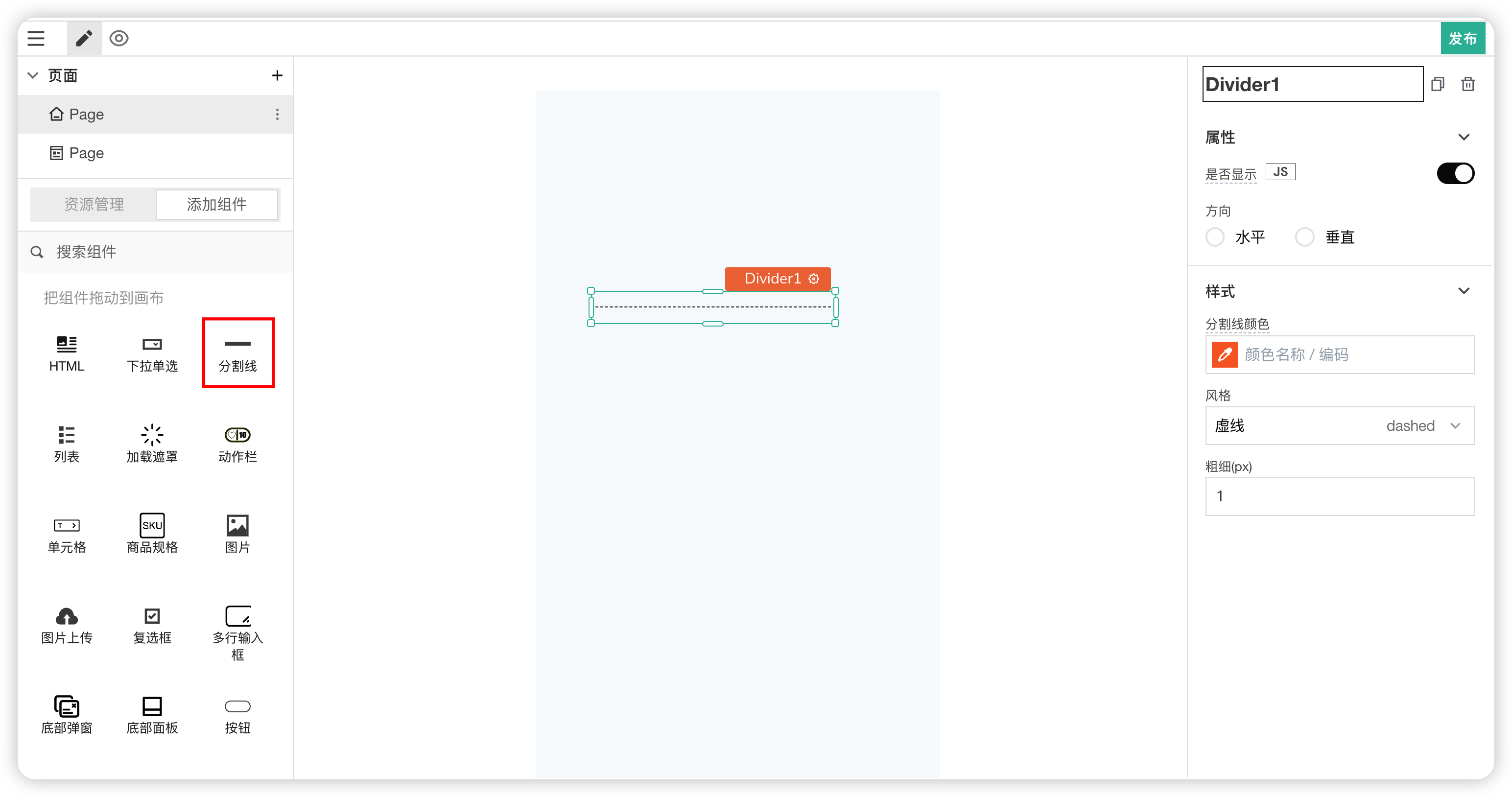
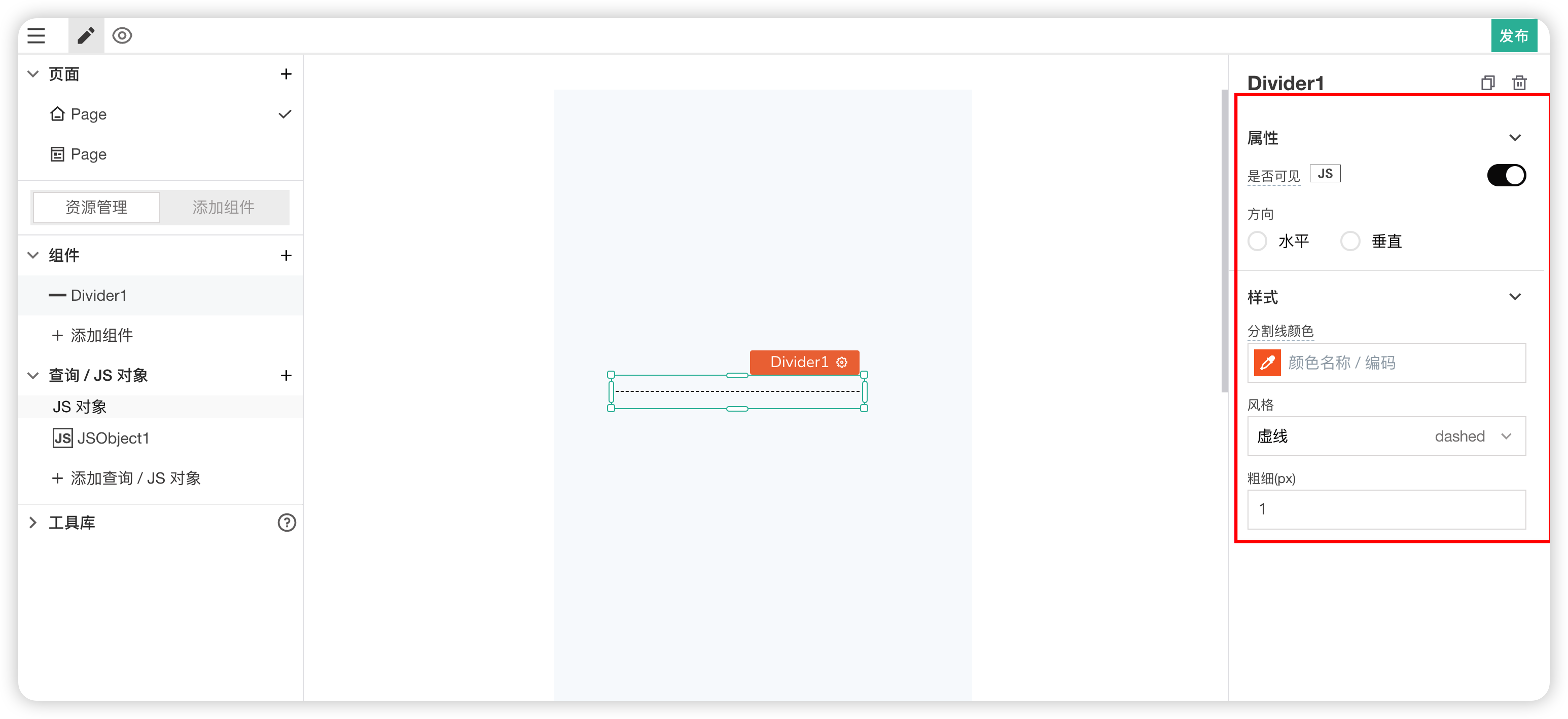
Properties
| Field | Description |
|---|---|
| Visible | Controls the visibility of the component on the page. When off: The component will be invisible when the application is published. In edit mode, it appears translucent |
| Orientation | Controls the orientation of the divider, vertical or horizontal |
Styles
| Field | Description |
|---|---|
| Divider Color | Used to modify the color of the divider line |
| Style | Controls the line style of the divider. Options: dotted, dashed, solid |
| Thickness | Controls the thickness of the line. Unit is px |
# 21. Image Upload
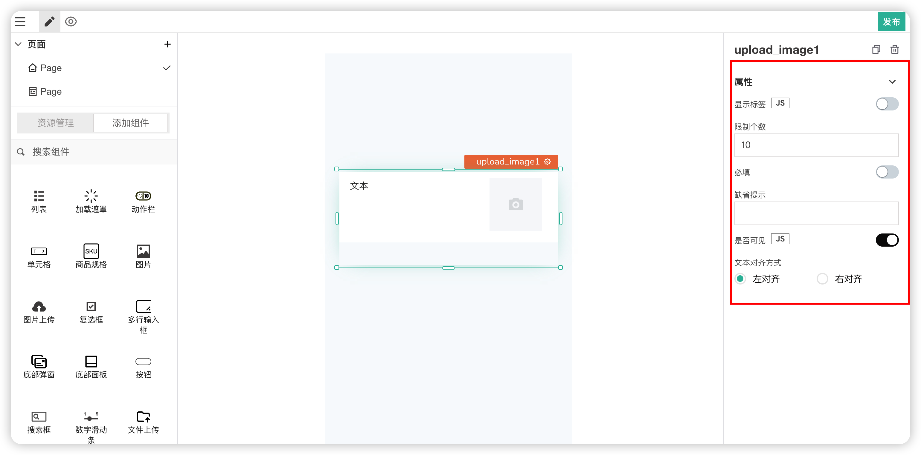
Used for uploading image files. Can limit the maximum number of uploads.
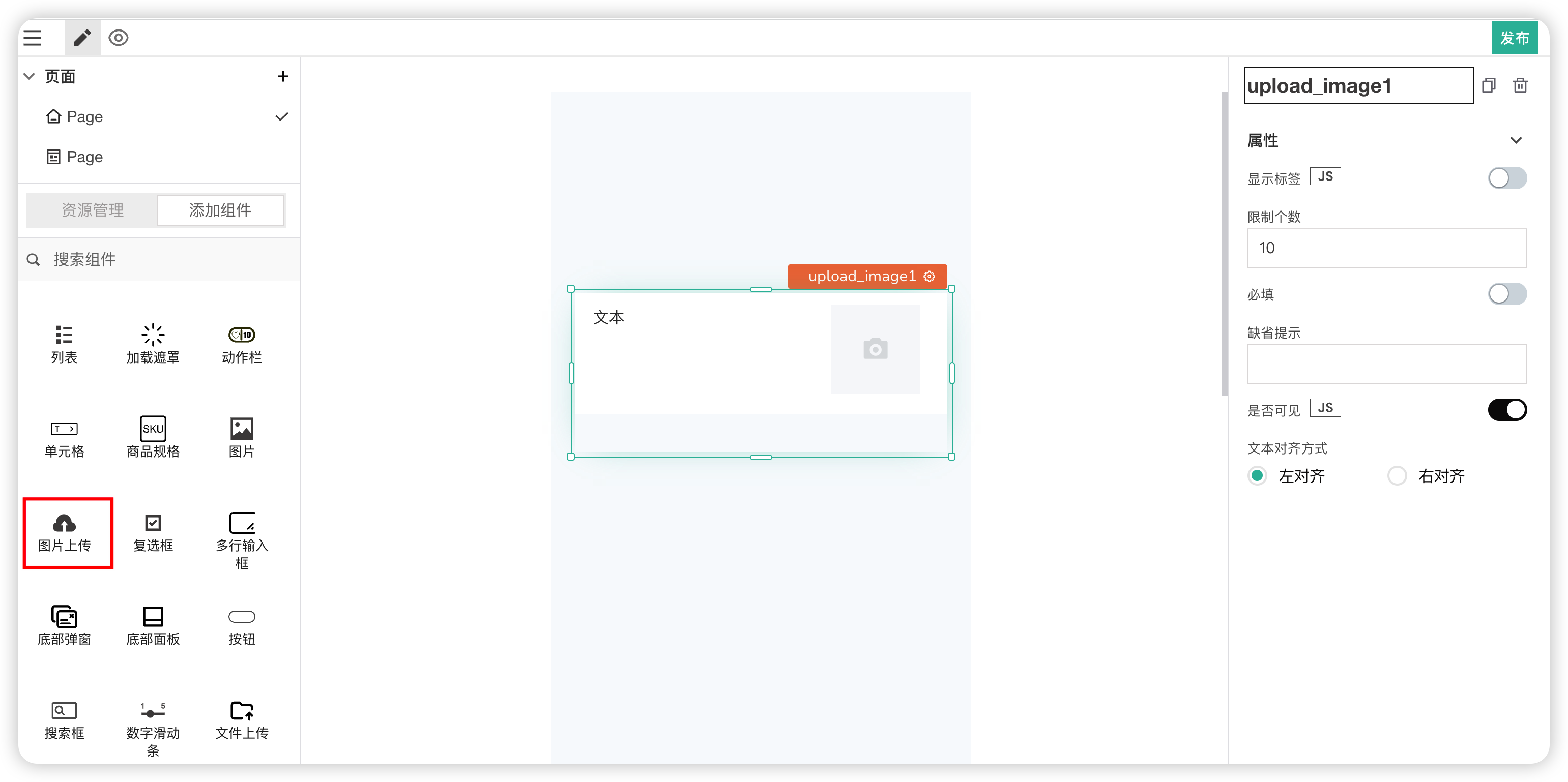
Properties
| Field | Description |
|---|---|
| Show Label | Whether to display the field label text |
| Limit Count | Controls the number of files that can be uploaded |
| Required | Whether the field is required. There is validation if empty |
| Placeholder | The hint text when the field is empty. Only effective when Required is true |
| Visible | Controls the visibility of the component on the page |
| Text Alignment | The alignment of the label text |
# 22. Textarea
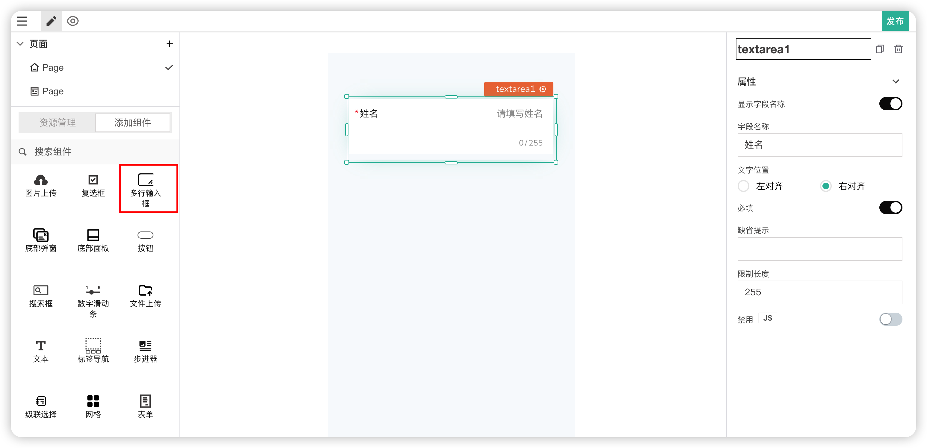
Allows users to input or edit multiple lines of text in a text box.
Properties
| Field | Description |
|---|---|
| Show Field Name | Whether to display the field label text |
| Field Name | The text content displayed for the label |
| Text Position | Modifies the text alignment |
| Required | Whether the field is required. If required, validation occurs on blur |
| Placeholder | If required, modifies the hint text when empty. Only effective when Required is true |
| Limit Length | Can limit the input length of the text content |
| Disabled | Makes the component unclickable or unusable. |
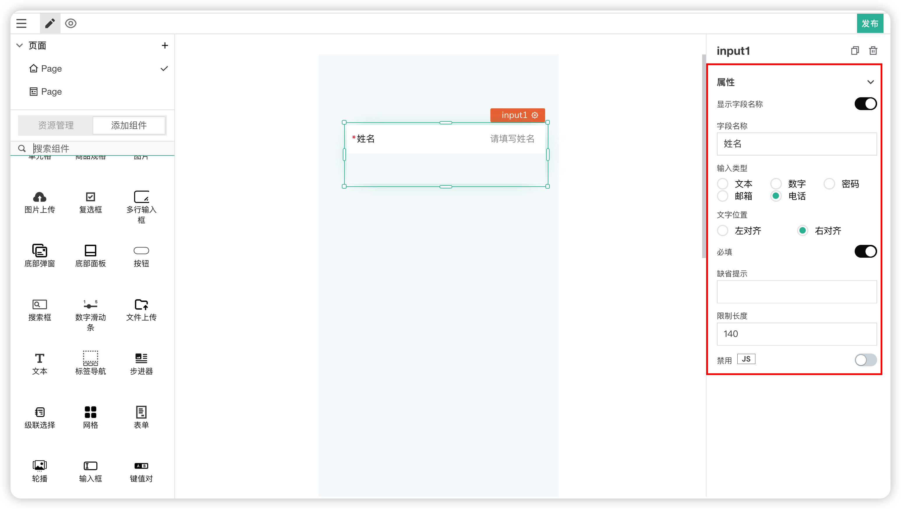
# 23. Input
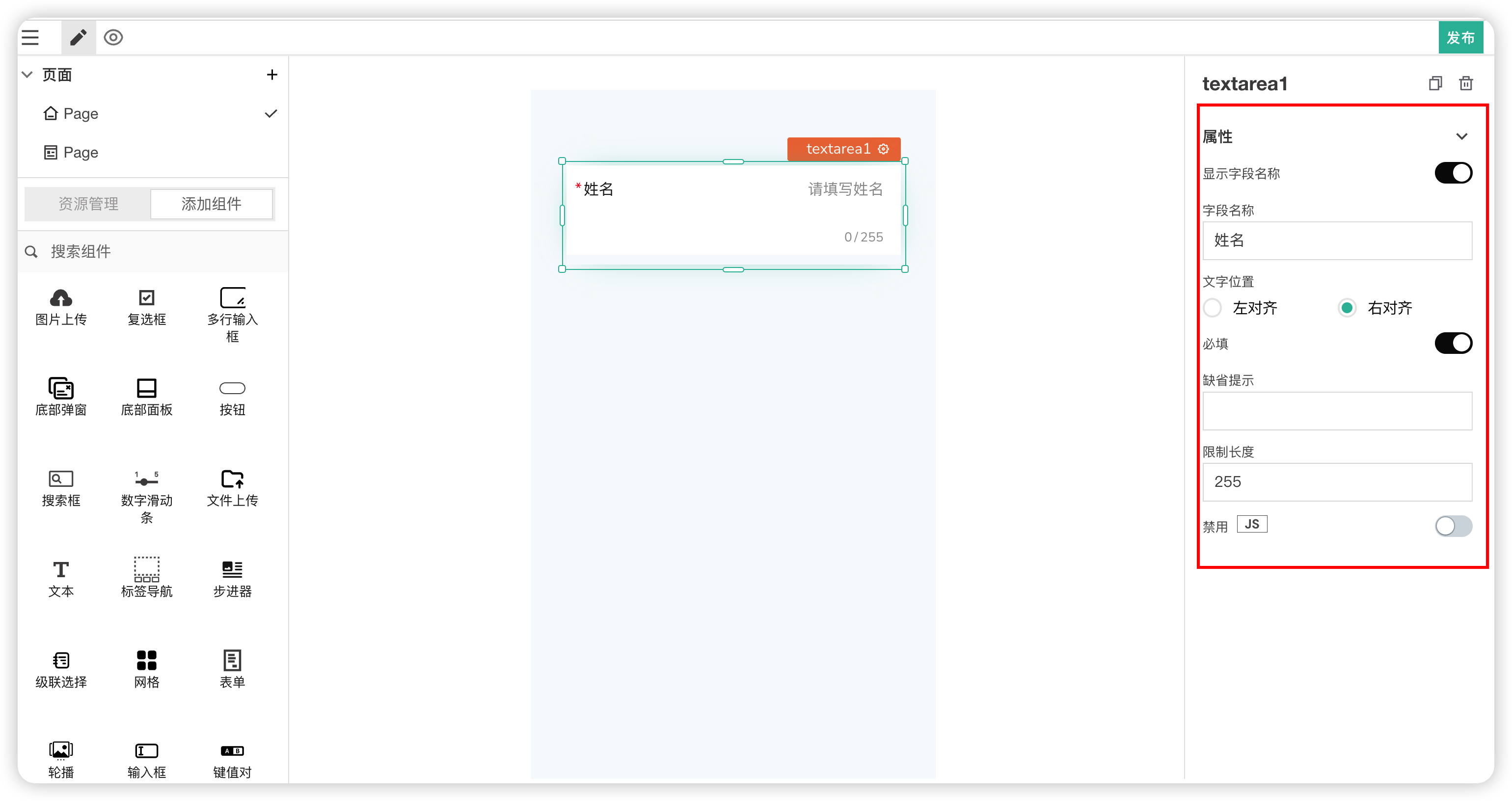
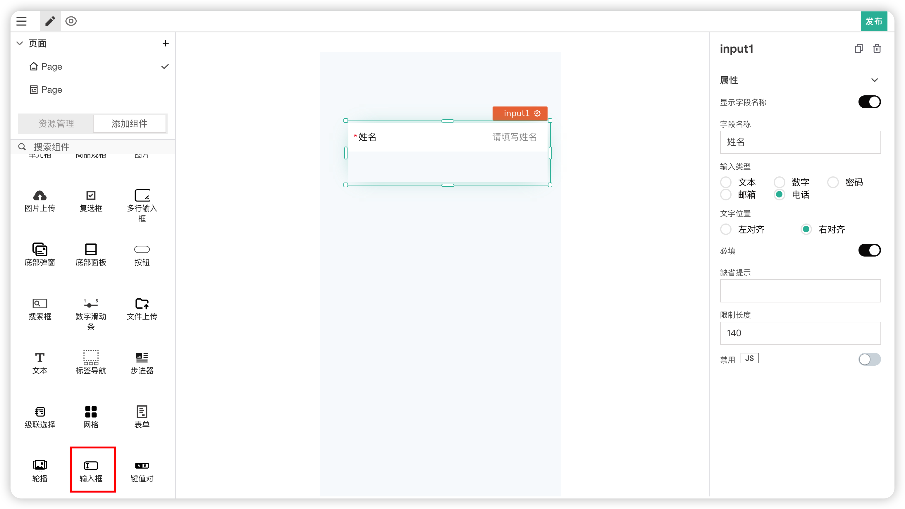
Allows users to input or edit text in a single-line text box.
Properties
| Field | Description |
|---|---|
| Show Field Name | Whether to display the field label text |
| Field Name | The text content displayed for the label |
| Input Type | Selects the text type. Corresponding validation occurs on blur |
| Text Position | Modifies the text alignment |
| Required | Whether the field is required. If required, validation occurs on blur |
| Placeholder | If required, modifies the hint text when empty. Only effective when Required is true |
| Limit Length | Can limit the input length of the text content |
| Disabled | Makes the component unclickable or unusable. |
# 24. Number Slider
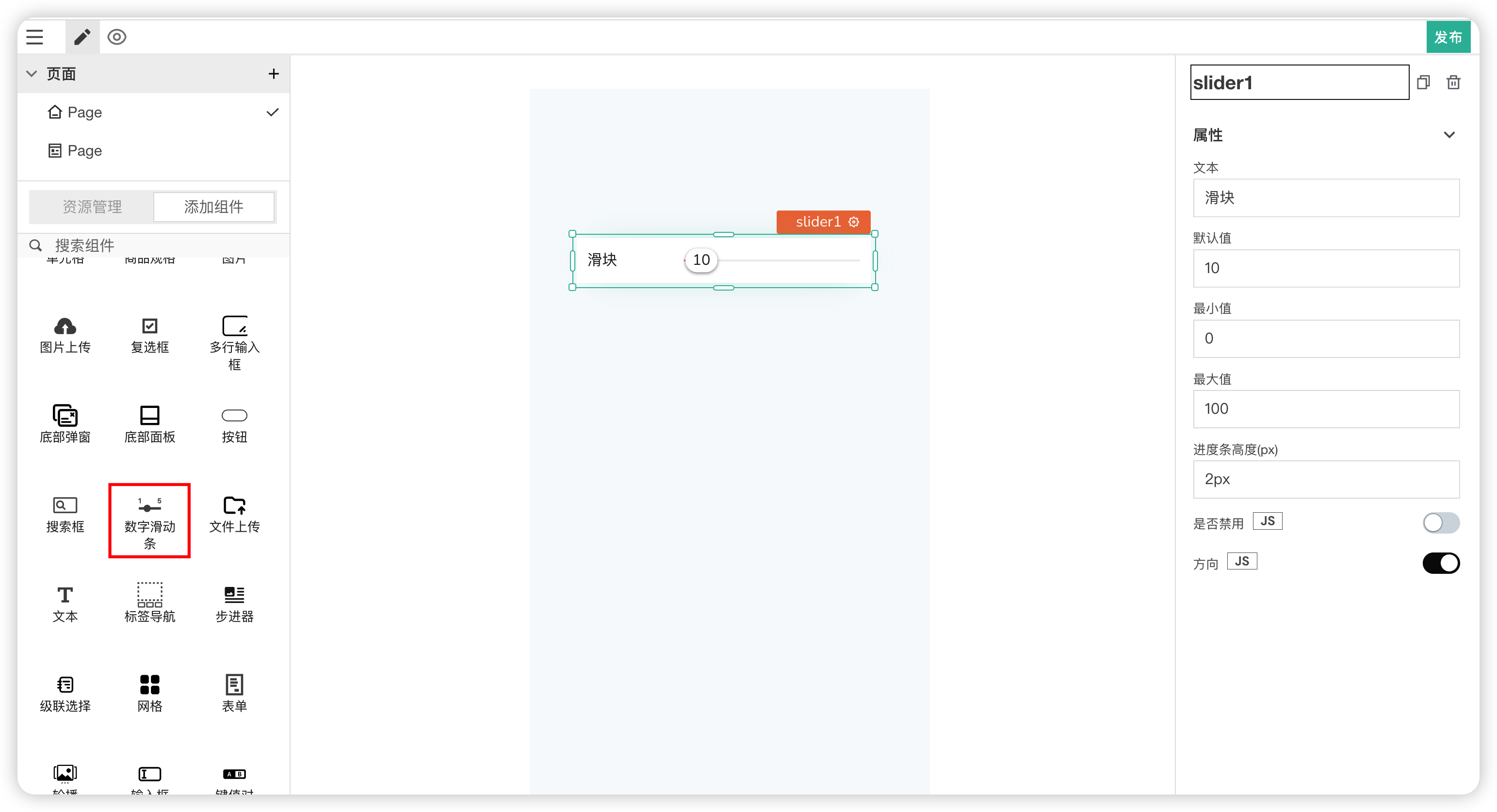
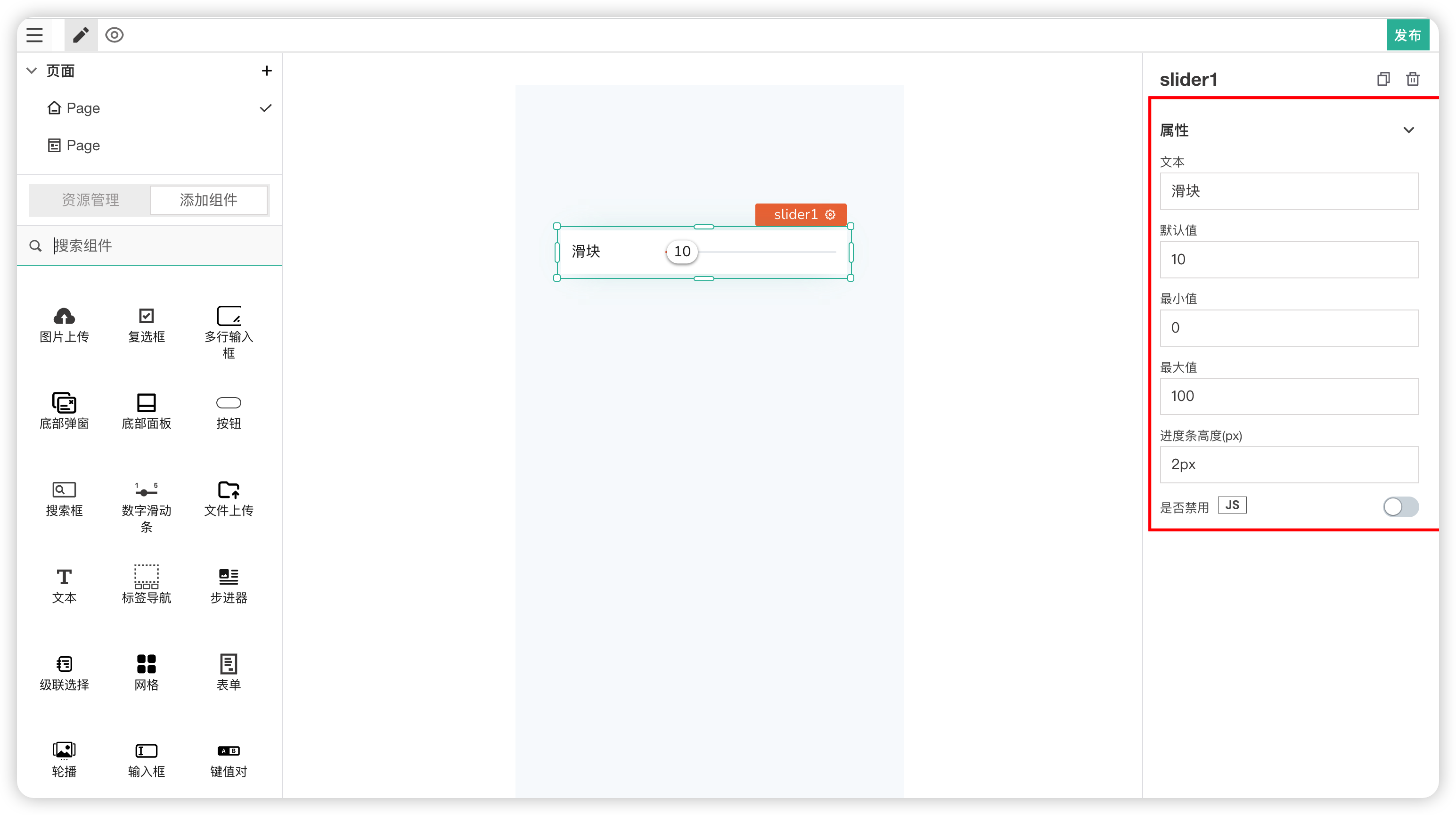
A slider input for selecting a value within a given range.
Properties
| Field | Description |
|---|---|
| Text | Modifies the field name label |
| Default Value | The initial value of the slider |
| Minimum Value | The minimum value |
| Maximum Value | The maximum value |
| Progress Bar Height | Controls the height of the progress bar |
| Disabled | Makes the component unslidable or unusable. |
# 25. Dialog Popup
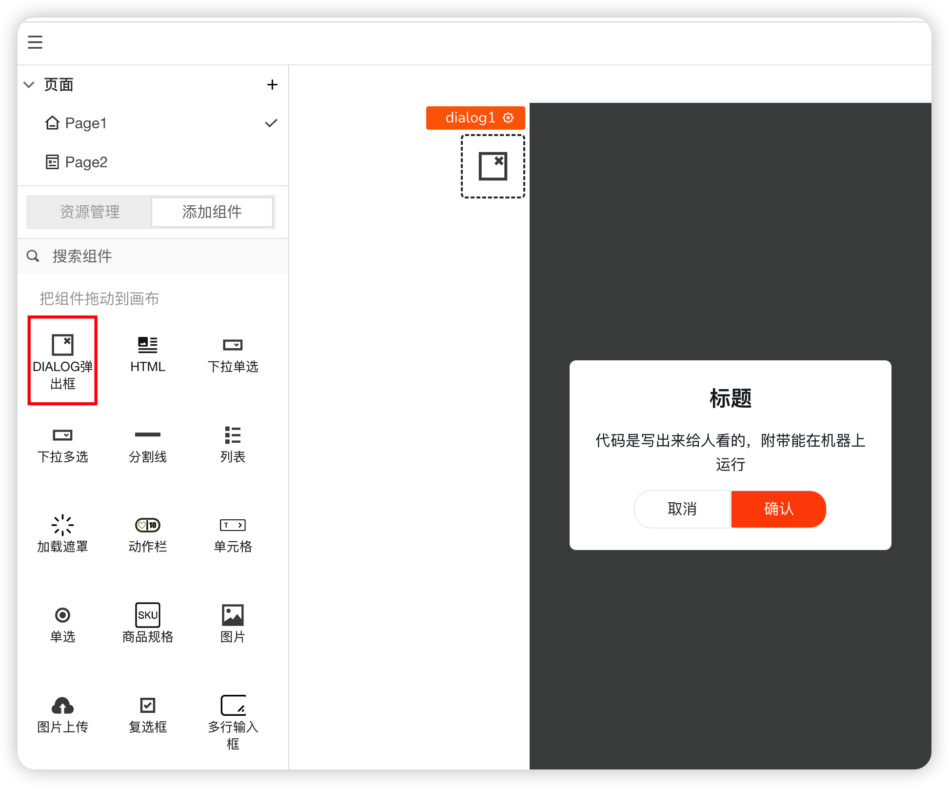
A modal popup box, commonly used for message prompts, confirmations, or completing specific interactive operations on the current page.
Properties
| Field | Description |
|---|---|
| Show Loading | Controls whether the dialog is displayed |
| Title Text | Used to modify the title text |
| Content Text | Used to modify the content text |
| Cancel Button Text | The text for the cancel button |
| Confirm Button Text | The text for the confirm button |
| Content Text Alignment | Controls the alignment of the content text |
Actions
| Field | Description |
|---|---|
| onClick(cancel) | Action triggered when the cancel button is clicked |
| onClick(confirm) | Action triggered when the confirm button is clicked |
# 26. Dropdown Select (Single)
A dropdown menu list.
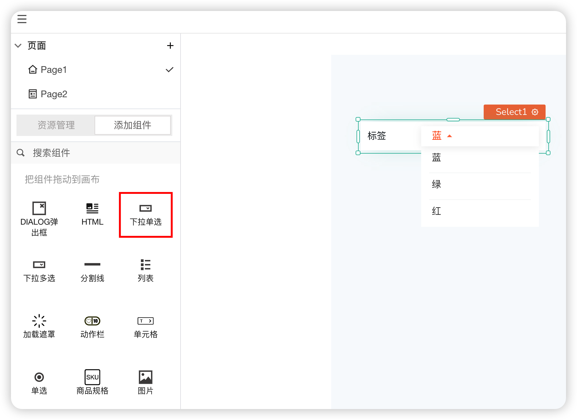
Properties
| Field | Description |
|---|---|
| Data | Used to display the list content |
| Dropdown Display Content | Display as text or image |
| Text | The label text content |
| Disabled | Whether it is disabled |
Styles
| Field | Description |
|---|---|
| Selected Text Color | The highlight color for the selected text |
| Label Alignment | The alignment of the label |
# 27. Dropdown Select (Multiple)
A dropdown menu list that allows multiple selections.
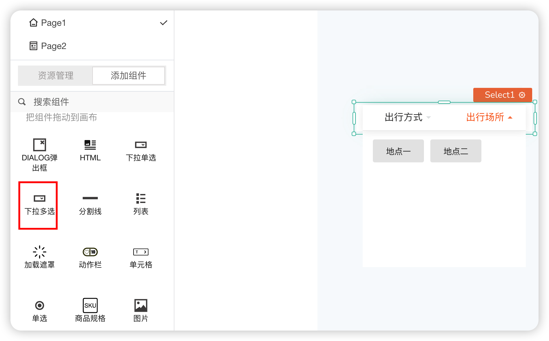
Data
Please write the data format according to the default data format.
Properties
| Field | Description |
|---|---|
| Show Field Name | The label text content |
| Component Theme Color | Modifies the highlight color when selected |
| Selected Highlight Background Color | Modifies the highlight background color when selected |
# 28. Radio
Used for single selection within a set of options.
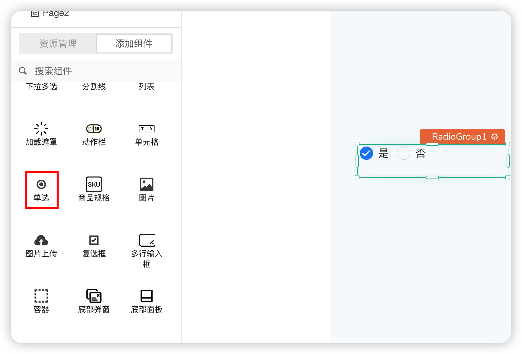
Data
| Field | Description |
|---|---|
| Data | Configures the radio option content |
| Default Selected Value | The value of the option selected by default |
Styles
| Field | Description |
|---|---|
| Icon Size | Controls the size of the icon |
| Horizontal Layout | Whether the options are arranged horizontally or vertically |
| Circular Checkbox | Modifies the shape of the checkbox to circular |
Properties
| Field | Description |
|---|---|
| Disabled | Whether the option is disabled |
Events
| Field | Description |
|---|---|
| onSelectionChange | Event triggered when the selected item changes |
# 29. Image Upload
Used to upload local images or files to the server, displaying preview images and upload progress. Currently, the Uploader component does not include the interface logic for uploading files to the server; this step needs to be implemented by the user.
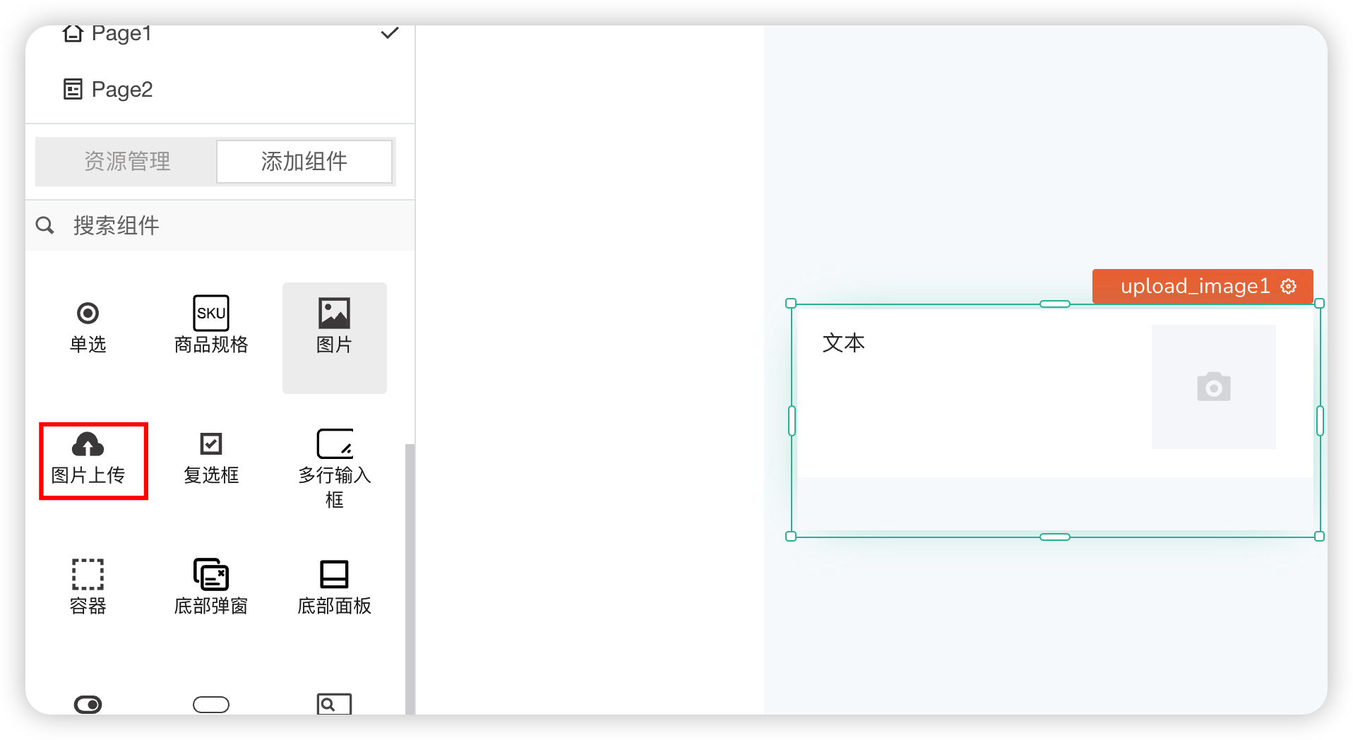
Properties
| Field | Description |
|---|---|
| Show Label | Whether to display the label |
| Field Name | The text for the label name |
| Limit Count | Limits the number of images that can be uploaded |
| Required | Whether it is required. Shows a validation reminder if empty |
| Placeholder | The hint text when the field is empty/default |
| Text Alignment | The alignment of the label |
# 30. Textarea
Allows users to input or edit multiple lines of text in a text box.
Properties
| Field | Description |
|---|---|
| Show Field Name | Whether to display the label |
| Field Name | The text for the label name |
| Required | Whether it is required. Shows a validation reminder if empty |
| Placeholder | The hint text when the field is empty/default |
| Limit Length | Controls the length of the text input in the text box |
| Disabled | Whether the input box is disabled |
# 31. Container
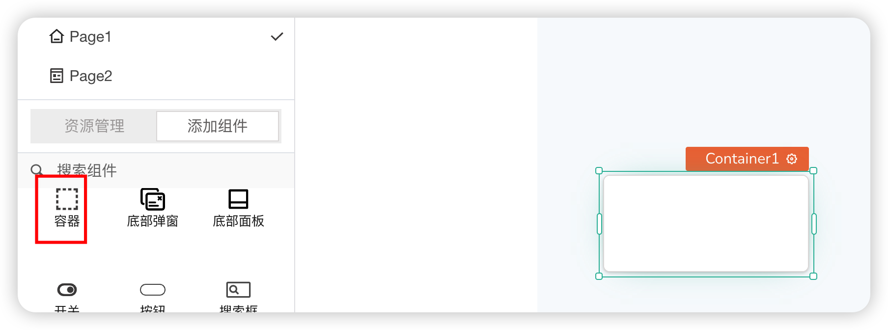
Components can be dragged into the container.
Properties
| Field | Description |
|---|---|
| Visible | Controls the visibility of the component on the page. When off: The component will be invisible when the application is published. In edit mode, it appears translucent |
| Show Animation on Load | When off, the component will not have any animation when loading. You can use the toggle switch to turn it on/off. You can also use JavaScript by enabling the JS tag next to it to turn it off/on. |
| Height | When the components inside the container exceed the container size, sets whether scrolling is allowed within the container component |
Styles
| Field | Description |
|---|---|
| Background Color | Sets and adjusts the background color inside the container component |
| Background Image | Sets and adjusts the background image of the container component |
| Border Color | Sets and adjusts the border color of the container component |
| Border Width | Sets the width between the canvas inside the container component and the container border |
| Border Radius | Modifies the border style of the container component (rounded corners) |
| Shadow | Adjusts the overall shadow size of the container component |
# 32. Switch
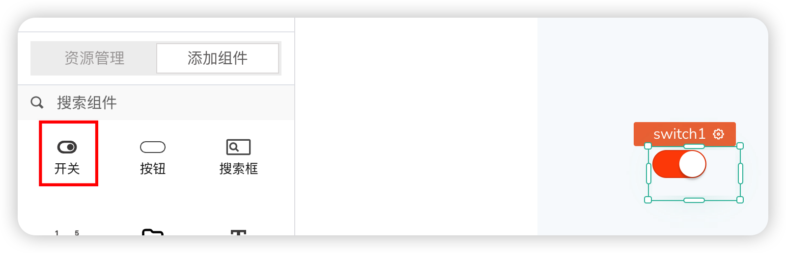
Used to toggle between on and off states.
Properties
| Field | Description |
|---|---|
| Disabled State | Sets the disabled state |
| Default Switch State | The default on/off state of the switch |
| Custom Size | Sets the size of the switch |
| Background Color | Modifies the background color when off |
| Selected Color | Modifies the background color when on/selected |
Events
| Field | Description |
|---|---|
| onChange | Event triggered when the switch changes state |
# 33. Number Slider
A slider input for selecting a value within a given range.
| Field | Description |
|---|---|
| Text | The content of the label text |
| Minimum Value | Sets the minimum value in the selectable range |
| Maximum Value | Sets the maximum value in the selectable range |
| Progress Bar Height | Sets the height of the progress bar. Unit is PX |
| Disabled | Whether sliding is disabled |
# 34. File Upload
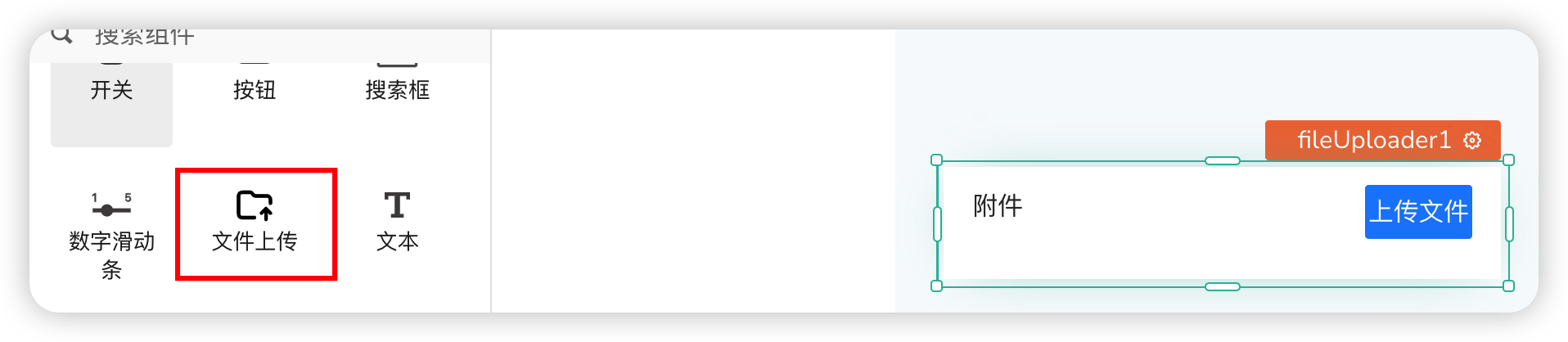
Used for file uploads. Only provides the UI and entry point for uploading files. Users need to handle the upload themselves via JS events. The data part needs to be arranged in a prompt structure.
Data
File data. Can write variables, returned via functions. Users need to handle the data format themselves.
Properties
| Field | Description |
|---|---|
| Show Field Name | Whether to display the field name |
| Field Name | The text for the field name |
| Required | Whether it is required |
Actions
| Field | Description |
|---|---|
| onUploadClick | The operation executed when the upload file button is clicked. Can execute code for file upload, including API calls and data processing |
| onDeleteClick | The operation executed when the delete file button is clicked. Can perform API calls and data processing |
# 35. Calendar
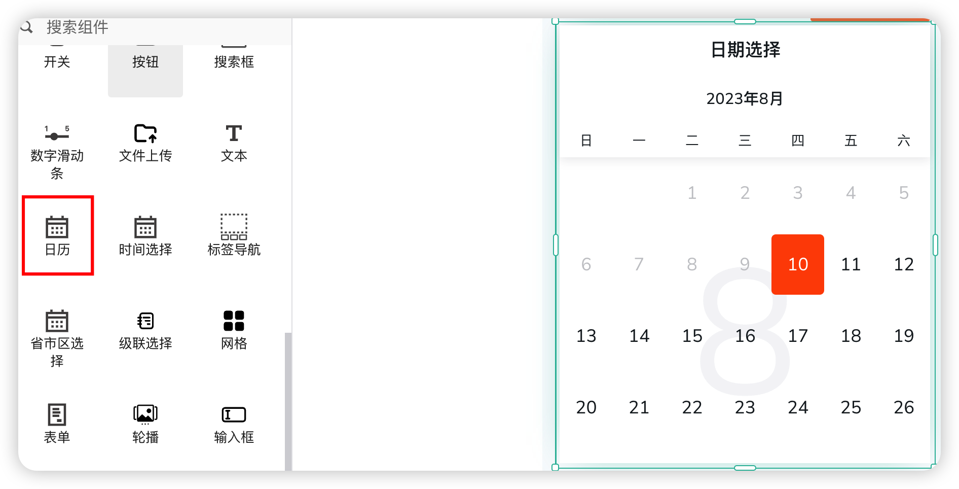
The Calendar component is used for selecting a date or date range.
Properties
| Field | Description |
|---|---|
| Calendar Title | The text content of the title |
| Highlight Selected Color | The highlight background color for the selected date |
| Show Calendar Subtitle (Year-Month) | Whether to display the year-month hint |
| Read-only State | Sets the edit state |
| Default Selected Date | The date selected by default |
| Minimum Selectable Date | The minimum date that can be selected |
| Maximum Selectable Date | The maximum date that can be selected |
| Selection Type | Can be set to single selection, multiple selection, or range |
Events
| Field | Description |
|---|---|
| onChange | Triggered when any date is clicked and selected |
| onConfirm | Triggered after date selection is completed |
# 36. Time Picker
A time picker supporting dimensions like date, year-month, hour-minute-second, etc. Often used in conjunction with popup layer components.
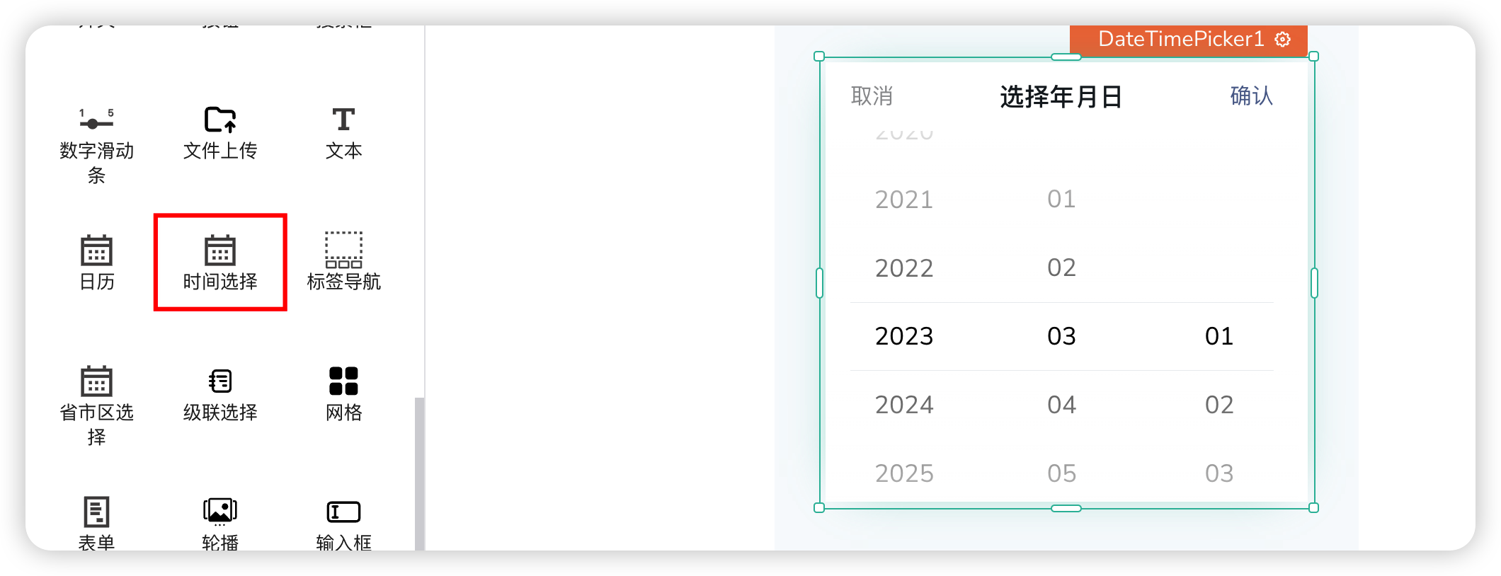
Data
| Field | Description |
|---|---|
| Default Selected Value | The date selected by default |
| Custom Column Order Array | Custom column order array. Sub-items can be: year, month, day |
| Read-only | Sets read-only mode |
Events
| Field | Description |
|---|---|
| onChange | Triggered when the selected date changes |
| onConfirm | Event triggered when confirm is clicked |
| onCancel | Event triggered when cancel is clicked |
# 37. Province-City-District Selector
A three-level联动 selector for province, city, and district.
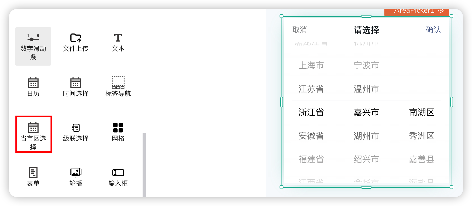
Data
| Field | Description |
|---|---|
| Default Selected Value | The time selected by default |
| Read-only | Whether it is read-only |
| Number of Visible Adjacent Options | The number of visible adjacent options |
| Number of Displayed Columns | Number of displayed columns: 3-Province/City/District, 2-Province/City, 1-Province |
Events
| Field | Description |
|---|---|
| onChange | Triggered when the selected date changes |
| onConfirm | Event triggered when confirm is clicked |
| onCancel | Event triggered when cancel is clicked |
# 38. Cascader
A cascading selection box for selecting multi-level data. A typical scenario is province-city-district selection.
Data
| Field | Description |
|---|---|
| Field Name | The text content of the field name |
| Option Title | Modifies the title text of the option |
| Visible | Whether it is visible. In an invisible state, it appears translucent in the editor |
| Default Text | The content of the default text |
| Data | The data to be displayed. Format refers to the default data |
# 39. Custom Component
Custom Component. If the current components do not meet the requirements, users can create custom components to implement their needs.
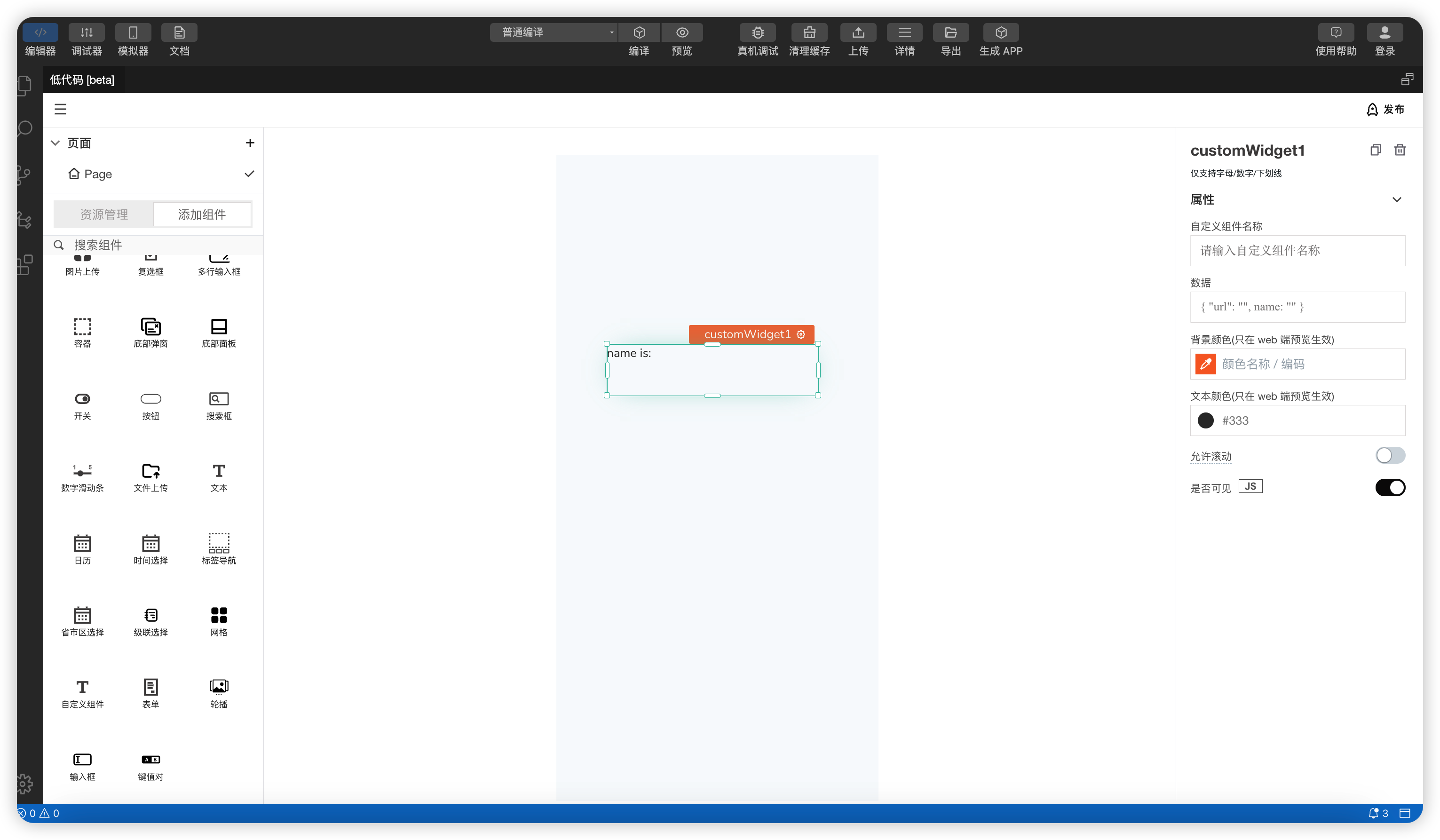
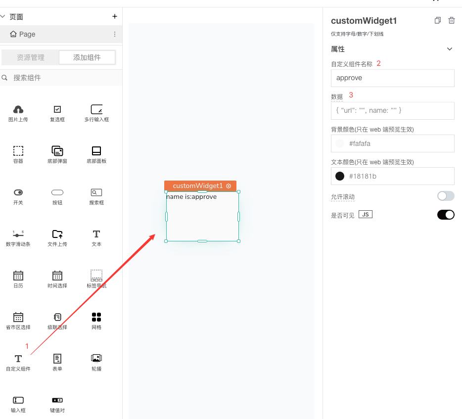
- Find the Custom Component in the component list and drag it onto the page.
- Set the name of the custom component to be created. On the Taro side, different components can be rendered based on this field.
- Data that needs to be passed to the custom component for use.
- Text color and background color only take effect in the web preview and do not take effect on the Taro side.
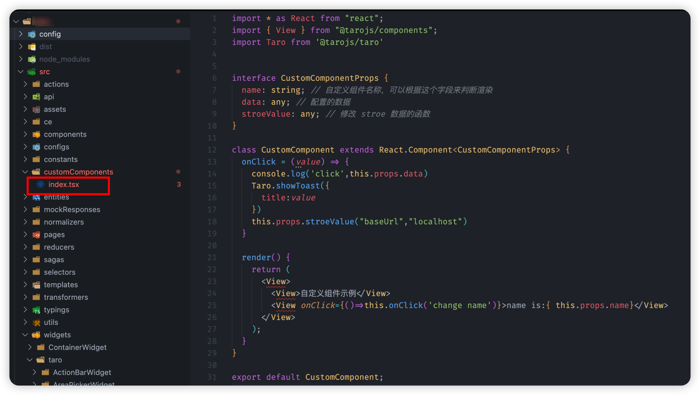
- In the project, the components in
src/customComponentsare the components actually rendered on the Mini-Program side.
- In the project, the components in
CustomComponenthas three properties:
name: The name of the custom component. Rendering can be controlled based on this field.data: The data configured on the web side.stroeValue: A method used to modify store data. Accepts two parameters, e.g.,this.props.stroeValue("baseUrl","localhost").
- When using a custom component, you can use a
switchstatement in therenderfunction ofCustomComponentto check the setnamefield and control the rendering of different components.
- When using a custom component, you can use a