
# Mini-Program Plugin
Feature Background
Developers can declare the plugin code to be introduced within the Mini-Program code. When compiling with the Developer Tools, the Developer Tools will fetch the plugin code from the server and package and compile it together. The plugin feature can only be used in environments where Base Library Version ≥ 2.11.1 and SDK Version ≥ 2.34.0.
# 1. Feature Introduction
A Mini-Program plugin encapsulates a set of js interfaces, Custom Components, or pages. Compared to ordinary js files or custom components, plugins possess greater independence. However, plugins cannot be called directly; they must be embedded within a Mini-Program for users to use and cannot run independently. When a third-party Mini-Program uses a plugin, it cannot see the plugin's code. Therefore, plugins are suitable for encapsulating your own functionality or services and providing them to third-party Mini-Programs for display and use via the plugin form.

Developers can write and upload plugins similarly to developing Mini-Programs. After a plugin is published, FinClip hosts the plugin code. When other Mini-Programs call it, the uploaded plugin code is downloaded and run along with the Mini-Program.
Within the FinClip Mini-Program system, we employ sandbox technology to provide data security protection for both the Mini-Program and each plugin it uses, ensuring that none can steal data from any other party (unless data is actively passed to another party). The domains required for requests within the plugin also need to be configured on the "Domain Settings" page. Plugins can also call all FinClip API functionalities.
# 2. Operational Instructions
Regarding the use of Mini-Program plugins, it is divided into two parts: developers developing plugins, and Mini-Program developers using plugins.
# 2.1 Developing Plugins
# 2.1.1 Creating a Plugin Project
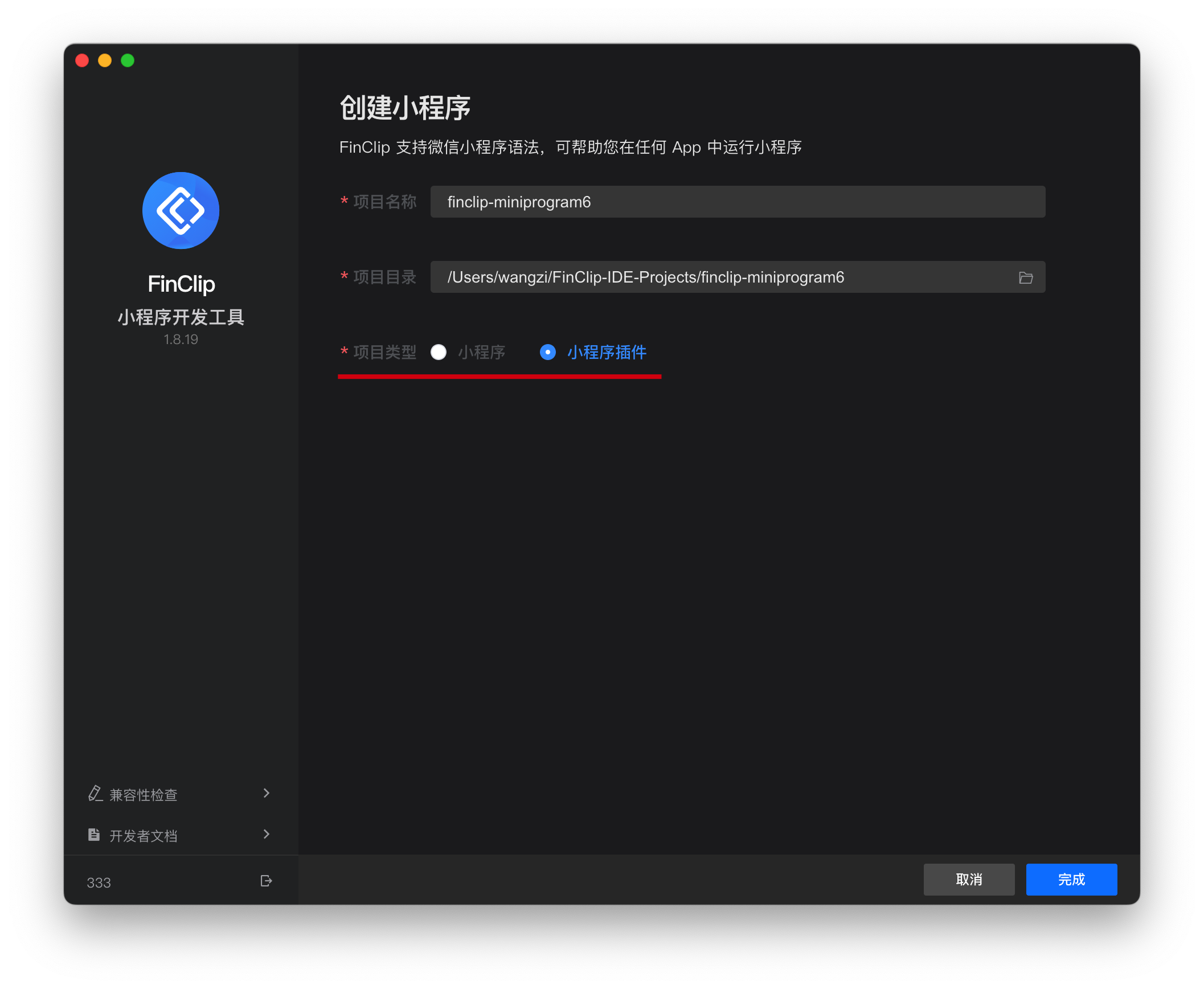
Developers need to select "Create Mini-Program" in the Developer Tools and choose "Mini-Program Plugin" as the project type.
After creating the plugin Mini-Program, we can find two directories and one file in the project directory:
plugindirectory: Directory for the plugin code;miniprogramdirectory: Contains the FinClip Mini-Program used for debugging the plugin;fide.project.config.jsonfile: FinClip project configuration file;
The content within the miniprogram directory can be written as an ordinary Mini-Program and used to preview, debug, and review the plugin.
# 2.1.2 Plugin Directory Structure
If you create a Mini-Program of the plugin type via the Developer Tools, you can also learn more about Mini-Program plugins by directly viewing its contents.
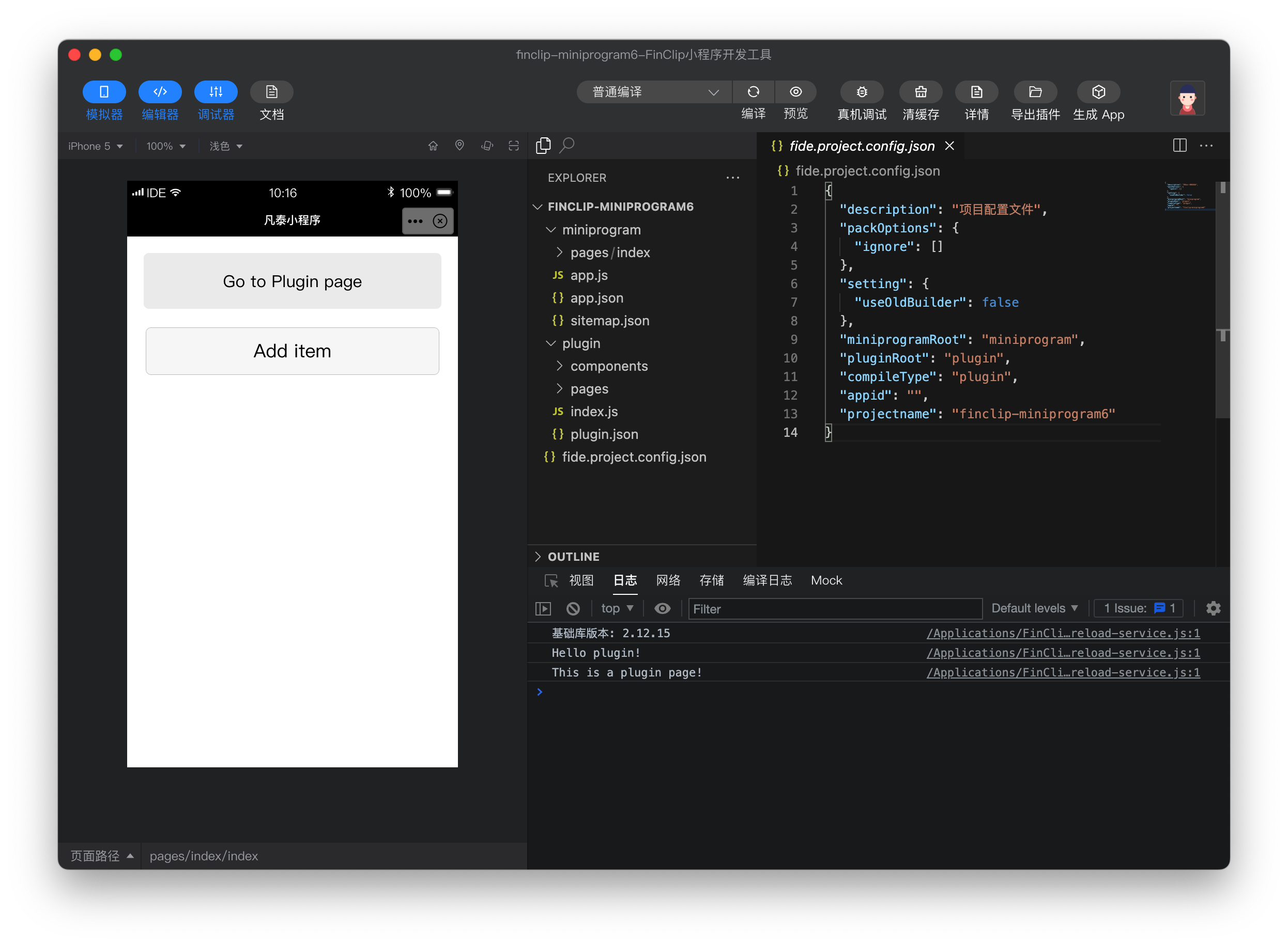
A plugin can include several custom components, pages, and a set of js interfaces. The directory contents of a plugin are as follows:
plugin
├── components
│   ├── hello-component.js   // Custom components provided by the plugin (can have multiple)
│   ├── hello-component.json
│   ├── hello-component.fxml
│   └── hello-component.ftss
├── pages
│   ├── hello-page.js        // Pages provided by the plugin (can have multiple, supported since Base Library version 2.1.1)
│   ├── hello-page.json
│   ├── hello-page.fxml
│   └── hello-page.ftss
├── index.js                 // js interfaces of the plugin
└── plugin.json              // Plugin configuration file
# 2.1.3 Plugin Configuration File
All custom components, pages, and js interfaces exposed to the consuming Mini-Program must be listed in the plugin configuration file plugin.json, formatted as follows:
{
  "publicComponents": {
    "hello-component": "components/hello-component"
  },
  "pages": {
    "hello-page": "pages/hello-page"
  },
  "main": "index.js"
}
This configuration file exposes one custom component hello-component, one page hello-page, and all js interfaces exported under index.js to the consuming Mini-Program.
# 2.1.4 Developing Custom Components
A plugin can define several custom components, and these custom components can reference each other within the plugin. However, custom components provided for use by consuming Mini-Programs must be listed in the publicComponents section of the configuration file (refer to above).
Apart from interface restrictions, the writing and organization of custom components are the same as general custom components. Each custom component consists of fxml, ftss, js, and json files. For details, refer to the Custom Components documentation.
When introducing a custom component in a json file, use the plugin:// protocol to specify the plugin's reference name and the custom component name, for example:
{
  "usingComponents": {
    "hello-component": "plugin://myPlugin/hello-component"
  }
}
# 2.1.5 Developing Pages
Plugins support pages starting from Mini-Program Base Library version 2.1.1. A plugin can define several plugin pages, which can be navigated to from custom components within this plugin, other pages, or from the consuming Mini-Program. All pages must be listed in the pages section of the configuration file (refer to above).
Apart from interface restrictions, the writing and organization of plugin pages are the same as general pages. Each page consists of fxml, ftss, js, and json files.
When performing page navigation within the plugin, you can use the navigator component. When the plugin navigates to its own page, the url should be set using the plugin:// prefix in the format: url="plugin://hello-plugin/hello-page", for example:
<navigator id="nav" url="plugin://hello-plugin/hello-page">
  Go to Plugin page
</navigator>
Similarly, within the plugin's own pages, the plugin can also call ft.navigateTo for page navigation, with the url format similar to when using the navigator component.
# 2.1.6 Developing Interfaces
A plugin can export some js interfaces in the interface file (specified in the configuration file, details above) for the plugin's consumers to call, for example:
// plugin/pages/hello-page.js
Page({
  data: {},
  onLoad() {
    console.log('This is a plugin page!')
  }
})
# 2.1.7 Previewing Plugins
Plugins can be previewed and uploaded similarly to Mini-Programs, but plugins do not have an Experience Version. A plugin can have multiple online versions simultaneously, and the specific version number used is determined by the Mini-Program consuming the plugin. When previewing or submitting a plugin for review on a mobile device, a special Mini-Program is used to wrap the Mini-Program under the miniprogram folder in the project, thereby previewing the plugin.
# 2.2 Uploading and Publishing Plugins
Please Note
In FinClip, plugins are divided into Platform Published Plugins and Private Plugins. All users can see Platform Published Plugins, while plugins uploaded by ordinary developers are only visible within their own team or enterprise.
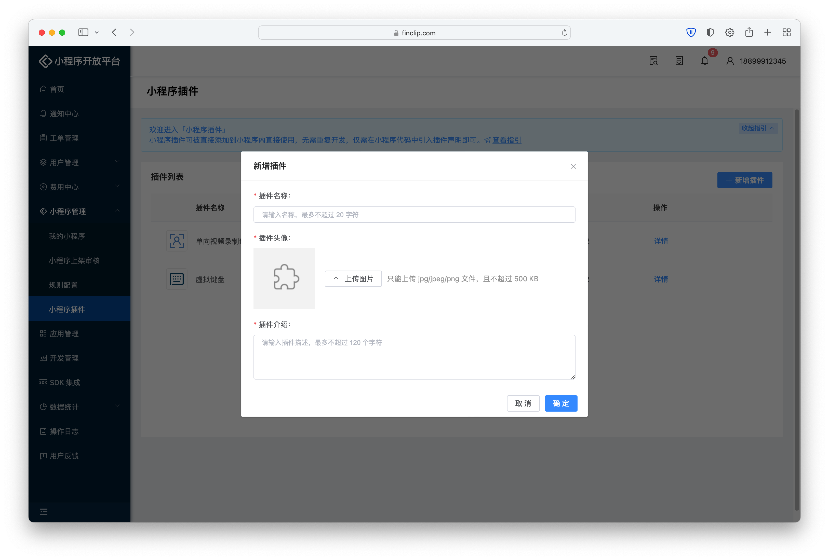
If developers need to upload private plugins, they need to go to the "Mini-Program Management - Mini-Program Plugins" page, click the "Add Plugin" button, and enter the plugin name, avatar, and description information respectively to complete the plugin creation.
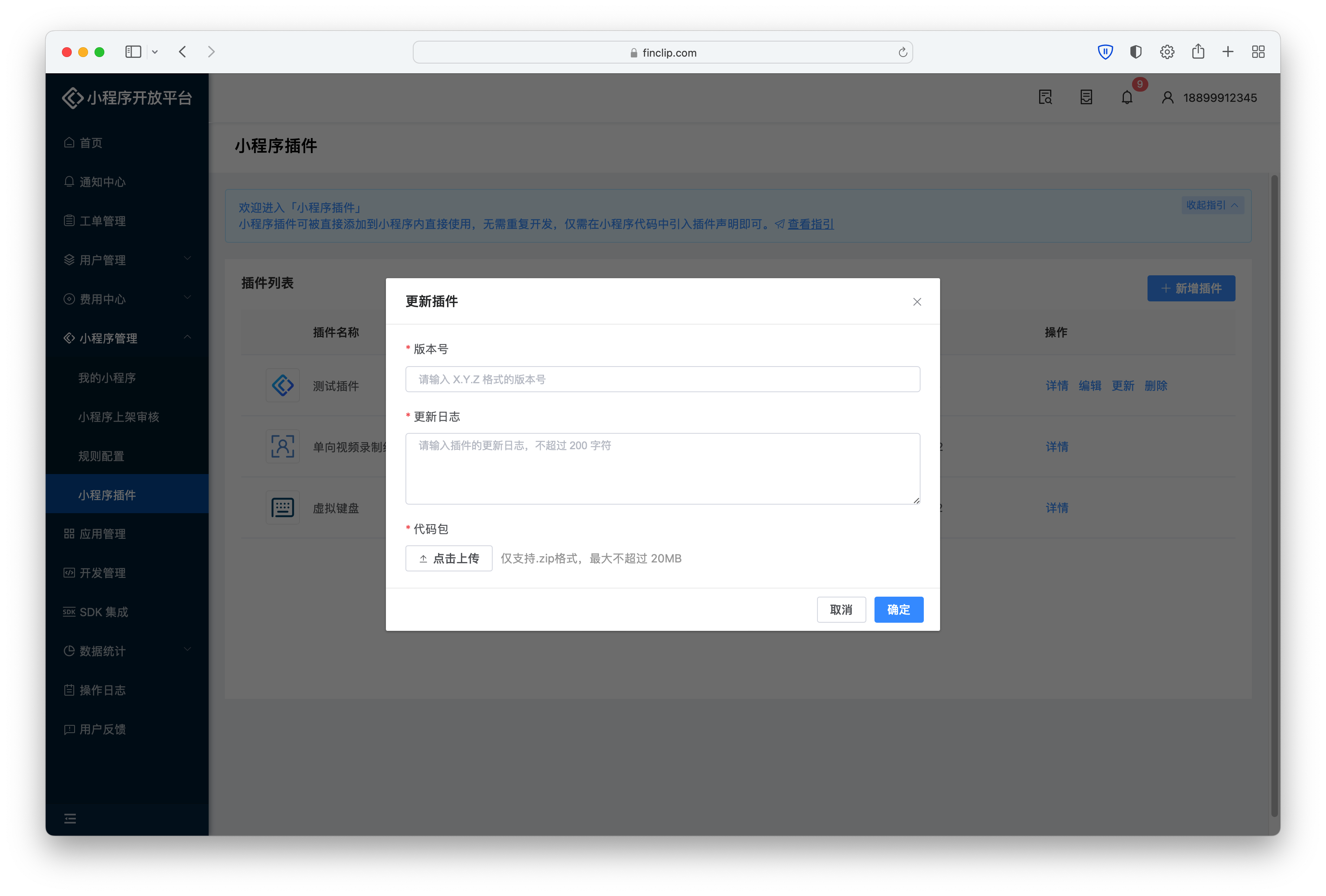
After creating the plugin, click "Update Plugin" on the right, enter the plugin version number, update log, and upload the code package respectively to complete the plugin upload.
# 2.3 Using Plugins
# 2.3.1 Finding Needed Plugins
Before using a plugin, developers can log in to "Mini-Program Open Platform - Mini-Program Management - Mini-Program Plugins" to obtain the Plugin ID information. Using plugins in FinClip does not require application; they can be used directly.
When using a plugin, the plugin's code is invisible to the consumer. To use the plugin correctly, the consumer should check the "Development Documentation" section on the plugin details page, read the plugin development documentation provided by the plugin developer, and clarify the custom components, page names, and js interface specifications provided by the plugin through the documentation.
# 2.3.2 Introducing Plugin Code Package
Before using a plugin, the consumer must declare the plugins to be used in app.json, for example:
{
  "plugins": {
    "myPlugin": {
      "version": "1.0.0",
      "provider": "Plugin ID"
    }
  }
}
As shown in the example above, the plugins definition segment can contain multiple plugin declarations. Each plugin declaration is identified by a consumer-defined plugin reference name and specifies the plugin's ID and the version number to be used.
Among these, the reference name (like myPlugin in the example above) is defined by the consumer and does not need to be consistent with the plugin developer or coordinated with the developer. In subsequent plugin usage, this reference name will be used to represent the plugin.
# 2.3.3 Introducing Plugin Code Package Within a Subpackage
If a plugin is only used within one subpackage, it can be placed only in that subpackage, for example:
{
  "subpackages": [
    {
      "root": "packageA",
      "pages": [
        "pages/cat",
        "pages/dog"
      ],
      "plugins": {
        "myPlugin": {
          "version": "1.0.0",
          "provider": "Plugin ID"
        }
      }
    }
  ]
}
Using plugins within subpackages has the following restrictions:
- The plugin can only be used within this subpackage;
- The same plugin cannot be referenced by multiple subpackages simultaneously;
# 2.3.4 Using Custom Components
Using custom components provided by a plugin is similar to using ordinary custom components. When defining the custom components to be introduced in a json file, use the plugin:// protocol to specify the plugin's reference name and the custom component name, for example:
{
  "usingComponents": {
    "hello-component": "plugin://myPlugin/hello-component"
  }
}
For plugin protection, custom components provided by plugins have certain usage restrictions:
- By default, the
this.selectComponentinterface in a page cannot obtain the instance object of the plugin's custom component; - The
>>> selectorof interfaces likeft.createSelectorQuerycannot select into the plugin's interior.
# 2.3.5 Using Pages
When needing to navigate to a plugin page, use the plugin:// prefix for the url, in the form plugin://PLUGIN_NAME/PLUGIN_PAGE, for example:
<navigator url="plugin://myPlugin/hello-page">
  Go to pages/hello-page!
</navigator>
# 2.3.6 Using Interfaces
When using the js interfaces of a plugin, you can use the requirePlugin method. For example, if a plugin provides a method named hello and a variable named world, you can call them as follows:
var myPluginInterface = requirePlugin('myPlugin');

myPluginInterface.hello();
var myWorld = myPluginInterface.world;
The interface can also be obtained via the plugin's id, for example:
var myPluginInterface = requirePlugin('Plugin ID');
# 2.3.7 Exporting to Plugins
A Mini-Program using a plugin can export some content for the plugin to obtain. Specifically, when declaring the use of a plugin, an export field can be used to specify a file, for example:
{
  "myPlugin": {
    "version": "1.0.0",
    "provider": "Plugin ID",
    "export": "index.js"
  }
}
Then the content exported by this file (index.js in the example above) can be obtained by this plugin using a global function. In the file above, the Mini-Program using the plugin exported the following:
// index.js
module.exports = { whoami: 'MiniProgram' }
Then the plugin can obtain the exported content above:
// plugin
requireMiniProgram().whoami // 'MiniProgram'
What specific content to export should be read in the plugin development documentation and agreed upon with the plugin developer.
When the plugin is in a subpackage, this feature can also be used, but the path of the specified file is relative to the subpackage. For example, if export: exports/plugin.js is specified in a subpackage with root: packageA, then the specified file should be /packageA/exports/plugin.js in the file system.
Please Note
The exports of multiple plugins used do not affect each other; two plugins can export the same file or different files. However, when exporting the same file, if one plugin modifies the exported content, the other plugin will also be affected.
# 2.3.8 Providing Custom Components for Plugins
Sometimes, a plugin might render a part of an area within a page or custom component by handing it over to the consuming Mini-Program, thus requiring the consuming Mini-Program to provide a custom component. However, since the plugin cannot directly specify the custom component path of the Mini-Program, it needs to be provided by specifying Abstract Nodes (generics) for the plugin.
If a plugin's custom component needs to specify an abstract node implementation, it can be specified when referencing:
<!-- miniprogram/page/index.fxml -->
<plugin-view generic:mp-view="comp-from-miniprogram" />
You can specify the abstract component implementation for plugin pages via configuration items. For example, to specify the Mini-Program's custom component components/comp-from-miniprogram as the implementation for the abstract node mp-view in the plugin page named plugin-index:
{
  "myPlugin": {
    "provider": "Plugin ID",
    "version": "1.0.0",
    "genericsImplementation": {
      "plugin-index": {
        "mp-view": "components/comp-from-miniprogram"
      }
    }
  }
}
# 3. Plugins Provided by FinClip
When you use the FinClip SaaS environment, you can see plugins sourced from the Platform. These types of plugins are developed by FinClip itself or cooperative ecosystem partners for you to call and use.
# 3.1 One-way Video Recording Plugin
# 3.1.1 Quick Start
// pages/video/video.js
Page({

  data: {
    recordTime: 30000,
    top: 20,
    stepList: [
      {
        audioSrc: 'https://devtest-1252553964.cos.ap-guangzhou.myqcloud.com/1.mp3',
        showTime: 0,
        textList: [{
          text: 'First line of text',
          margin: '0 0 6rpx 0'
        }, {
          text: [{
            text: 'Second line'
          }, {
            text: 'Highlight Highlight',
            color: '#ee6f2d',
            fontWeight: 'bold',
            margin: '0 6rpx'
          }, {
            text: 'Text text text text text'
          }]
        }, {
          text: 'Third line text text text text text',
          color: '#ee6f2d',
          margin:  '6rpx'
        }]
      },
      {
        audioSrc: 'https://devtest-1252553964.cos.ap-guangzhou.myqcloud.com/2.mp3',
        showTime: 8000,
        textList: [{
          text: 'Second text',
          margin: '0 0 6rpx 0'
        }, {
          text: [{
            text: 'Text'
          }, {
            text: 'Highlight',
            color: '#ee6f2d',
            fontWeight: 'bold',
            margin: '0 6rpx'
          }, {
            text: 'Text text text text text'
          }, {
            text: 'Highlight',
            color: '#ee6f2d',
 fontWeight: 'bold',
            margin: '0 6rpx'
          }]
        }]
      },
      {
        audioSrc: 'https://devtest-1252553964.cos.ap-guangzhou.myqcloud.com/3.mp3',
        showTime: 18000,
        textList: [{
          text: '3 Third text',
          margin: '0 0 6rpx 0'
        }, {
          text: [{
            text: '3 Second line'
          }, {
            text: '3 Highlight 3',
            color: '#ee6f2d',
            fontWeight: 'bold',
            margin: '0 6rpx'
          }, {
            text: '333 Text text text text text text 333'
          }]
        }]
      }
    ],
    buttonStyle: {
      width: '16vw',
      height: '16vw',
      bottom: '80rpx'
    }
  },

  /**
   * Lifecycle function--Listens to page load
   */
  onLoad: function (options) {
    wx.showLoading()
  },

  onRecordReady() {
    wx.hideLoading()
  },

  onRecordStart() {
    wx.showToast({
      title: 'Recording started',
      icon: 'none'
    })
  },

  onRecordEnd(res) {
    const { tempVideoPath } = res.detail
    wx.showToast({
      title: 'Recording ended, address: ' + tempVideoPath,
      icon: 'none'
    })
    setTimeout(() => {
      wx.navigateTo({
        url: '/pages/index/index?url=' + encodeURIComponent(tempVideoPath)
      })
    }, 3500)
  },

  onRecordError(res) {
    const { errMsg } = res.detail
    wx.showToast({
      title: errMsg,
      icon: 'none'
    })
  }
})
// pages/video/video.json
"usingComponents": {
    "video-recognition": "plugin://video/video-recognition"
}
// pages/video/video.fxml
<view style="width: 100vw;height: 100vh;">
  <video-recognition recordTime="{{recordTime}}"
                     top="{{top}}"
                     stepList="{{stepList}}"
                     buttonStyle="{{buttonStyle}}"
                     mask="/assets/img_mask_person@3x.png"
                     resolution="low"
                     bind:onRecordReady="onRecordReady"
                     bind:onRecordStart="onRecordStart"
                     bind:onRecordEnd="onRecordEnd"
                     bind:onRecordError="onRecordError">

  </video-recognition>
</view>
# 3.1.2 Parameters
| Attribute | Type | Required | Default Value | Description |
|---|---|---|---|---|
| resolution | String | No | medium | Resolution, options: low, medium, high. Only effective during initialization, cannot be changed dynamically. |
| mask | String | No | - | Resource path for the viewfinder area mask. It is recommended to use relative paths to resources within the Mini-Program. HTTPS addresses may have loading delays. The mask will be placed on the camera with dimensions width 100% height 100%. Pay attention to match the component dimensions. |
| recordTime | Number | No | 30000 | Recording time, unit: milliseconds. |
| top | Number | No | 20 | Unit: rpx. Distance of the text prompt from the top. You can also modify the wxss inside the video-recognition component to customize the text's position. |
| stepList | Array[Object] | No | - | See below. |
| buttonStyle | Object | No | - | Controls the style of the recording button, allowing fine-tuning of the button's position. Currently only supports the following fields: width, height, left, top, bottom, right. Only effective during initialization, cannot be changed dynamically. |
| onRecordReady | EventHandler | No | - | Bound via onRecordReady. Some asynchronous resource downloads occur before ready. Triggered when resources are ready. Can be used by the page using the component to determine if preparation is complete and control loading display. |
| onRecordStart | EventHandler | No | - | Bound via bind:onRecordStart. Triggered when recording starts. |
| onRecordEnd | EventHandler | No | - | Bound via bind:onRecordEnd. Triggered when recording ends. Callback parameter res: tempVideoPath - local file address of the recorded video. |
| onRecordError | EventHandler | No | - | Bound via bind:onRecordError. Triggered when a recording error occurs. Callback parameter res: errMsg - error message when an error occurs. |
setpList Configuration for the speech and prompt text for each step. Maximum supported length is 3. Data element structure is as follows:
{
    "audioSrc": "https://xxxxx.mp3",
    "showTime": 0,
    "textList": []
}
- audioSrc - Audio link. It is recommended to use HTTPS links. The component will download audio resources when attached. If the download fails, the error callback will execute, reporting a resource loading error (Note: The domain of the mp3 must be added to the whitelist in the management backend, otherwise the download will fail).
- showTime - Display time for the text prompt and audio, in milliseconds. 0 means initial display, 2000 means display 2 seconds after recording starts.
- textList - Text prompt, array type. Parameter object is as follows;
{
    "text": 'Please read aloud in Mandarin'
}
- text - Text content. You can add style attributes like width|height|padding|margin|color|fontSize|fontWeight|textAlign to simply control the text style:
{
    "text": "Text",
    "color": "red",
    "fontWeight": "bold",
    "margin": "0 20rpx"
}
Note: A child element of textList will be displayed as a single line without wrapping. You can split it into multiple lines and multiple child elements as needed.
Additionally, if individual words within a single line need to be highlighted, the text attribute can be passed an array, with attributes consistent with the object parameters above, as follows:
{
    "text": [{
        "text": "Text"
    }, {
        "text": "Highlighted Text",
        "color": "red",
        "fontWeight": "bold",
        "margin": "0 20rpx"
    }, {
        "text": "Text"
    }]
}
Only effective during initialization, cannot be changed dynamically.
# 3.2 Virtual Keyboard
# 3.2.1 Quick Start
// component.json
"usingComponents": {
    "keyboard": "plugin://virtual-keyboard/keyboard"
}
// wxml
<keyboard show="{{ show }}" closeButtonText="Done" bindinput="changeInput" binddelete="changeDetete" />
# 3.2.2 Parameters
| Attribute | Type | Default Value | Description |
|---|---|---|---|
| title | string | Title displayed above the keyboard | |
| show | boolean | false | Controls whether the keyboard is displayed |
| theme | string | default | default/custom. When set to custom, adds delete and done buttons on the right side |
| themeColor | string | #2e7cff | Sets the theme color |
| zIndex | number/string | 999 | Z-index |
| isRandomLetter | boolean | false | Scramble letters |
| isRandomNumber | boolean | false | Scramble numbers |
| normalType | string | number | number/letter/symbol. Controls the type of keyboard displayed |
| closeButtonText | string | Text for the close button | |
| extraKey | [string] | Extra keys | |
| icon | string | Path for the icon in the title bar |
Translated content: