# Dark Mode Adaptation Guide
Supported in Base Library 2.12.2 and above. Use Developer Tools 1.8.11 or above for debugging, and SDK 2.35.1 or above.
# Enabling Dark Mode in the SDK
When initializing the Mini-Program SDK, set autoAdaptDarkMode = true (deprecated in version 2.44.5) to enable Dark Mode. Starting from version 2.44.5, you can set themeStyle (Light Mode, Dark Mode, Follow System) to specify the Mini-Program's theme mode.
# Enabling Dark Mode in the Mini-Program
Configure darkmode as true in app.json to indicate that the current Mini-Program has adapted to Dark Mode. All Basic Components will display different default styles according to the system theme, and the Navigation Bar and Tab Bar will also automatically switch based on the configurations below.
# Related Configurations
When darkmode is set to true in app.json, some Mini-Program configuration items can be configured using variables. Define colors or icons under different themes in the variable configuration file as follows:
- Configure
themeLocationinapp.jsonto specify the path of the variable configuration filetheme.json. For example, if you addtheme.jsonin the root directory, configure"themeLocation":"theme.json". - Define related variables in
theme.json. - Reference variables in
app.jsonusing@as a prefix.
Properties that support variable configuration:
- Window properties under global configuration and properties under page configuration
- navigationBarBackgroundColor
- navigationBarTextStyle
- backgroundColor
- backgroundTextStyle
- backgroundColorTop
- backgroundColorBottom
- Properties under global configuration window.tabBar
- color
- selectedColor
- backgroundColor
- borderStyle
- list
- iconPath
- selectedIconPath
# Variable Configuration File theme.json
theme.json is used for defining variables related to color themes. You must first configure the path of theme.json in themeLocation; otherwise, the variable configuration cannot be read.
The configuration file must include the following properties:
| Property | Type | Required | Description |
|---|---|---|---|
| light | object | Yes | Variable definitions for Light Mode |
| dark | object | Yes | Variable definitions for Dark Mode |
Variables can be defined under light and dark in the format key: value, for example:
{
  "light": {
    "navBgColor": "#f5f6f7",
    "navTxtStyle": "black"
  },
  "dark": {
    "navBgColor": "#1a1a1a",
    "navTxtStyle": "white"
  }
}
After definition, you can reference the variables in relevant properties of the global or page configuration using @ as a prefix, for example:
// Global configuration
{
  "window": {
    "navigationBarBackgroundColor": "@navBgColor",
    "navigationBarTextStyle": "@navTxtStyle"
  }
}
// Page configuration
{
  "navigationBarBackgroundColor": "@navBgColor",
  "navigationBarTextStyle": "@navTxtStyle"
}
After configuration, the Mini-Program Framework will automatically display the colors corresponding to the system theme for the Mini-Program.
# Configuration Example
app.json
{
    "window": {
        "navigationBarBackgroundColor": "@navBgColor",
        "navigationBarTextStyle": "@navTxtStyle",
        "backgroundColor": "@bgColor",
        "backgroundTextStyle": "@bgTxtStyle",
        "backgroundColorTop": "@bgColorTop",
        "backgroundColorBottom": "@bgColorBottom"
    },
    "tabBar": {
        "color": "@tabFontColor",
        "selectedColor": "@tabSelectedColor",
        "backgroundColor": "@tabBgColor",
        "borderStyle": "@tabBorderStyle",
        "list": [{
            "iconPath": "@iconPath1",
            "selectedIconPath": "@selectedIconPath1"
        }, {
            "iconPath": "@iconPath2",
            "selectedIconPath": "@selectedIconPath2"
        }]
    }
}
theme.json
{
    "light": {
        "navBgColor": "#f5f6f7",
        "navTxtStyle": "black",
        "bgColor": "#ffffff",
        "bgTxtStyle": "light",
        "bgColorTop": "#eeeeee",
        "bgColorBottom": "#efefef",
        "tabFontColor": "#000000",
        "tabSelectedColor": "#30c8121",
        "tabBgColor": "#ffffff",
        "tabBorderStyle": "black",
        "iconPath1": "image/icon1_light.png",
        "selectedIconPath1": "image/selected_icon1_light.png",
        "iconPath2": "image/icon2_light.png",
        "selectedIconPath2": "image/selected_icon2_light.png",
    },
    "dark": {
        "navBgColor": "#1a1a1a",
        "navTxtStyle": "white",
        "bgColor": "#1e1e1e",
        "bgTxtStyle": "dark",
        "bgColorTop": "#1a1a1a",
        "bgColorBottom": "#1e1e1e",
        "tabFontColor": "#ffffff",
        "tabSelectedColor": "#51a937",
        "tabBgColor": "#1a1a1a",
        "tabBorderStyle": "white",
        "iconPath1": "image/icon1_dark.png",
        "selectedIconPath1": "image/selected_icon1_dark.png",
        "iconPath2": "image/icon2_dark.png",
        "selectedIconPath2": "image/selected_icon2_dark.png",
    }
}
# Getting the Current System Theme
If "darkmode": true is declared in app.json, the return result of ft.getSystemInfo or ft.getSystemInfoSync will include a theme property, with a value of light or dark.
If "darkmode": true is not declared in app.json, the theme property cannot be obtained (i.e., theme is undefined).
# Listening for Theme Change Events
Two methods are supported:
- Pass the
onThemeChangecallback method inApp(); this callback will be triggered when the theme changes. - Use
ft.onThemeChangeto listen for theme changes andft.offThemeChangeto cancel listening.
# WXSS Adaptation
In WXSS, you can adapt to different themes using the media query prefers-color-scheme, consistent with the adaptation method on the Web, for example:
/* Styles under normal conditions begin */
.some-background {
    background: white;
}
.some-text {
    color: black;
}
/* Styles under normal conditions end */

@media (prefers-color-scheme: dark) {
    /* Styles under Dark Mode start */
    .some-background {
        background: #1b1b1b;
    }
    .some-text {
        color: #ffffff;
    }
    /* Styles under Dark Mode end */
}
# Debugging in Developer Tools
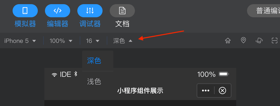
Developer Tools version 1.8.11 and above support Dark Mode debugging. You can switch between Dark/Light modes at the top of the simulator, as shown in the figure: