# General Adaptation Rules for Wide Screens
# 1. Overview
FinClip Mini-Program supports large screens (PC/TV/in-vehicle tablets, etc.), ensuring content is clear and readable, interface elements are easy to operate, and establishing an efficient, friendly, and consistent user experience. It maximizes adaptability and support for different requirements. This guide provides recommendations related to wide-screen adaptation for reference.
# 2. Adapting to Wide Screens
On PC/TV/in-vehicle tablets, due to the increased view size allowing more information to be displayed, the layout of the Mini-Program can be optimized.
# 2.1 Adaptation Principles
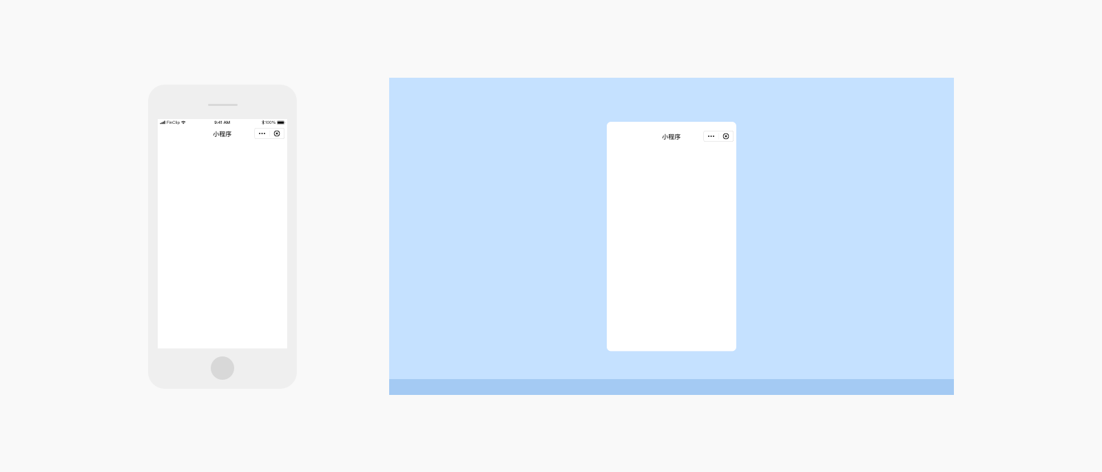
Portrait Mode: Displayed at phone size 414×736
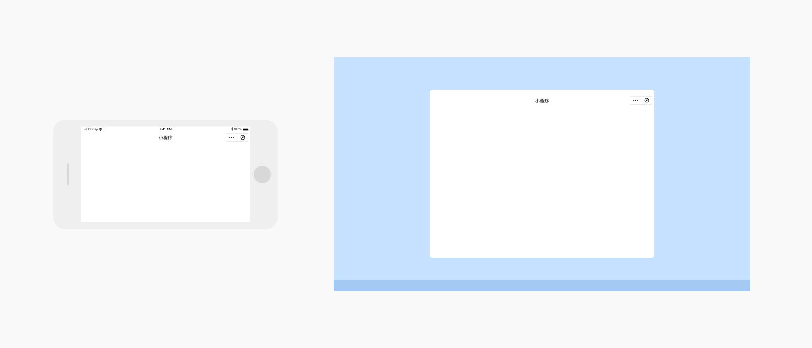
Landscape Mode: Displayed at tablet size 768×1024
# 2.2 Layout Optimization for Adaptation
(1) Left-Right Layout: Fully utilize the screen width, arranging page elements left and right to improve view utilization.

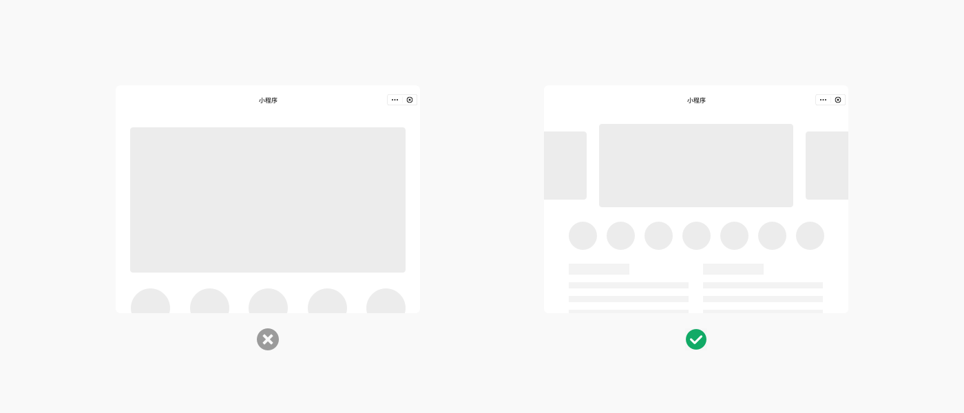
(2) Free Layout: Appropriately redesign the content layout to allow elements to be fully displayed in the view.
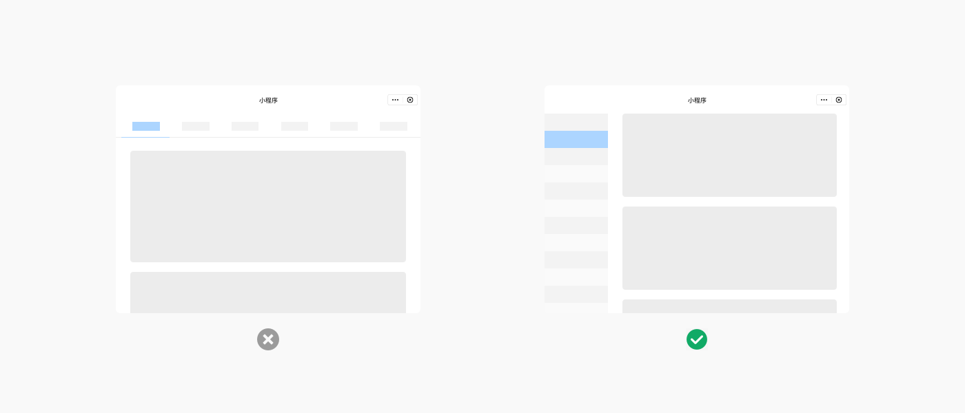
(3) More Suitable Navigation Method: Change the horizontal navigation bar to a sidebar style to better distinguish the primary and secondary relationships of the interface.
# 3. Interaction Adaptation for Wide Screens
# 3.1 Interaction Adaptation for PC
PC relies on mouse and keyboard operations, requiring the translation of mobile gestures into mouse operations.

# 3.2 Interaction Adaptation for TV
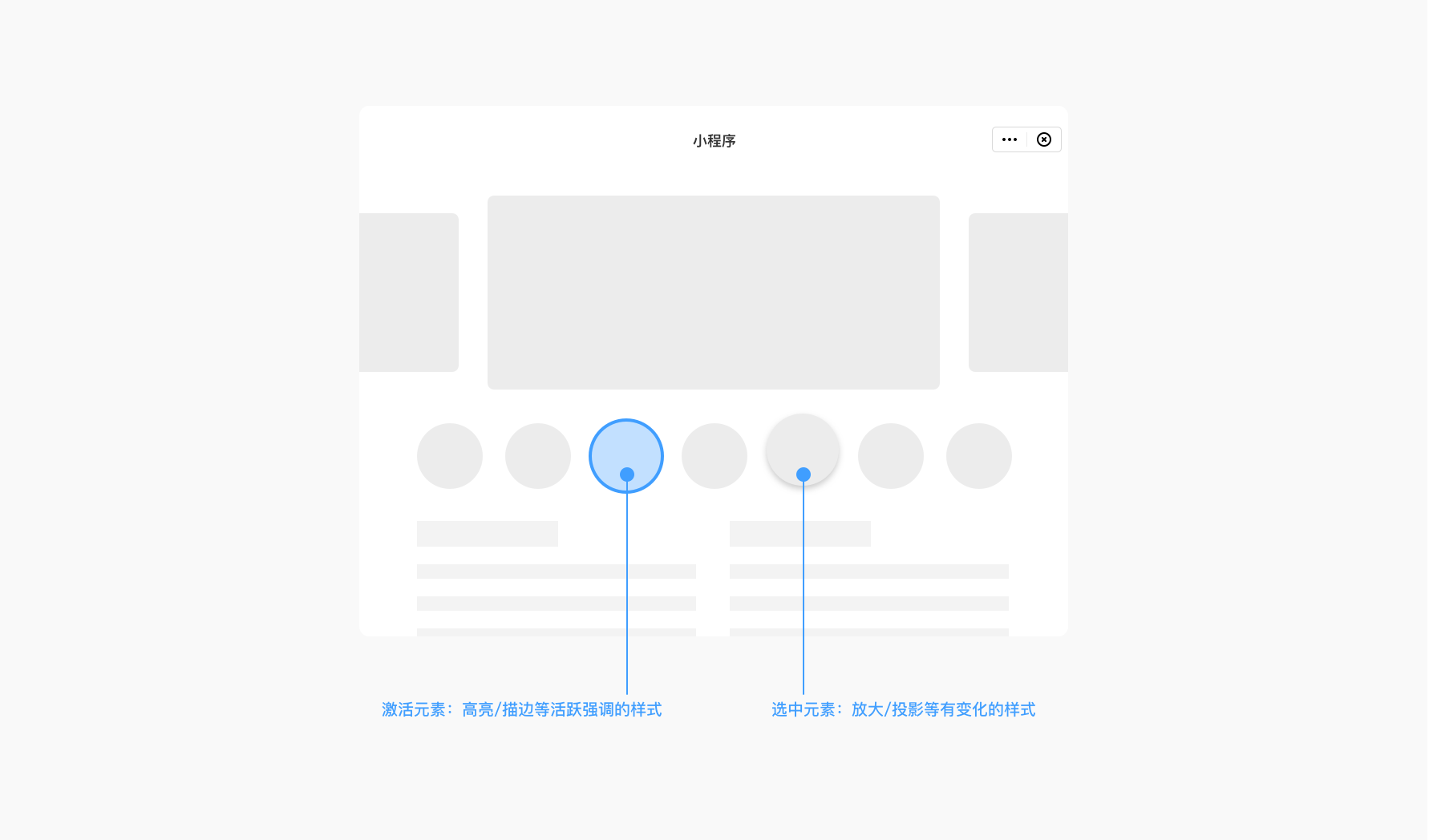
TV relies on remote control interaction with the television, requiring clear indication of the current cursor position and highlighting selected or hovered elements.
# 3.3 Interaction Adaptation for In-Vehicle Tablets
In-vehicle tablets should prioritize driver safety as a premise. Interaction areas should be clear, readable, and easy to operate, enabling simple interactions to be completed while the vehicle is in motion.